One Chinese Architect’s Quest To Easternize American Cities
At just 40 years old, architect Ma Yansong has made a mark for himself in his native China through wildly adventurous buildings, such as residential complexes that mimic the look of a hilly horizon, sinuous museums, and skyscrapers that subvert the Miesian box.
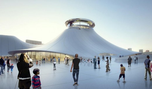
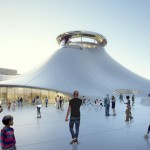
Rooted in the spirituality of the natural world, his structures seek to evoke visceral reactions from the people who step inside them or see them from afar. Now, the architect—a member of Fast Company‘s Most Creative People list—is eager to bring his approach stateside and has projects underway across the country: a residential complex in Beverly Hills, the controversial George Lucas Museum in Chicago, and a yet-to-be revealed residential high-rise in New York.
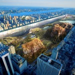
A protégé of Zaha Hadid, Yansong opened his firm, MAD, in 2004. Since then he’s designed residential towers, master plans, museums, opera houses, and hotels. His staff has expanded to 80 in Beijing, 10 in Los Angeles, and he’s soon to open a New York City outpost. In his manifesto Shanshui City (Lars Müller, 2015), Yansong writes: “The future development of society demands that we reconsider the relationship between humanity and nature. We must carefully reevaluate our experience of an industrial civilization that forfeited our natural environment. We have to find a new path, one that restores a sense of harmony and balance to our relationship with the natural world.”
Is the West ready for an influx of Eastern philosophy? Yansong offers compelling reasons why.
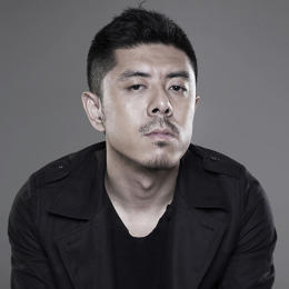
Co.Design: How is your process and approach different from Western architects?
Ma Yansong: I would say that many architects are very logical. They start their process from analysis and from rational processes to try and find the “right” answer, like solving a mathematic equation. It’s also the case now in China. The result is that many urban buildings become similar—they follow one direction. That wasn’t always the case. When you look at classical structures, they’re often linked to literature, music, or a poem. They were constructed by master builders, which means it’s not something standard that you can copy. The architect put his philosophy into the project, and you keep discovering energy and spirit in the project. That’s what modern architecture in cities lacks. If a designer doesn’t put emotion into the project at the beginning, how can a project have a spirit? And how will people feel about it in the future?
I treat my projects as art. I want to have a very instinctive reaction at the beginning of the design process. It doesn’t matter if it’s right or wrong; we can make it right in the second phase. During the first phase, we treat the architecture as art or as a concept, then we treat it as a building. It’s like a painting, you don’t want viewers to focus on the brushstrokes. You want them to think about the stories behind the piece or the emotional response. I never reveal the structure. Although some of our buildings require very advanced technology, I want people to “feel” the space, not focus on the specific materials or details. I think architecture should be a stage, not something too material—more of an environment, not a product.
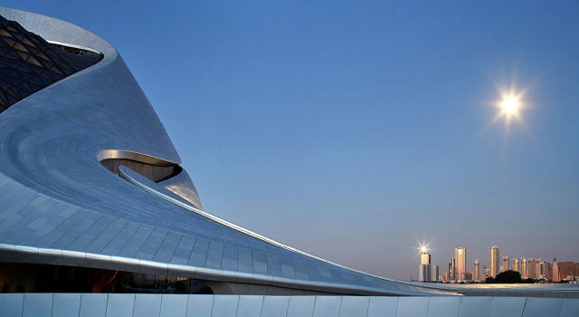
For example, achieving the Harbin Opera House‘s flow was super challenging. We had to cover everything outside in aluminum panels; inside it’s all white. You don’t know how heavy the place is—it all floats. No one talks about the material, or questions how we did this. The structure becomes dematerialized.
In the past, you’ve said that “architecture should provide a constructive resolution for the future.” What are the most pressing issues?
Modern architecture has become a symbol of power and capital, but in the future architecture will be about human nature. We have to question what we’ve done in the past. The present issue is, if we have to have density and have to build high-rises, then how should we talk about humanity and nature in the project at the urban scale, the architectural scale, and the spaces inside the building?
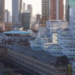
We studied the skyline in New York City, and there are basically two types of high-rises. Many towers are “strong” boxes, which means maximum efficiency and maximum space. Some other buildings rise to a point and are trying to be the tallest through a spire, which reminds you of churches from the past. Churches used to be the tallest buildings in the city. They stand out, they’re landmarks, and they presented religion. Now it’s become about capitalism. I don’t want to do either. The skyline we’re trying to create is about how we celebrate nature and humanity. For example, when I designed the Chaoyang towers, I was thinking about the black, cubic Mies van der Rohe buildings in Chicago and New York. I thought, maybe these buildings start to melt. I respect the modern and then I transform it.
How do your designs respond to the problem?
Take the Nanjing project in China. It’s a big project encompassing six urban blocks. We put all the towers on the edge and we created a valley in the middle. Normally, large buildings become the focal point, but here we tried to blend them into the background and put two-story structures in the middle. When people enter the complex, it feels intimate. There’s a fountain in the plaza and the buildings feel like waterfalls on a mountain.
With towers in large cities, you lose the human scale. We suggest that every three levels within the tower, you have a garden and the elevator can only open on this level so you’ll stop there, experience the garden, and then you walk one floor up or one floor down—which is not a big deal—but then you can build a community in a high-rise because now everyone isn’t isolated on a single level.
For 8600 Wilshire, an 18-unit building in L.A., we built all of the units so the dining and living rooms face the courtyard and the bedrooms face outside. It’s like the movie Rear Window. People can peek into each other’s apartments, get to know each other, see each other, and say hello. That’s rare in Beverly Hills.
Ten years ago, we designed two towers outside of Toronto. The balconies emphasize horizontality. Some people say they have a beautiful shape and nicknamed the buildings “Marilyn Monroe,” linking the high-rise to a woman. That’s very rare and interesting, I think, because people also are tired of muscular, strong buildings. Cities could have more sensitive, elegant structures.
China’s rapid urbanization reads like a cautionary tale for Western cities. What lessons can we learn?
The Chinese city developed according to the American typology: the density and the buildings of Chicago and New York are the examples we learned from. Now we’ve realized that we can’t keep copying [the West]. We’re starting to have new ideas in China.
The whole world is nearing the end of an industrial civilization; we’re talking about nature and humanity. My Shanshui City philosophy is not decorating with nature; it’s how people use a space and feel about a space—it’s a social agenda. In the West, people are already talking about green design and nature, but in very different ways from the East. Sustainability and green architecture is very technical. What I’ve learned from the Eastern culture is that we look at how nature inspires—it’s about beauty or the emotional element of the environment. It’s not just to be labeled green. In China, I was wondering how could we bring this philosophy to the future of urbanism.
Earlier this year, China placed a moratorium on “weird” architecture. What do you think of that?
I agree with it. We have a lot of residential towers that look like classic Roman-style buildings. You wouldn’t see that in Europe, but you see it in China. We have government buildings that look like the White House. Some headquarters look like wine bottles. Those are weird. It means they don’t have value, they don’t have the cultural identity. I think it’s about culture and taste—and in this category there is some very bad taste. The policy is not attacking new, innovative ideas.
People are also criticizing the similarity in cities—there’s no identity. And we’re building these towers all the same. It means people are looking for new stuff, new ideas, which is also good for society. Because the government calls it “weird architecture,” the definition is not so clear and then the discussion goes deeper. It’s important for designers like me to have my definition. Then I can advise the community about what we should and shouldn’t have.
All Images: via MAD
Lucas Museum
” src=”http://b.fastcompany.net/multisite_files/fastcompany/imagecache/slideshow_large/slideshow/2016/03/3057800-slide-s-6-ma-yansong-interview.jpg”>
Absolute Towers
” src=”http://c.fastcompany.net/multisite_files/fastcompany/imagecache/slideshow_large/slideshow/2016/03/3057800-slide-s-3-ma-yansong-interview.jpg”>
Chaoyang Park Plaza
” src=”http://d.fastcompany.net/multisite_files/fastcompany/imagecache/slideshow_large/slideshow/2016/03/3057800-slide-s-8-ma-yansong-interview.jpg”>
Fast Company , Read Full Story
(54)

