Opera Reimages Web Browser With ‘Neon’
Opera launches Neon, a new experimental desktop browser

Browsers have gotten boring. After a flurry of innovation, especially around the time Google launched Chrome, things slowed down over the last few years. We’ve seen a few interesting experiments, mostly from smaller players like Yandex, Brave and Vivaldi, but the largest players have pretty much stuck to their script. Opera, which was sold to a consortium of Chinese companies last year, is now doing its part to mix things up with the launch of Opera Neon, an experimental desktop browser for Windows and Mac that tries to reimagine what a modern browser should look like.
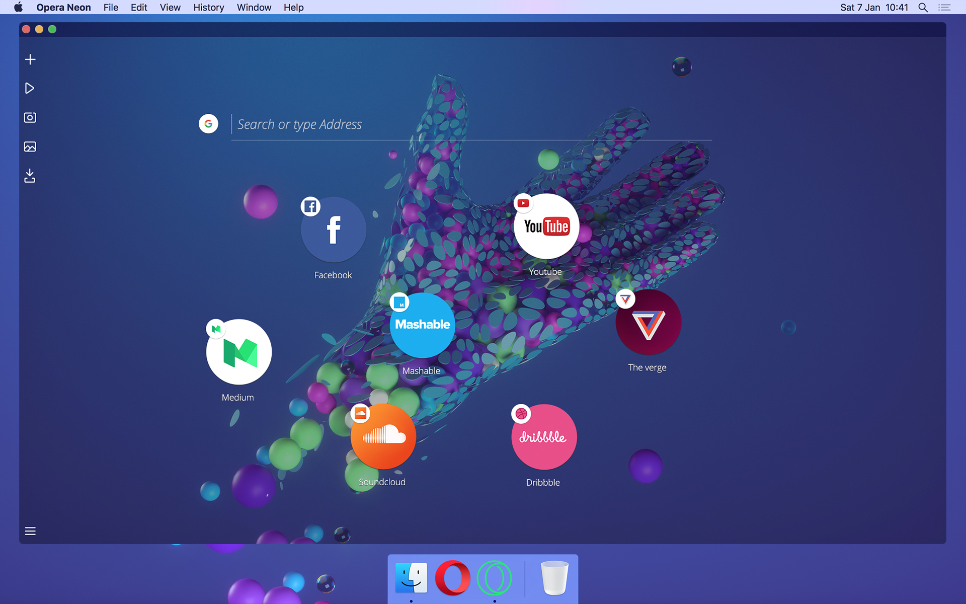
The moment you open Neon, you’ll notice that this is not your average browser. There is no task bar or bookmarks bar (though the team kept the concept of the URL bar alive). Instead of having tabs at the top, you get round bubbles on the right. It automatically grabs your desktop’s background image and uses that as the background image of your new tabs page.
There is also a sidebar on the left that lets you control audio and video playback (which you can also pop out so you can watch it even while you’re surfing in other tabs). This same sidebar also features a screenshotting tool and access to your recent downloads.
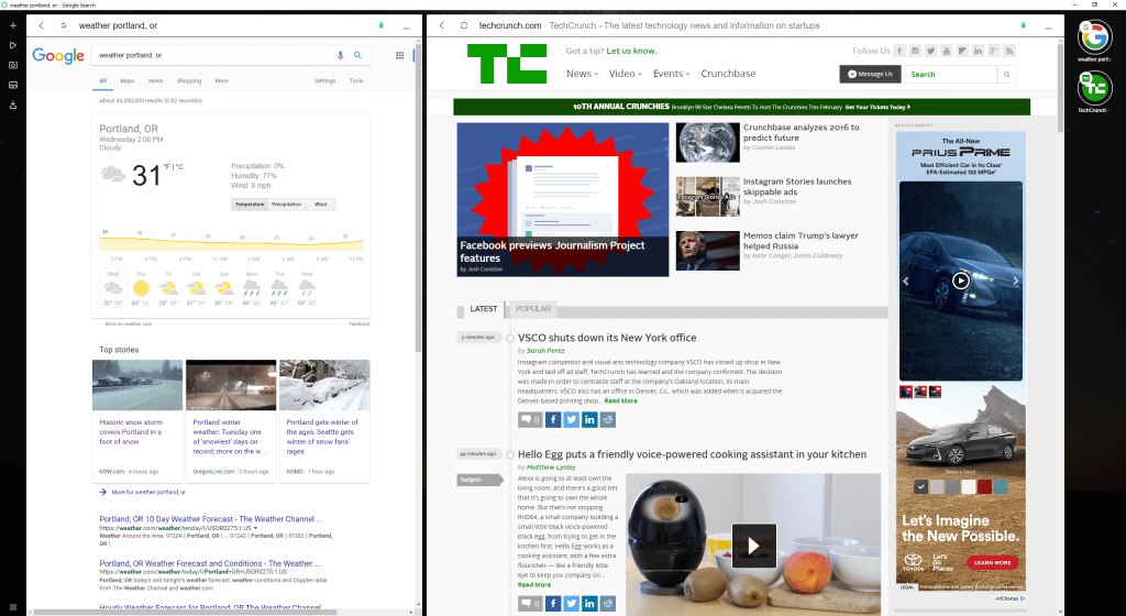
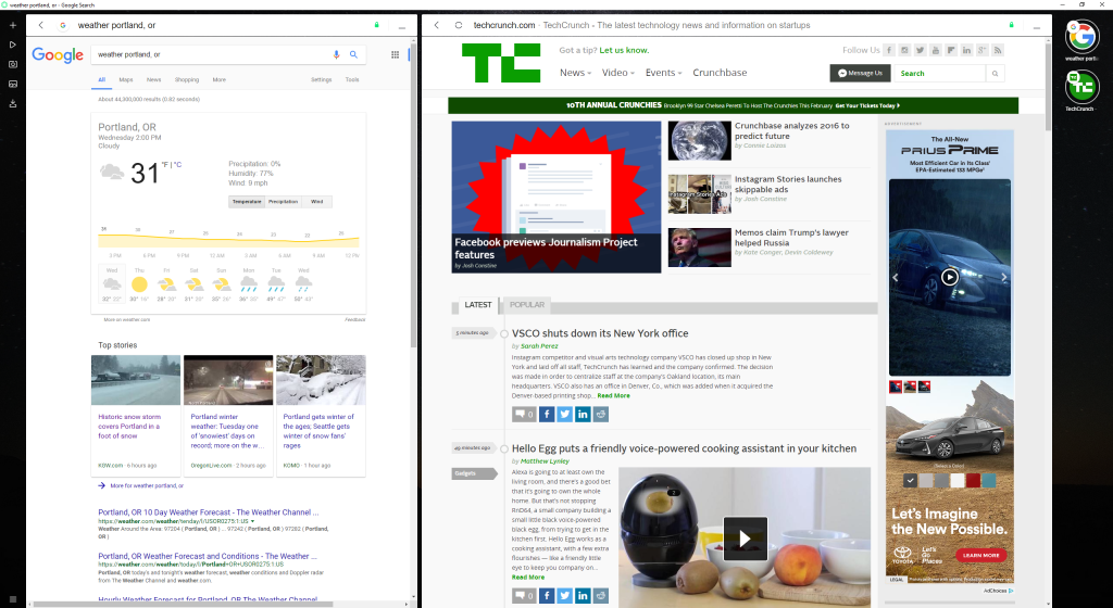
For those of you with very large and wide screens, Opera Neon also allows you to place two browser tabs side-by-side within the same window (similar to the split-screen view on iOS or Android).
I spent the last day or so playing with Opera Neon. I can’t quite see myself switching to it as my main browser at this point (especially because it doesn’t support any plugins yet), but it does feature its fair share of interesting concepts. I don’t mind the tabs on the side, for example, even though I never got used to the side-tab plugins for Chrome and Firefox (though I acknowledge that they do have their ardent fans). I’m also a big fan of Opera’s existing pop-out video feature which also makes an appearance in Neon. Just like the standard Opera desktop browser, Neon uses the Blink engine, so it feels fast, too.
I’m not sure I like Neon’s new tab page, though, which is also your bookmarks page. I’d rather have an easier way to get to my bookmarks than to open a new tab, for example. Now, you have to open a new tab (even if you don’t want to) and then open your bookmark in that new tab. If you heavily rely on your bookmarks (and especially your bookmarks bar), that doesn’t quite feel right and quickly leads to far more open tabs than necessary. I also like to organize my bookmarks into folders and that’s not currently an option in Opera Neon. To be fair, Neon isn’t billing itself as a concept for power users (if that’s what you’re looking for, check out Vivaldi, which was started by Opera’s former CEO).
Opera stresses that this is meant to be a “concept browser.” It won’t replace Opera’s existing browser. “However, some of its new features are expected to be added to Opera this spring,” the company notes in today’s announcement. 
(119)


TechCrunch