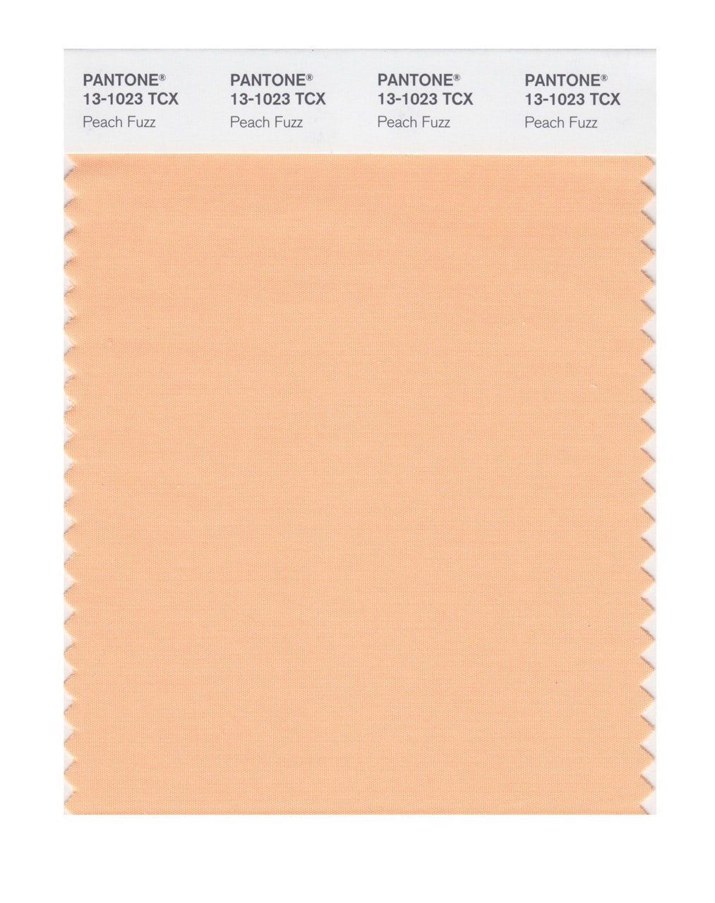
Pantone’s 2024 Color of the Year is everything 2023 was not
Peach Fuzz has been crowned Pantone’s Color of the Year for 2024. A soft, warm shade that is nestled between pink and orange, Peach Fuzz is meant to be peaceful and cozy. It evokes comfort, kindness, and tenderness.
It is everything 2023 hasn’t been—and that is almost the point.

“I think we can all look through these past years and be pretty clear that this has been a time of ongoing turmoil, and that our need for nurturing empathy and compassion has grown ever stronger,” says Laurie Pressman, VP of the Pantone Color Institute.
Peach Fuzz marks the 25th anniversary of the Pantone Color of the Year program, which launched in 1999 with the decidedly Zen “Cerulean” blue. As always, today’s announcement has unleashed a carousel of collaborations, from a Motorola phone in Peach Fuzz to limited-edition Ruggable rugs, doormats, and bath mats featuring peach tones. The Pantone team has also imagined a wide range of applications, from hair dyes and blushes to velvety jackets.

Now, arguably any pastel color could provide the calming effects of a soft peach, but there is more to the Color of the Year than arbitrary color therapy. Every year, Pantone spends more than six months scouring markets from fashion to cosmetics to home decor. This year, the team noticed peach tones popping up across the board, from J.Lo’s Oscars gown to snapshots from design guru Kelly Wearstler’s portfolio to lip gloss shades and fuzzy slippers. “You want to reach out and touch this color,” Pressman says. “That was a very important part of our message.”

As Pantone team members scour, they are looking for a common theme, as well as a mood that rises up above the others. In that sense, the Color of the Year is less a pigment prediction and more a reflection of the times—a mirror of people’s aspirations. “It’s things that we’re looking for that color can hope to answer,” Pressman says. “So it’s not ‘I’m angry, it’s going to be a red.’ It’s ‘I’m angry. What’s going to calm me down?’”
This year has served up enough reasons to be angry, and it is certainly naive to buy into the idea that a single color can capture the zeitgeist, or even brighten up the mood when it is this dark. But Pantone’s COTY 2024 is a clear reminder of the company’s mission as it was stated from the start: to remind people that color can convey a powerful message—or in this case, a cry for peace.
(20)


