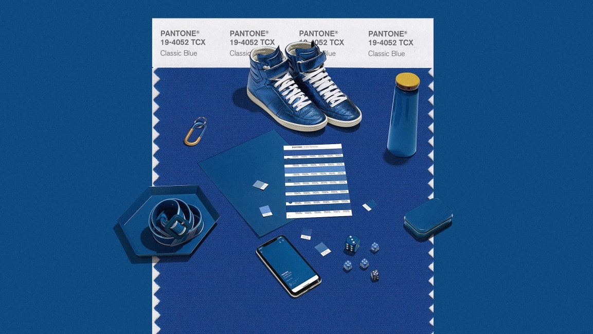
Pantone’s color of 2020 is the new black
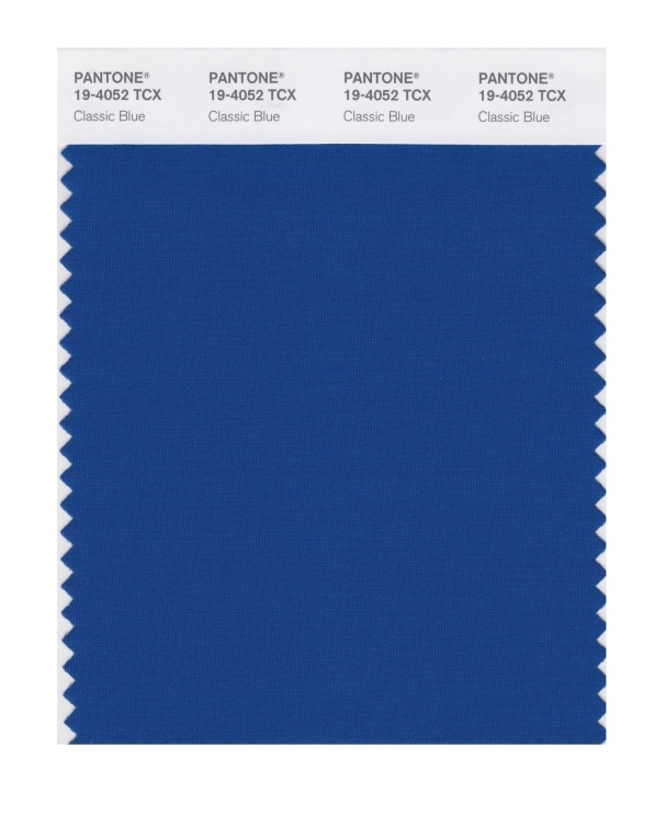
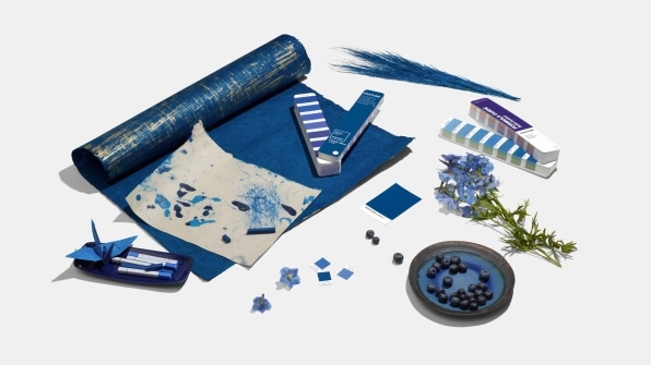
It’s the color of blue jeans, blueberries, and the sky at dusk. Pantone’s Color of the Year 2020 is Classic Blue. It’s what the color forecasters at Pantone have deemed to be a comforting, timeless color for a time of change.
“Many of us looked at 2020 as the future, but now we’re here,” says Laurie Pressman, VP at Pantone Color Institute. “Here” is an admittedly unstable place. Social media sucks our attention and breeds anxiety. We’re so connected, yet our relationships are suffering. Global politics is in great unrest as dictators make a comeback. The truth is being challenged by mass propaganda machines.
And amid all this, Pantone was faced with deciding which color best expressed the zeitgeist—a tradition now in its 20th year. “We landed back on the blue family, where we’ve been and where we are,” says Pressman. “Just not knowing where to go and who to trust…[blue is] the feeling of calm and reassurance that help us have that confidence to move forward.”
All of this psychology might sound familiar: Pantone’s 2019 Color of the Year, Living Coral, was “comforting and energizing at the same time, a color meant to serve as a salve in a time of global uncertainty,” as Co.Design reported last year. Classic Blue is in many ways a product of the same core observation.

[Photo: Pantone]
Classic Blue is the color of the sky at dusk, Pressman says, which is a strong visual symbol about fresh starts. Since it’s the sky, it’s also a color of blue everyone sees everywhere around the world—a universal color that transcends global cultures.
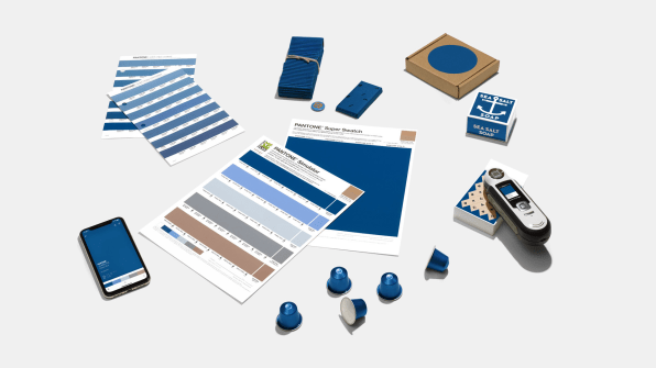
While Classic Blue is the color of 2020, it’s been bubbling up for a while now. Pressman walks me through slide after slide of examples in which Classic Blue has been poking around the design world already. She shows a dozen catwalk photos from fashion shows—and more than one design by Virgil Abloh—with garments that feature a deep blue. In fashion, it can serve as a baseline, much like black, off of which other more experimental colors can play. Classic Blue catches light in a way that seems to create contrast, which makes it superb at highlighting tactile materials, from felt to pleather (perfect timing, since texture is having a moment in fashion and interior design alike). And because it’s good old blue, pieces in this color shouldn’t go out of style soon, which is valuable to those of us who want to consume less, Pressman argues.
[Photo: Pantone]
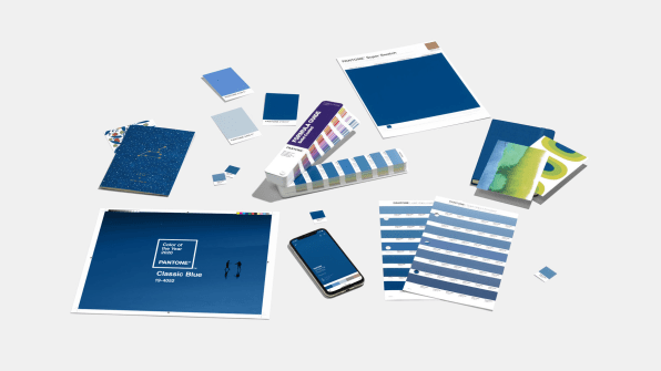
When it comes to interior design, Pressman walks me through how Classic Blue livens up the all-white kitchens that have otherwise dominated so much of the mid-aughts—but still in a relatively safe way, because who hates blue?
[Photo: Pantone]
Classic Blue also hints at a relationship to other popular blues. There’s Klein Blue, a more vibrant blue, invented by the artist Yves Klein in the 1960s and even inducted into the MoMA, that recirculates through design culture regularly (see: Kanye West’s 2019 Jesus Is King cover). Sherwin Williams’s 2020 Color of the Year is also a blue, dubbed Naval, evoking maritime rather than the sky. But both Naval and Classic Blue are meant to play on another big trend: wellness.
[Photo: Pantone]
For Pantone, picking the right shade of the moment is a showcase for its bigger business. The company profits from selling everything from swatches to the chemical formulas for its proprietary colors. Pantone also consults with various product companies across industries to keep their colors timely. With the Color of the Year, Pantone offers a free trend forecast to the wider world, in a play to lead the conversation about color and further cement its expertise.
Whether or not you agree with all of Pantone’s psychology and forecasting, there’s no doubt its 2020 Color of the Year is a safe choice, and that’s by design. “When I do my psychology presentation, I say, ‘Everyone wears jeans! We all relate to this color! It’s an approachable color,’” says Pressman. Indeed, it’s hard to argue with blue.
(18)


