People are hilariously bad at drawing famous logos from memory
BMW. Puma. Red Bull. Lego. These brands are so ubiquitous, there’s a good chance you see their logos every single week. But would you be able to draw them from memory?
Adler, a British company that specializes in corporate gifting, asked 100 people to draw famous logos. Each participant was given paper, some colored pens, and a list of 10 iconic logos to draw. The results were hilarious, offering a fascinating insight into how our brains store away images we see every single day. It turns out that these logos are embedded into consciousness, but they’re often a bit foggy.
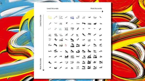
After the experiment, Adler collected the drawings and put them in a graph from least to most accurate. The company even listed common mistakes.
Animal-related logos were some of most fun to critique. Participants were particularly baffled by Red Bull, whose logo is admittedly fairly complex. It features two red bulls facing each other locked in combat, with a large yellow disc behind them. Many drawings revealed complete confusion. Several feature a single infernal-looking bull with wings flying into the sky. (Presumably inspired by the brand’s tagline, “Red Bull gives you wings.”) Another awesome one featured a single bull with intimidating horns with the words, “WTF Bro” on top. Indeed. I have the same question. Some did not feature bulls at all but other animals. There was an ant in the mix, along with another bug whose species I cannot decipher. In another, two cockroaches appear to be happily having lunch together.

There there’s Puma, whose logo, you’ll recall—or actually there’s a decent chance you don’t recall—is a puma leaping in midair from left to right over the word PUMA. In the hands of some of these consumers, the beautiful wildcat was turned into an adorable household kitty, a dinosaur, and a cat stick figure. (Though the problems with this last drawing might have more to do with the participant’s lack of drawing skills.)
Lacoste, which features a silhouette of a green crocodile with a red mouth over the word LACOSTE, also got butchered. In many, the animal was shrunk into a tiny lizard. In one case, I would argue the participant improved on the logo by creating a dragon-like creature directly facing the viewer.
Participants seemed to be better at accurately drawing simpler logos. Almost every single person got the Shell logo right and even used the right color palette. They also generally nailed Spotify, which is a green circle with three lines in the center of it. Most people got the Lego logo right, since it’s just the words Lego against a red backdrop. Only one person was confused about it and created, instead, a little Lego person, which frankly Lego should consider for a future rebranding.
What can we learn from this slightly absurd exercise? Well, Adler’s conclusion is that simple logos are better because they tend to stick in the consumer’s mind more accurately. But I have a different take. Complicated, visually interesting logos do tend to stick in consumers’ consciousness, thought sometimes not precisely. Still, this exercise shows that people tend to play with these logos in their imaginations, morphing them slightly but still generally keeping with the message of the brand. And the more a consumer dwells on the image, parsing its meaning, the more they think about the brand.
Either way, I hope Lacoste is inspired by the friendly looking dragon. That’s a winner.
(97)


