Pete Buttigieg debuts a radical new approach to campaign branding
On Sunday, Pete Buttigieg formally announced his candidacy in South Bend, Indiana, where he has served as mayor for eight years. Just a few months ago, few people had heard of Buttigieg and fewer still could pronounce it. (His campaign encourages people to pronounce it “Boot Edge Edge.”) But he caught many people’s attention at a CNN Town Hall in March, standing out in the crowded field of Democratic hopefuls as the youngest candidate at 37, who also happens to be openly gay, a vet who fought in Afghanistan, and a progressive who has won support in a conservative Rust Belt state. He’s since seen surge of interest over the past six weeks. A poll on Friday placed him third among voters in Iowa and New Hampshire, after Bernie Sanders and Joe Biden.
In addition to officially joining the presidential race, this announcement was an opportunity for Buttigieg to unveil his new campaign design and website, created by Brooklyn-based design firm Hyperakt. The new logo features a yellow backdrop with the word “PETE” in bold blue in the shape of a bridge. This bridge represents the 120-year-old Jefferson Boulevard Bridge in South Bend, which Buttigieg transformed into a modern icon by installing an interactive light sculpture underneath, illuminating the river at night. The Pete for America campaign makes the case that this bridge is a metaphor for Buttigieg himself, who is trying to serve as a connecting force between America’s past and future; the center of the country and the coasts; and conservatives and progressives.
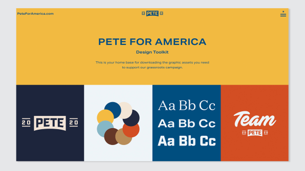
In an unprecedented move, the campaign has created an online design tool kit that will allow supporters to customize campaign logos and images using the campaign’s nine official colors, then download them in whatever size they like to use them on social media, yard signs, or however else they choose. “People will be able to use this however they want, other than selling it,” Deroy Peraza, principal and creative director of Hyperakt, told Fast Company exclusively. It saves them time, it gives them more assets to work with, and it gives them a clear sense of what the full color palette is. It just make it easier for people to rally around Pete.”
This isn’t the first design system to be used in a political campaign. Designer and developer Mina Markham created a pattern library, fondly dubbed the Pantsuit UI, for Hillary Clinton’s designers and front-end teams to develop consistent messaging throughout her 2016 presidential campaign. Hyperakt’s toolkit goes a step further, making Buttigieg’s graphic design assets available to the wider public.*

The Colors of Pete
Peraza is well-versed in the design language that surrounds political campaigns. Earlier this year, he wrote an article in Fast Company about how the female candidates vying for the Democratic nomination have introduced new colors–like purples and pinks–into their campaign imagery, which is very different from the vast majority of presidential candidates over the past 80 years whose campaigns have been saturated in the colors of the American flag. This story came to the attention of the Pete for America campaign, which is how Peraza and Hyperakt were brought on to design the campaign imagery.
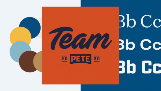
The campaign design is grounded in nine colors, spanning blues, browns, and golds. Each of these colors was pulled from Buttigieg’s life and are named to reflect this. One color is called Calm Blue, reflecting Buttigieg’s tendency to be soft-spoken and unflappable. Another is called Heartland Yellow. The orange is called Rust Belt. Buttigieg’s two dogs, Buddy and Truman, each have their own brown.

In an interactive mood board on the design tool kit website, you can see exactly how these colors came about: You can slide across various photographs from Buttigieg’s world, seeing how they are made up of the nine campaign colors. Some of the images are of Buttigieg at home with his husband, Chasten Buttigieg, while others are of scenes around South Bend, from the factories that have closed to the new tech center that Buttigieg helped build. There are pictures of Buttigieg’s favorite whiskey, Talisker, his shoes, and the watch that Chasten gave him as an engagement present.
In other words, rather than shaping the campaign’s colors around what might appeal to Buttigieg’s constituents, Peraza felt it was important to create the most authentic visual representation of Buttigieg himself. “Our position is just that when you’re branding a candidate, the most important thing is to reflect who that person is,” he says. “Lead with that story, rather than focusing on whatever sector or space they’re working within.”
Taken as a whole, the colors have a Midwestern flair, calling to mind corn fields and industrial buildings. The colors are also reminiscent of collegiate baseball paraphernalia from the 1950s and 1960s, which often featured browns, yellows, and blues. Peraza says it makes sense to evoke team sports in the campaign, since it might spur people to rally around Mayor Pete the way they might rally around their favorite team. It’s also true that sports tend to bring people of different political persuasions together. “If you go to the Midwest, sports are everywhere,” says Peraza. “There’s really great design in those meeting places where everybody, regardless of whether you’re blue-collar or white-collar gets together around a team. We wanted to infuse a little bit of that into this brand, because this is about rallying around a movement, around a campaign. We want you to root for this team.”
However, this imagery may read a bit masculine, particularly when there are many strong female candidates in the field who are embracing traditionally feminine colors. Kamala Harris has made purple a key color, and Kirsten Gillibrand has incorporated “pussy hat pink” into her campaign imagery. In interviews, Buttigieg is often asked to respond to Democratic voters who were disappointed that Hillary Clinton did not win in the last election, and are looking forward to ushering a woman into the Oval Office. When Ellen Degeneres asked Buttigieg the question on her talk show, he responded, “I also was disappointed that a woman wasn’t elected in 2016 . . . The next administration is going to have to make sure that the most senior levels has gender balance, especially if the next president turns out to be male.”
Peraza, for his part, doesn’t believe that colors are necessarily gendered in the first place. “I think having a gendered dichotomy and spectrum is something we’re trying to avoid,” he says. “We’re using the palette for authentic storytelling. If you look at that mood board, those are the colors that authentically surround him, and that authenticity is all we cared about.”
In Supporters’ Hands
Starting today, those who support Buttigieg now have access to all the campaign’s assets. On the design tool kit website, Hyperakt has laid out the main logos, including “Pete 2020,” “Team Pete,” and a funny graphic that simply says “Boot Edge Edge.” Supporters can play around with these logos by reconfiguring them in different colors, then downloading them in whatever size they like, including an Instagram icon, a desktop wallpaper, and a printable sign. Hyperakt also created specific Pete 2020 signs for each state, which supporters can download and use. These are very clearly inspired by sports imagery, and look a little like vintage pennants for sports teams. People are free to use and distribute the images within the tool kit, but they are not allowed to sell anything with assets to make money for themselves. This is similar to a creative commons noncommercial license.
This is the first time a campaign has made a design tool kit so easily available to supporters. In the past, supporters have been able to buy official merchandise and posters from the candidate’s website, and third parties try to capitalize on the popularity of a candidate by selling merchandise with their own graphics. (There are many Pete Buttigieg T-shirts currently available on Amazon that are not affiliated with the campaign.) What’s more, supporters often come up with their own images, then disseminate them. One of the most well-known examples of this was the Hope poster that the artist Shepard Fairey created featuring a stylized image of Barack Obama’s face. But most supporters don’t have the design skills or resources to create elaborate images or logos, so they use simple online tools to create their own signs or social media icons. And without a single visual language, supporters use a mishmash of colors, fonts, and graphics.
With this tool kit, it is possible that the grassroots support will have a more coherent visual look, with a consistent color scheme and set of fonts. But Peraza says the Pete for America campaign wasn’t particularly concerned about controlling the aesthetic of the campaign. This was much more about making it easy for supporters to download images if they wanted them. And after the tool kit launches, supporters will have an opportunity to provide feedback about what other resources they need. “People are pretty resourceful,” says Peraza. “We were seeing support groups out there creating their own imagery. If people are going through the trouble of doing that, we want to make it easier. As an organizer, it is helpful to have access to these graphics to download and print if you’re hosting a viewing party, for instance.”
And of course, these tools are bound to be leveraged by people who oppose Buttigieg as well. But Peraza points that negative imagery and merchandise will pop up for any political candidate. “People can take any image that is online and modify or replicate it,” Peraza says. “If somebody wants to use images in a negative way, they will find a way to do that regardless. So we feel the benefits outweigh the negatives.”
When Buttigieg launched his exploratory committee at the start of 2019, he seemed like a long-shot candidate and was widely seen as an underdog in the race. Now he’s a serious contender for the Democratic ticket, and he will need to scale up his organization quickly. A big part of this will be organizing grassroots support. Peraza hopes that the tool kit will help propel the campaign forward, giving the movement a recognizable look, one that supporters will be excited and proud to rally around. “We’re scrappy, but this is a high-performance organization, and there are high standards, and we’re paying attention to every detail,” Peraza says.
*After this story published, some readers reached out to comment on the work of Mina Markham, who developed an internal UI design system for Hillary Clinton’s presidential campaign, which Fast Company covered in 2016. We’ve updated our story to include more detail about that project.
Fast Company , Read Full Story
(35)


