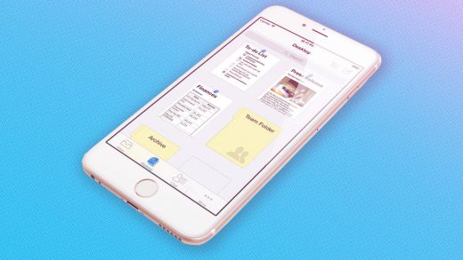
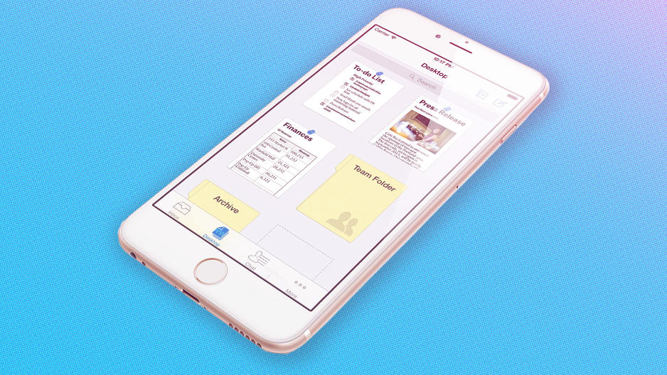
Quip Gets A Redesign To Focus On Project Management
Quip is moving further away from its roots as a word processor with its first major update since being acquired by Salesforce last year.
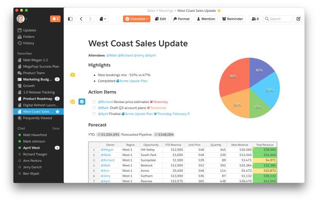
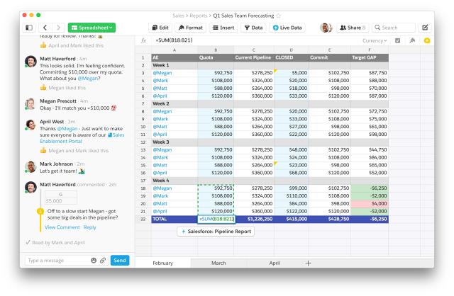
The modern document editor has a new design—it’s a bit less minimalist than the old Quip—and lets users sprinkle their documents with date reminders. Quip is also getting its first Salesforce product tie-in, with spreadsheets that automatically pull in fresh sales data.
CEO Bret Taylor says the changes reflect how organizations have adopted Quip as a project management tool. Instead of monolithic pages to be printed, Quip is best for creating collaborative, free-flowing documents that build up over time with checklists, spreadsheets, bullet points, and text.
“We don’t want a separate app for tasks, a separate app for spreadsheets, a separate app for documents,” Taylor says. “We want this one canvas where teams can lay out what they’re working on, and mix and match them all into one document.”
New Look For New Features
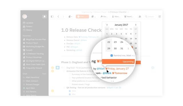
Quip’s new date reminders are an extension of the app’s project management focus. By typing a date or pressing the Reminder button, users can create a due date for themselves and anyone they mention with an “@” symbol on the same line. Those reminders can exist anywhere in the document, including within spreadsheet cells, next to checkboxes, and inside regular lines of text.
“You can start from a blank sheet of paper, and kind of gracefully escalate into this pretty robust task management system,” Taylor says.
The redesign, meanwhile, helps underscore Quip’s collaborative nature. Quip’s left sidebar now lets users switch between documents from anywhere in the app, and adds a shortcut of frequently viewed documents. And instead of hiding checkboxes, reminders, and other functions behind an easy-to-miss “Tools” button, Quip now lists those possible actions along the top of the screen.
Perhaps it’s an acknowledgement that Quip’s old design was too bare-bones, in that it hid essential functions for the sake of minimizing distraction. Taylor, however, points out that Quip’s toolbar is still contextually aware, showing different options depending on what you’ve tapped on or highlighted.
“You look at the legacy products like Microsoft Word, and they’ve got these toolbars with two thousand buttons at the top,” he says. “We really want our product to feel minimal and simple, but we wanted to do that in a way that doesn’t diminish the power underneath the hood.”
As for Salesforce integration, Quip will release a tool for Salesforce’s AppExchange store next week that synchronizes sales reports with Quip spreadsheets. That way, users who want to see how they’re doing in a particular quarter can crunch numbers within Quip and always have the latest data. Users can also link to those documents from the Salesforce dashboard.
Taylor says the feature arose from talking to mutual customers of Quip and Salesforce after the acquisition, and figuring out how they’d want to bring the two products together.
“At a very superficially high level, Salesforce is very structured. It’s essentially a database of all your customers and opportunities. And Quip is very unstructured. It’s the place people go to brainstorm and make decisions, and [customers] wanted to essentially connect those two worlds,” Taylor says.
Whiteboard In App Form
With all of these changes, Quip is becoming harder to recognize as the Microsoft Word alternative it seemed to be when the product first launched in 2013. But Taylor points out that if you look at Quip’s first blog post, the underlying philosophies of collaboration and interactivity have remained intact.
“We’ve always had things like checkboxes and comments and all these things that are not within a traditional document canvas, so I would say the idea that you add these interactive controls—it almost makes these things feel like an application as opposed to a document—has always been something that really excited us,” Taylor says.
Down the road, expect Quip to expand on the idea of being a digital whiteboard of sorts. Taylor notes that Instacart, one of Quip’s clients, still edits 60% of the documents it created a year ago, and when asked specifically about a possible free-form drawing tool, Taylor says it’s the type of thing he’d love to focus on.
“With Quip, you have one document for that team, and they’re just constantly writing, and erasing, and rewriting, just like that whiteboard in their open-office floor plan,” he says. “And so I think adding things like drawing to play into the fact that Quip is kind of this whiteboard for teams is something I could really imagine us doing in the future.”
Beyond that, Quip is looking to add more ways for users to express themselves within the app, and to improve the app’s communication features. And while the links to Salesforce will likely grow deeper as well, Taylor says Quip will remain available as a standalone product. If anything, Taylor sees Salesforce’s reach as a way to bring more people to Quip, instead of just the other way around.
“We both think it can make the Salesforce experience and the Salesforce platform more complete, but it’s also a great opportunity to expose a much wider range of mainstream companies to the Quip experience,” Taylor says. “And so I don’t really see this coming at the expense of our broader vision around changing the way people work together.”
Fast Company , Read Full Story
(19)

