Rick Rubin wants to build you a better internet
Anyone can build a website with AI. But can you build a website that was pre-built by a legendary music producer?
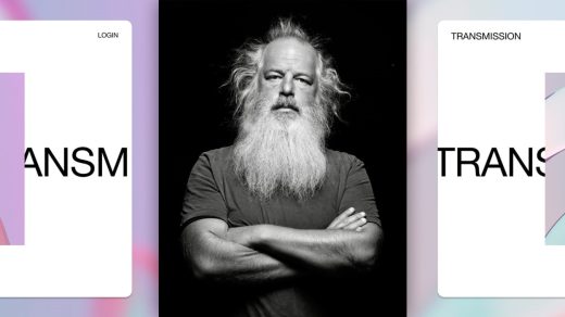
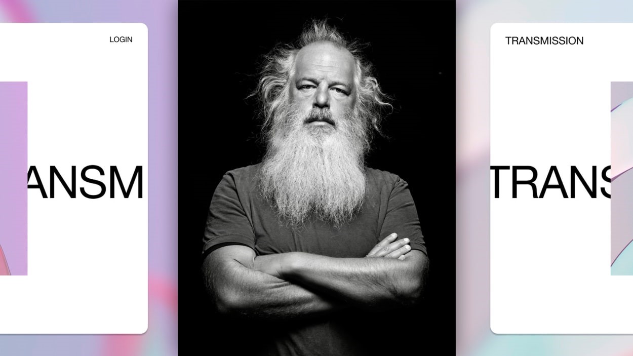
Rick Rubin—who has produced albums by LL Cool J, Public Enemy, and the Beastie Boys and who recently authored the celebrated book The Creative Act—has partnered with Squarespace to design an ultra-minimalist template that puts the content on a digital pedestal.
The collaboration is part of a project called Squarespace Icons, which won a 2023 Innovation by Design Award. The idea is as follows: top artists design a website for their own creative projects, then design a Squarespace template inspired by that website. What you get in this bargain is a website template that lets you build on the choices made by some of the world’s most creative people.
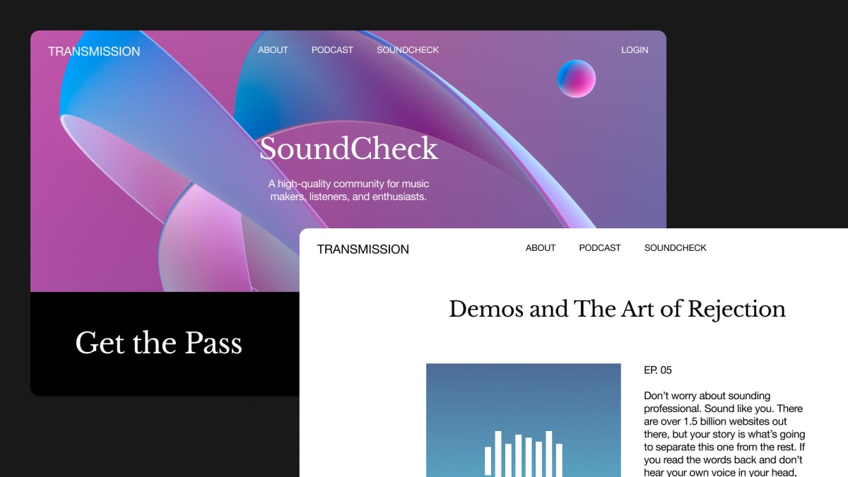
The first “icon” was the Icelandic icon Björk, who built an otherworldly, maximalist website for her album Fossora. The website, like its accompanying template Mycelium, is characterized by organic lines and overlapping images. According to Ben Hughes, Squarespace’s VP of creative, Mycelium became one of the most popular options in the company’s template store just a few weeks after launching.
Now, it’s Rubin’s turn to leave his mark on the internet—in a radically different way. Rubin’s website, like his podcast series, is called Tetragrammaton. As Rubin described it in an email to Fast Company, it is “a quiet website that gets out of the way,” or a “reaction to the general experience of the internet and how the internet feels today.” (Tetragrammaton hasn’t officially launched yet but anyone can access a prototype by signing up here.)
Tetragrammaton intends to act as an online repository for curated creative works. The entire site is designed to facilitate a sense of discovery, which Rubin says is “the key to everything.” You can read articles, poems or quotes, watch a random historic film (in my case, a documentary about Gaddafi), and look at artworks or photos. The Photos section is randomized, so each time you click on the page, you are presented with a random duo of photographs. “Every time you look at the Photos section of Tetragrammaton, you have a new experience,” says Rubin. “It’s engaging in the moment and creates a sense of scarcity since once you turn the page, you may never see it again.”
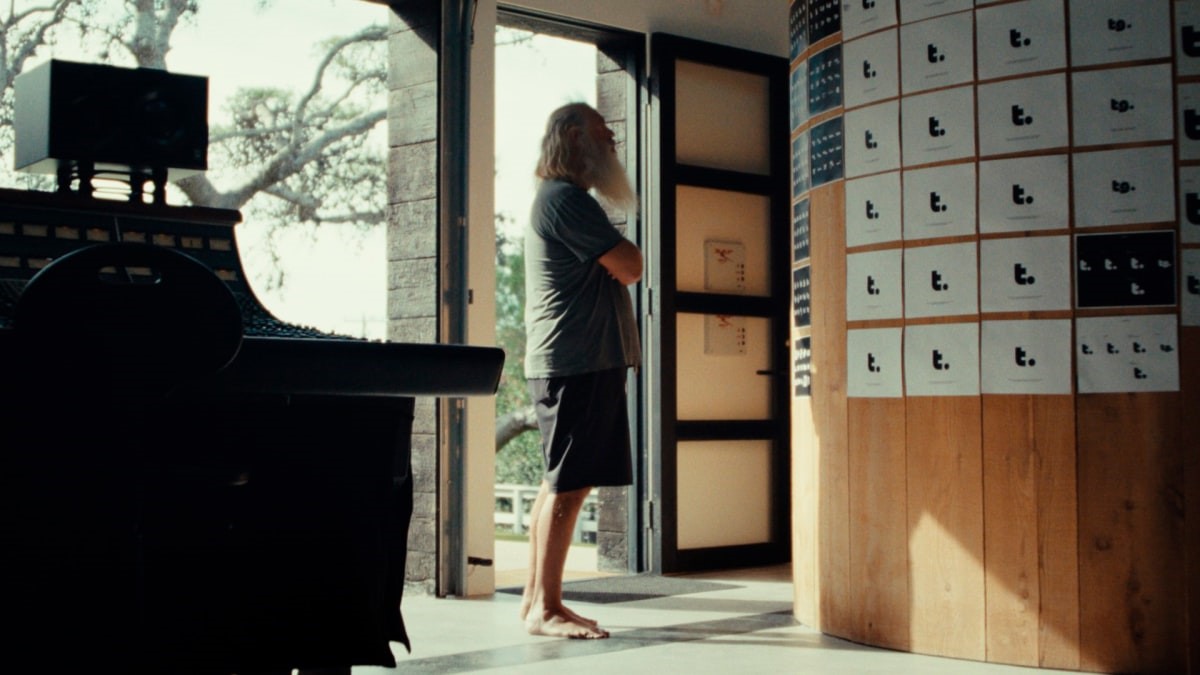
When designing the site (and the accompanying template), Rubin steered clear of many web design trends like the use of motion and pop-ups. Instead, he opted for a site with “a recessive nature,” he says. “It’s all about the content, unencumbered by decoration. A space to set the art free, where the viewer can commune with the works and contemplate them.”
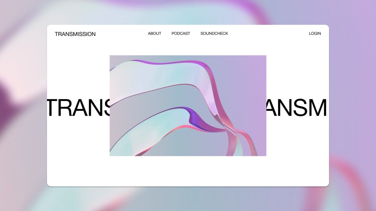
The Squarespace template, Transmission, works in similar ways. As Albert Chang, design lead at Squarespace, explains it, Transmission has a robust and scalable system of organizing, cataloging, and archiving.
The color palette skews heavily monochromatic, and the whitespace is pretty dominant, which is meant to let the content shine. Said content can be as varied as you’d like: You can add audio blocks, native video hosting (complete with mute, loop, speed, and other controls available), and even a member’s area for paying visitors to access exclusive content.
Both websites have similar vibes, too. Tetragrammaton’s landing page is a blank white space that Rubin likens to a “gallery wall” where a different piece of fine art is “hung” every day. There are no social media icons. No menu. No logo. The latter two only appear when you start moving the mouse around, and the social media icons simply don’t exist. “The platform never seeks your attention and hopefully, because of that, it earns your attention,” says Rubin.
Transmission’s landing page is a bit more practical (the logo and menu are visible by default), but it boasts the same uncluttered aesthetic. “The idea was to break from the accepted rules of how things are done,” says Rubin. “The template opens technical possibilities for more new experiences online.”
(23)

