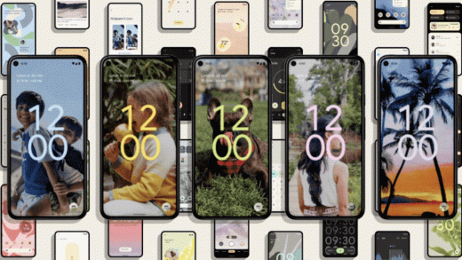
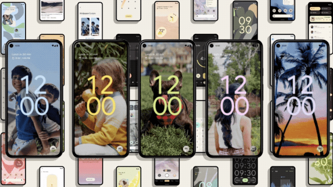
See Google’s expressive new design language, built by billions of users
It’s hard to remember now, but once upon a time, Google was terrible at design. Android was ugly. Google sites were ugly. And the company lacked a serious industrial design program. But in 2014, Google revealed a unified approach to design to help fix it all. Called Material Design, it reimagined all of Google’s apps with a new visual metaphor of digital paper and ink. Ugly pages were replaced by clear, clean cards. Supporting animations were simple and effective. Google got design, and shared this design language with any developer who wanted to adopt it.
The problem was that the language didn’t leave much room for expression and creativity. And nearly a decade later, Google VP of design Matias Duarte looks back at the language he helped create, and sees its shortcomings. “The material metaphor was maybe too good, and the paper has come to dominate our interfaces,” says Duarte. “They are consistent…but they’ve gotten a little stale, boring, too tied to a modernist same-ism that is spread everywhere.” That’s especially problematic today, as design is trending maximal and customizable while Google has perfected the stoic and functional.
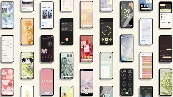
After toiling away with how to fix this issue for years, the company believes it has found the antidote. With the upcoming release of Android 12, Google will launch the evolution of Material Design dubbed Material You. You can try out Android 12 in beta starting today.
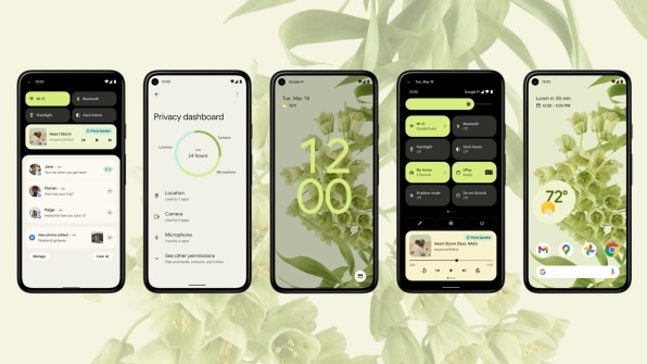
Material You preserves the generous white space and visual simplicity you’re used to with Material Design. But it’s filled with more dynamic animations, and it’s less reliant on a strict icon and interface grid. Most of all, the new Android will be easily customizable. (That’s the “You” part.) Think of Material You as a coded, Google design consultant. But the user is still the creative director.
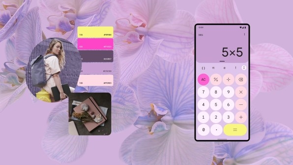
The system offers unprecedented control over the contrast, size, and line width of text and icons, so the interface can feel as airy or as high contrast as you want or need. Then when you set a wallpaper, software will automatically analyze its color, and offer you several custom color palettes that reskin your interface however you like.
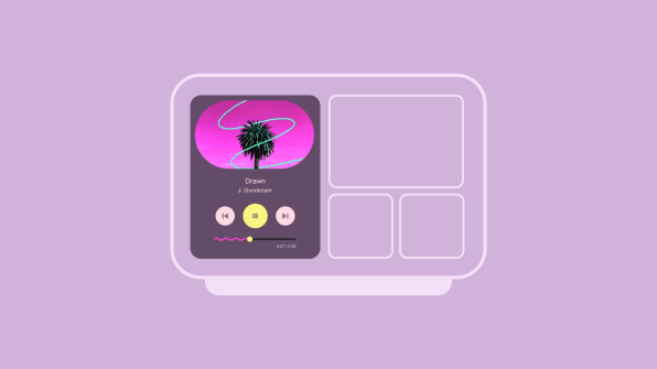
“The auto industry has moved beyond ‘you can have it in any color as long as it’s black,’” Duarte says. “We use our devices and apps throughout the day. They’re with us more intimately and in more places than our shoes, clothing, and glasses. So why are they all stuck in this backwards world, especially when computers are so good and powerful? We can really be designing personally for each individual. We think that’s what design and technology looks like in the future. And we’re hoping to start a conversation to move things in that direction.”
Sebastian Bauer, creative director on Android, has dubbed Material You the “humanist antidote” to Google’s prescriptive Material Design standards. And while Material You will launch on Android 12, it will work its way across the entire Google ecosystem of products over the coming year.
More complicated than it looks
Customizable operating systems are nothing new, of course. The original Macintosh let you choose from a collection of different wallpapers and fonts. Early versions of Windows let you hand-pick colors for every element of the UI.
The difference with Material You is that it offers more nuance. A foundational premise to Material You is that the interface feels alive. When you flick down a list of settings and reach the end, it’ll bounce a bit (not a new UI trick, but new for Google). Widgets move around with a satisfying inertia. Notifications appear as a group, but if you grab one with your thumb and move it, its curved corners will reshape ever so slightly in response. And when you do something like unlock your screen or plug in your phone, your entire screen shimmers.
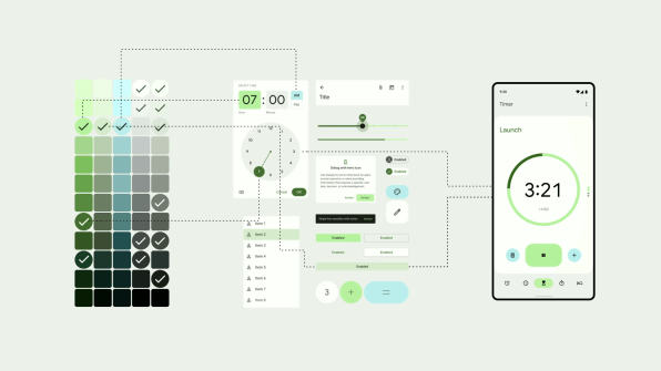
It’s a flexibility that Google has developed over time, having created a UI in which every element is not a static image asset, but is built upon easily tweakable parameters. “We’re no longer writing our design specifications as static documents, we’re encoding them,” Duarte says. This expression engine can update more and more parts of the interface, more dramatically, in real time.
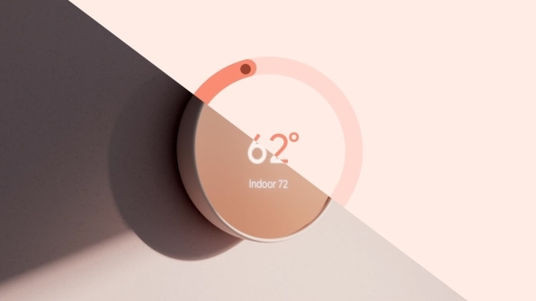
Duarte has big dreams for Material You. Imagine an interface in which every component is a true 3D object, affected by real light, and built upon parameters that can be instantly updated. As Duarte speaks, I picture this maximalist iPhone app that launched earlier this year. “We’re not there!” he says. “I’m trying to paint a picture of where this goes.”
A customizable skin, for expression or need
Part of the value proposition of Material You is also enabling a more accessible design system that accommodates everyone from the sight-impaired to the power user who wants to customize everything.
The buttons and fonts can be as bold or as airy as the individual user wants. “Everyone can get the full range of tweaking the science that’s perfect for them, even as the situation changes through the day,” says Duarte. “It’s not just someone with a special need who needs more contrast.. sometimes I’m out running and need it.”
That approach may be seen as placing a burden on the user, of course, but to lessen that, Google is surfacing customization options from the deep accessibility settings to a new “Wallpaper & Styles” section you can find with a long press on the launcher.
Nothing articulates the value of Material You more than the way it treats color palettes. While I’ve yet to try it myself, Google’s plan to build your entire phone’s color scheme from your wallpaper is a brilliant idea. That’s because, while almost no one changes the defaults of their software, Google says 60% of people update their wallpaper—and the images are often highly personal pictures of families and experiences.
By anchoring UI customization in the one customization choice most of us already make, Google is almost ensuring that our interfaces look different from one another. But that doesn’t mean users are on their own. Google’s software picks color palettes that not only look good; they have been shaped in coordination with Google’s own industrial design team, so that the interface doesn’t clash with Google hardware.
“It is a little bit terrifying…for Google designers themselves,” says Duarte. “It is terrifying that we’re going to have to share control of every pixel with our users! But we’re finding that leap of faith we’re taking is unlocking totally new positives.”
Fast Company , Read Full Story
(15)

