See how visits to retail, grocery, workplaces are trending by area with Google Mobility Reports
How to use Google (and Apple) mobility reports to see how movements have shifted during the pandemic.
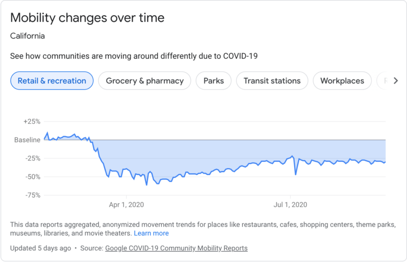
Google’s COVID-19 Community Mobility Reports show how visits and length of stay in various place categories have changed compared to a baseline period before the pandemic.
The reports, which are published on an ongoing basis, illustrate movement trends over time with respect to geography (including country, state and county) over a six-week period, with the most recent data representing approximately 2-3 days ago (the amount of time it takes to produce the reports).

Place categories. Community Mobility Reports present trends in the following place categories:
- Retail & recreation.
- Grocery & pharmacy.
- Parks (refers to official national parks, not the general outdoors found in rural areas).
- Transit stations.
- Workplaces.
- Residential.
The categories bundle together destinations with similar characteristics for the purpose of social distancing guidance. For example, grocery and pharmacy are grouped together because they tend to be essential trips.
Each category may contain many types of places and Google publishes trends for the above categories because they are useful for social distancing efforts and access to essential services.
What the baseline refers to. The baseline refers to the median day-value between January 3 and February 6, 2020. Essentially, it represents a “normal” value for that particular day of the week. Therefore, the baseline is actually seven distinct values (one for each day of the week).
The baseline days never change and also do not account for seasonality.
Google recommends that users calibrate for their region before analyzing the data by keeping the following questions in mind:
- Did anything significant happen [in your region] between January 3 and February 6, 2020?
- How do park visitors change from January to now?
- How much more time do you think people will spend in residential places?
- How might types of work affect the mobility changes on weekdays or weekends?
- How well is your region represented?
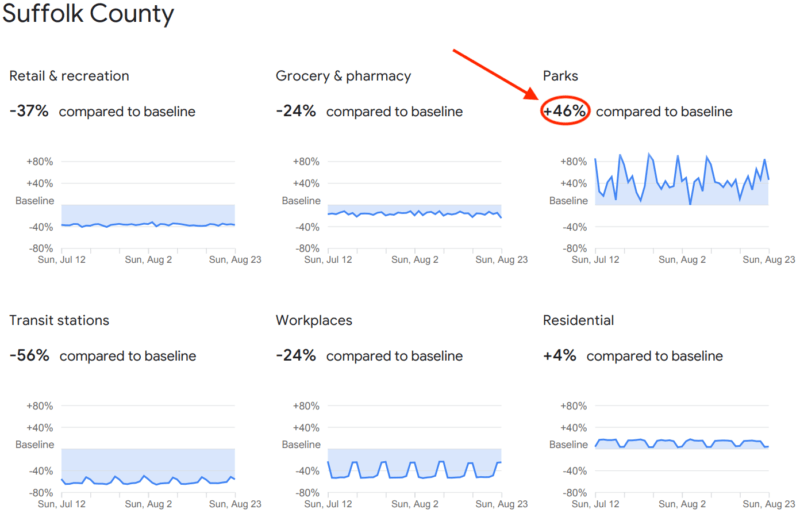
The considerations above can help you interpret the data more accurately. For example, the chart below shows that visits to parks are up 46% compared to the baseline; however, January in Suffolk County, Massachusetts, tends to be frigid, which may discourage many visitors.

The headline number (circled in red above) reflects the percent change for the report date, which appears at the top of the report.
What it doesn’t show. The reports illustrate relative change, not absolute visitors or duration of stay. As mentioned above, the trends are relative to the baseline period and do not show year-over-year trends.
Baselines are for their specific region-category, which should be kept in mind when comparing across regions. Gaps in trends lines are shown when Google did not have enough data to confidently and anonymously estimate the change from the baseline.
How data is collected. Trends insights are created with aggregated, anonymized sets of data from users who have opted into Location History in their Google accounts (which is disabled by default). “As with all samples, this may or may not represent the exact behavior of a wider population,” Google says in the “About this data” section of each report.
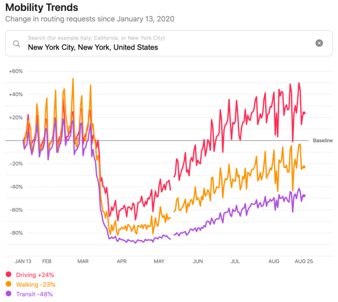
Apple’s got mobility trends, too. Apple also uses anonymized data to generate its own Mobility Trends Reports. However, Apple’s charts show driving, walking and transit trends, as opposed to breaking them down by place categories the way Google does.

Why we care. Mobility data may be useful for local businesses to gauge how potential customers in their area are responding to the ongoing pandemic and policies aimed at combating it. Community Mobility Reports data for the entire U.S. also provides businesses with a snapshot of how people are moving and responding nationwide.
Marketing Land – Internet Marketing News, Strategies & Tips
(35)


