See NYC’s bold new subway map, inspired by Massimo Vignelli’s 1972 classic
New York City’s subway system has a new map with a very old design concept.
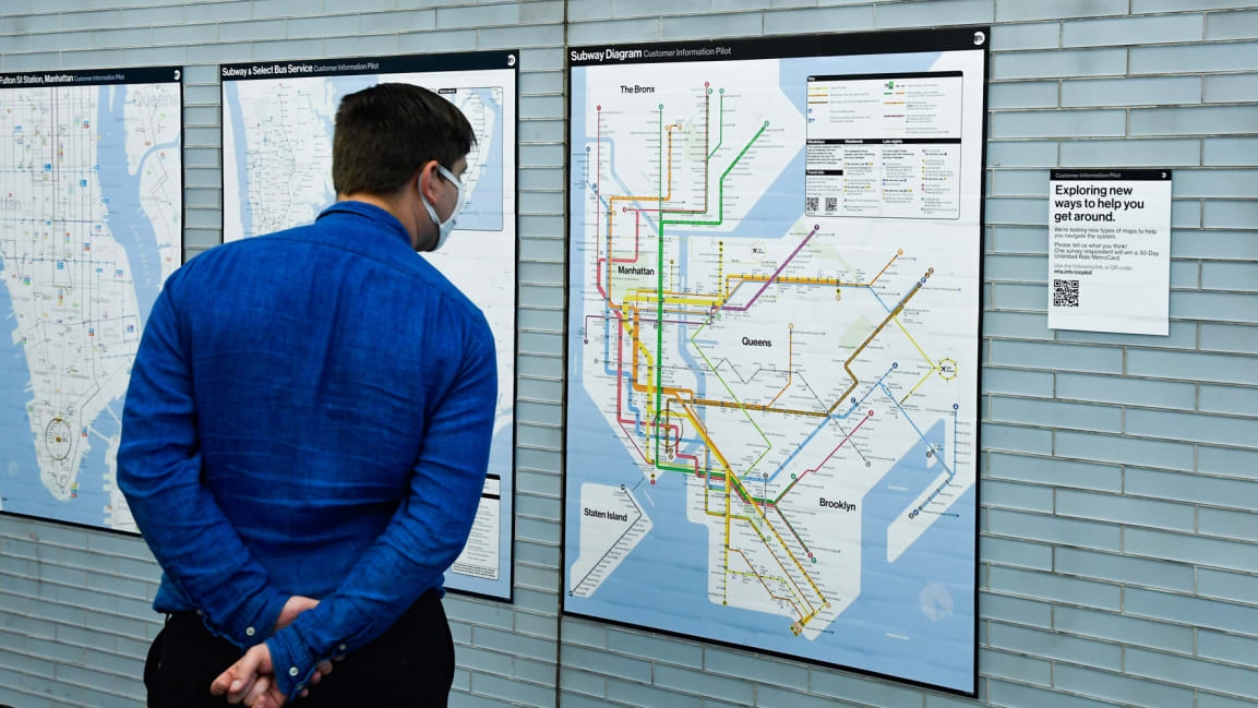
Rolling out in a handful of stations across the city, a pilot version of the Metropolitan Transportation Authority (MTA) subway map features an abstract version of the city, overlaid with bold lines marking each route. It’s an attempt to clarify where each line goes and how they connect at stations.
The printed map, now being tested on the walls of nine subway stations, is an updated version of a 1970s-era map that has become a classic example of informational design. The new map simplifies the shape of the city, and the precise location of subway lines, to give riders an easily comprehensible overview of the system, showing which lines connect and how to get across boroughs or into different neighborhoods.
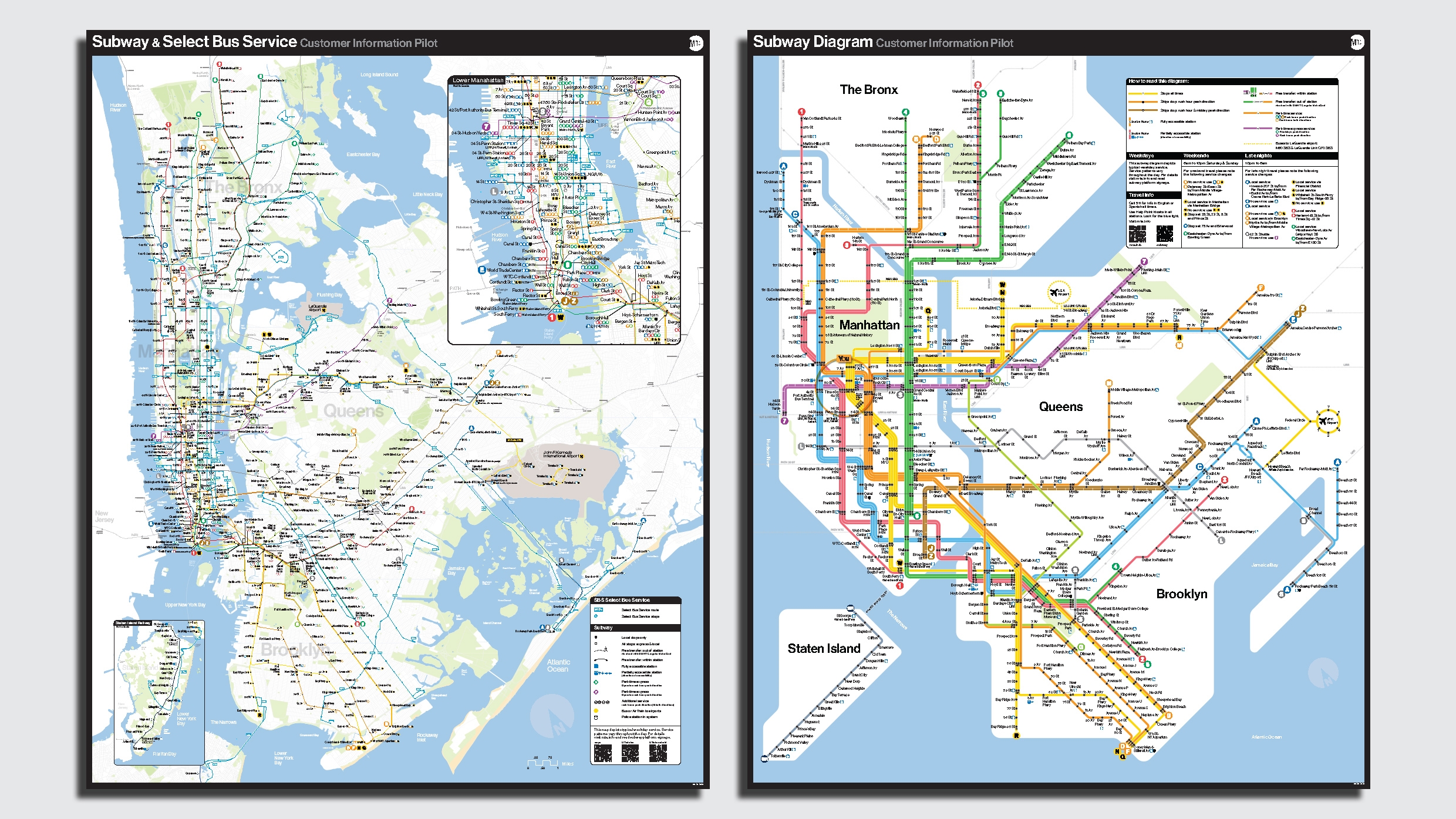
The new abstract maps are coupled with more geographically accurate maps of the city’s bus system, offering more detail on the exact location of services. MTA chief customer officer Sarah Meyer is leading the effort to redesign the system’s maps, and says the bus map offers “geographic relevance” to show how many blocks it will take to get from one place to another, while the abstract subway map provides a simple way to know where to change trains or how to get across town.
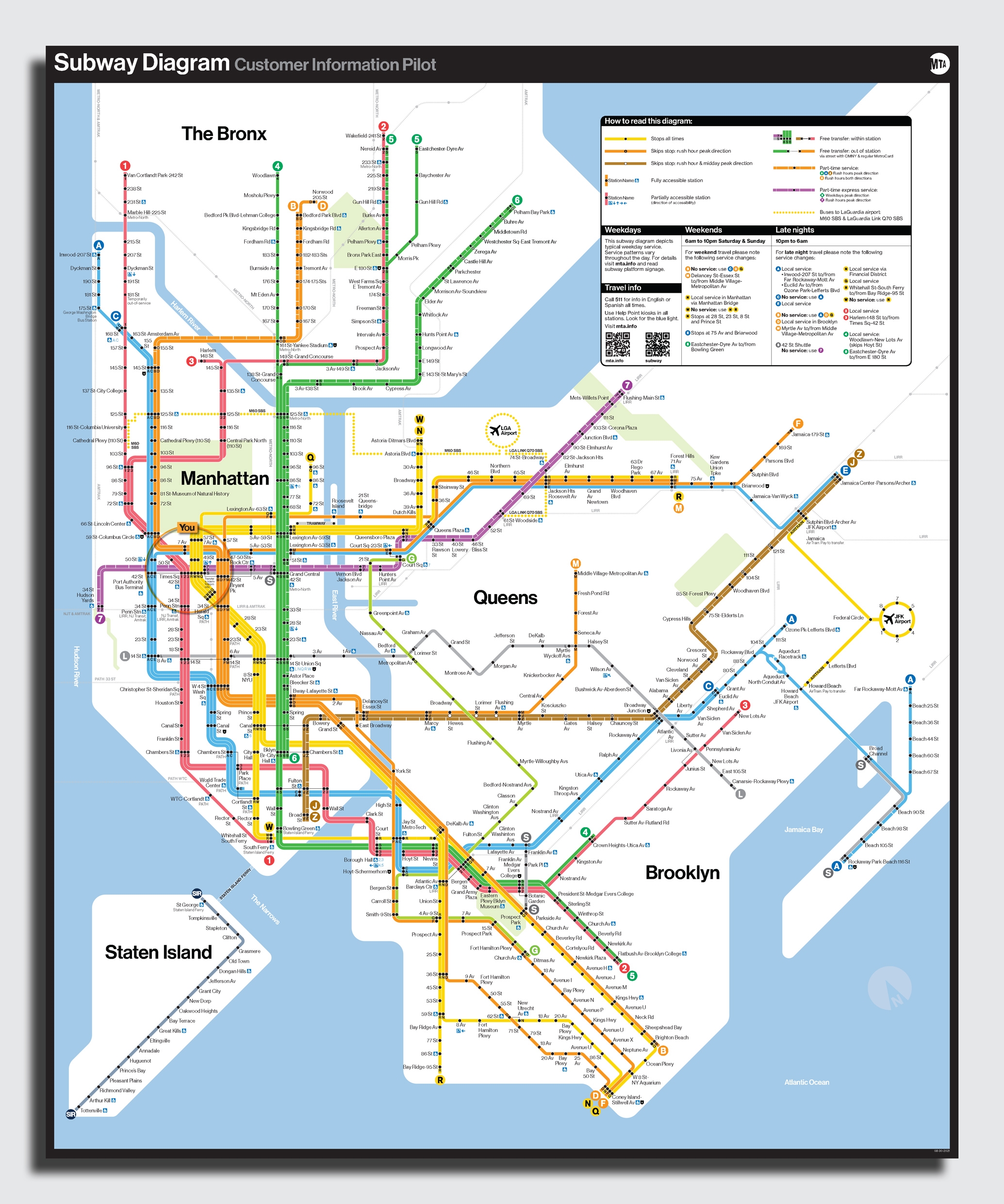
The new subway map is more than a little reminiscent of the iconic, if once controversial, subway map from 1972. Created by legendary designer Massimo Vignelli and his team at the New York office of Unimark International, the decidedly minimalist design didn’t take long to raise eyebrows, as the locations of subway lines on the map didn’t actually align with the reality. By 1978, a debate over the future of the stylized but technically inaccurate map was staged at the Cooper Union art school. As explored in a recent book from documentarian Gary Hustwit, Vignelli was pitted against the chair of the MTA Subway Map committee, John Tauranac, who had his own idea for a more geographically accurate map. Tauranac praised Vignelli’s version as aesthetically pleasing, but brushed it off as more art than information. “It’s made some lovely T-shirts for us at the MTA. But there is no relationship between the subway routes and the city above,” Tauranac said.
The next year, Vignelli’s map was replaced by one designed by Michael Hertz Associates, based on Tauranac’s concept. It features a more accurate representation of the city’s layout and distances between stations but simplifies some of the subway routes by combining multiple lines into a single trunk. Nonetheless, it’s been the MTA’s subway map for more than 40 years.
A few years ago, the MTA began reconsidering the wisdom of the Hertz design in the digital age. In 2020, Meyer worked with the interactive agency Work & Co to develop a digital version of the subway map that riders could use to plan journeys and see when service changes might affect their routes. Before, service updates and changes were mostly communicated on paper inside stations.
“I’m personally directionally challenged and really rely on maps,” Meyer says. “The disconnect from having our customers use two different visual forms to try to understand where service is felt wrong to me.”
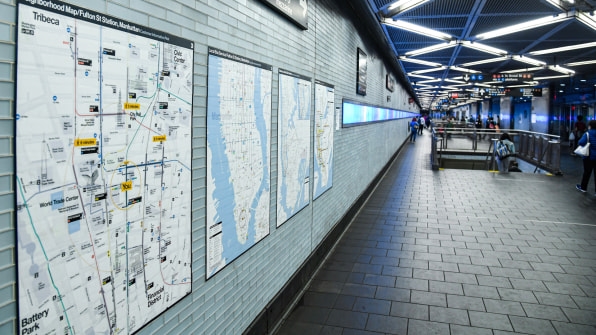
One of Fast Company’s 2021 Innovation By Design award winners, the digital map streamlines all this information—including real-time arrivals—into an app and map with one visual language. The new printed maps being tested in subway stations were developed in parallel and are the static version of the app. They’re intended to be used in combination with one another, with riders able to plan origin-to-destination trips on the app and use the printed maps in stations to grasp routes within the system at a glance. In conjunction with the geographically accurate bus map, they provide two levels of detail.
“The two together is a very powerful way to understand the geography of the system, where you need to go and how long it’s likely to take you to get here,” says J.P. Chan, senior director of creative at the MTA. “You have the best of both worlds.”
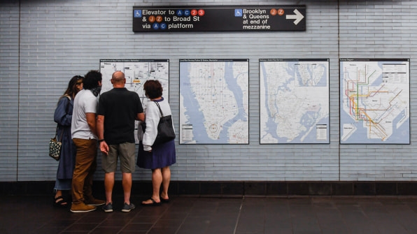
They’re also intended to be used alongside maps that riders likely already have in their pockets. Unlike the past, when the physical map in the subway station was the primary way riders could plan their journeys, riders today have more options, including smartphone map apps, in-station digital displays, and printed maps. Riders can view one or more map depending on how much information they need, instead of relying on a single map to convey the entire system. “That’s a big burden to ask of a large poster in a station,” Chan says.
Though the new subway map may be seen as vindication for fans of Vignelli’s version, Meyer says the redesign is not about choosing sides, but about getting people information efficiently. “We’re putting up what’s relevant for 2021 riders and the tools that they have.” (Besides, Vignelli’s map is part of the collection of the Museum of Modern Art in New York.)
The maps installed in the nine subway stations also include a QR code linking to a webpage that riders can use to provide feedback on the designs. Chan says the MTA has received hundreds of responses so far, and the maps will continue to evolve ahead of a system-wide rollout. A final version of the new map is likely months away, Meyer says. “But not that many months.”
(43)


