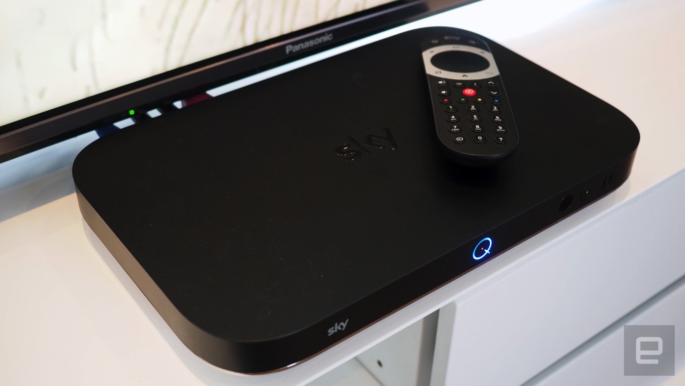
It’s more than a decade old, but Sky+HD remains one of the leading set-top boxes available to subscribers in the UK. YouView, TiVo and others all have their merits, but in terms of longevity, speed and ease of use, Sky’s had it all sewn up for years. But while internet-connected boxes like Now TV are Sky’s future, it needed a new piece of subscriber gear to get it through the next decade. The result is Sky Q, a family of devices that ensure you’ll never think about cancelling Sky and going to Netflix ever again. But here’s the gag: after years of development and a glitzy launch, Sky Q is a TV box that actively discourages you from watching TV. No, that’s a good thing.
Ecosystem
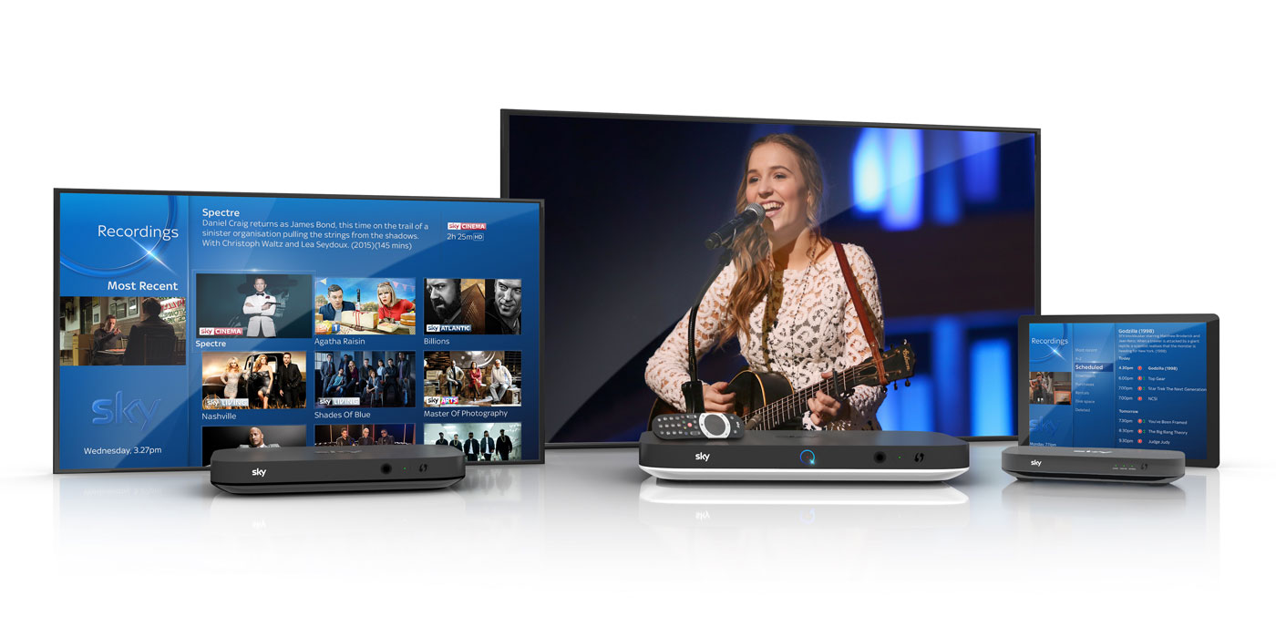
Sky Q isn’t a single set-top box, but a collection of products that, together, form an ecosystem of gear with gratingly similar names. Replacing the Sky+HD box under your TV is the Sky Q, which comes in either Black or Silver models. Silver is the premium option, offering 4K support (and channels), a 2TB HDD, five tuners and the ability to stream content to up to two mobile devices at once. The Black, meanwhile, tops out at 1080p, comes with 1TB storage, four tuners and streaming to just one mobile device.
If you previously wanted to watch Sky in more than one room of your home, you’d need a second set-top box wired directly to the same dish as the primary box. Q ditches this archaic system in favour of the Sky Q Mini, which piggybacks on the main Q box to stream live channels or recorded shows to a second TV. You can buy up to four Mini boxes with your subscription (first free, £99 each thereafter) if you’ve added the £12 per month multiscreen bundle, but be aware that you can only sustain two of them at a time, or just one if you have the Black box. You’ll also need the multiscreen add-on to stream to mobile devices using the Sky Q app.
Rounding out the lineup is the Q Hub, a revamped wireless router that’ll sit next to your phone line. This is only available to Sky Broadband customers, and choosing one gets you vastly improved WiFi performance. That’s because all of the Sky Q-branded devices in your home will form a mesh network that should banish any black spots without the use of additional boosters. Although, privately, Sky will supply extra boosters if your home is somehow incapable of sustaining a blanket WiFi network. Unfortunately, your humble reviewer lives in a Virgin area, and the Hub was unavailable for review.
Hardware
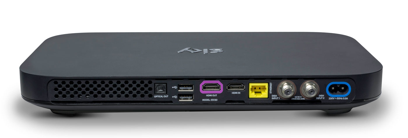
Do you remember how massive the original PlayStation 3 looked, and how tiny the PlayStation 4 was by comparison? The Sky Q boxes are similarly eeny-weeny, to the point where it’s almost shocking to see them side-by-side with the older model. The hardware measures just 330 x 210 x 43mm, down from the 364 x 255 x 73mm of the Sky+HD. In order not to break the sleek, elegant lines of the front, the viewing card slot is now hidden on the right-hand side. Up front, you’ll find a WPS button, the Q logo (which, when pressed, will cause your remote to bleep to make itself known) and an IR sensor. Round back, you’ll find the usual coterie of ports, including power, HDMI (x2), USB (x2), Ethernet, two dish connectors and an optical audio-out.
The Mini, meanwhile, measures in at 232 x 155 x 35mm and looks like a version of the main Q that’s been shrunk in the wash. Round back you’ll find slots for Ethernet, HDMI, 3.5mm audio-out, optical out and USB. If there’s one negative thing I could say about the Q Mini, is that I expected it to be smaller. Sky is an investor in Roku and the latest Now TV box (with a Freeview tuner) is a lot more diminutive than its wider and thicker cousin.
Remote
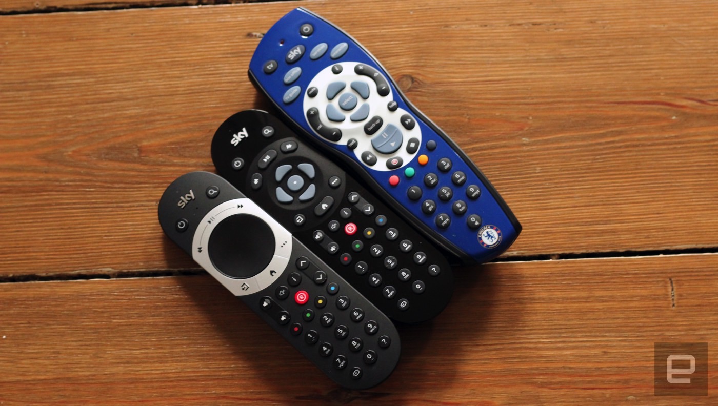
Here’s the bad news: your existing Sky remotes (even the branded ones) will not work with Sky Q. Except for the Sky Accessible remote, that is, which is designed for people with reduced dexterity and/or poor vision. For the rest of us, the company actually makes two controllers for the new gear: the futuristic Touch Remote, and a more traditional button remote that comes with the Mini.
For the purposes of this review, Sky let me borrow both a Touch Remote and a spare Mini remote that was paired with the Silver. This has turned out to be a Very Good Thing, because the former handset, for all of its bells and whistles, is going to be very divisive. Even Sky employees, off the record, have admitted that they struggle to use the newer handset and sometimes find themselves reaching for the simpler alternative.
The top third of the Touch Remote is dominated by a black, circular clickpad that you’ll use to gently scroll through the Q’s vast menus. The clicks are satisfying and the swipes have a real weight to them, and the further you pull south, the faster you scroll. That’s fine, and it’s really the only way to get around the significantly more dense UI that Sky Q is offering.
The issue comes with the capacitive playback controls that are housed in a half-ring above the clickpad. The bar offers a Play/Pause button and two arcs that end in a Rewind or Fast Forward command. Rather than a hard press, a dainty tap is all you need to get things moving, and you can actually slide across the arc to dictate the speed of play. Those with long memories will be reminded of the jog dial wheel that you’d find on super-expensive VHS players, updated for the 21st century.
Written down, it sounds fantastic, and futuristic, but in reality there are problems with how subtle the remote requires you to be. Linger too long, or press too heavy on the buttons, and you’ll find yourself picking the wrong option. Or you’ll press play, and follow through and put it back on pause again because the sensitivity is far too high. I’ve also had the remote on the sofa beside me, and my upper thigh brushing the controls is enough to jerk the picture into a frenzy of rewinding.
The Mini remote ditches the clickpad and capacitive controls for hard buttons, and I’ve asked plenty of visitors to try the both on for size. While I find the Touch Remote to be problematic, others have struggled to use it altogether, and express a liking for the simpler, nicer Mini remote. It’s less elegant for pawing through all of the Q’s menus, but it’s certainly easier to use in general.
I’ve always had a soft spot for the Sky+HD remote, with its easy-to-memorise control scheme and clear separation of sections. The Q remotes are a challenge to that muscle memory, not to mention that the “Back Up” button, an easy way to dismiss menus and overlays, is now a thing of the past. Instead, you have the “Home” button (which takes you to the Q Menu) and “Exit,” which lets you walk backwards one step, like a browser’s back button.
The other button below the clickpad is the apps menu, which lets you access apps for Sky News, Sky Sports News, Photos, Weather and Sky Help. I’m not sure that the menu deserves such a prominent button placement, especially given the limited utility of those features. It’s my hope that, down the line, Sky will let you add and remove other apps to the panel at your whim. For instance, it makes perfect sense to add YouTube to that list, given that’s where so many videos people look for are now housed.
Another annoyance is the loss of a dedicated subtitles button, great for when you need to translate a mumbled line of dialogue in a TV show. Previously, you could simply rewind a moment, hit subtitles and finally understand what the actors are saying when they move away from the microphone. Now, you have to come out of the show you’re watching, dive into the overall settings menu, find the accessibility panel and activate subtitles for all programs, forever. Suffice to say, it’s too involved to bother with, so I just live a life of ignorance.
Update: Turns out you can activate subtitles from the remote if you click the ? button to take you to the help menu. There you can toggle on or off the Audio Description or Subtitles options within three clicks.
Software

Shortly after the launch of Sky Q, BSkyB allegedly received a complaint from the BBC saying that Sky was deliberately burying public service channels. I can see why the BBC would feel this way, and there may be some legitimacy to its complaint, but the whole point of Sky Q is to bury all TV channels. Enter the home screen and you’ll be first presented with the Top Picks section rather than the channel menu. Hit the silver Sky logo at the top of the remote, and you’ll be dropped straight into your recordings.
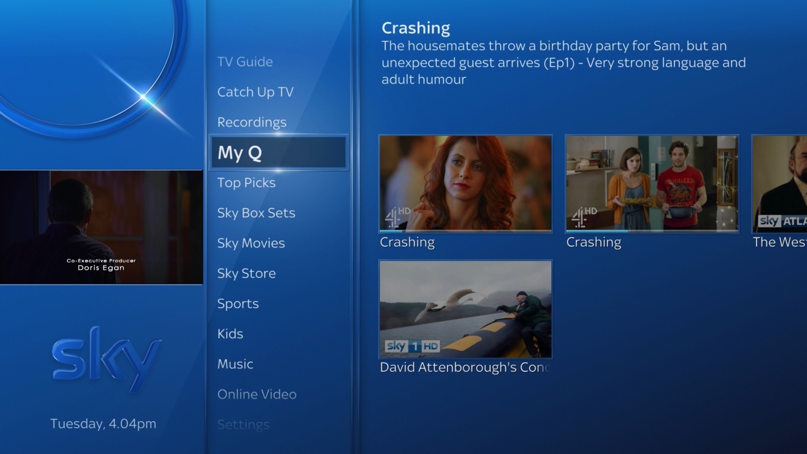
It’s here that Q really earns its keep, simply by using My Q and Top Picks as a way of serving up content straight to your eyeballs. The latter is curated by flesh-and-blood humans at Sky HQ, while the My Q menu looks at what you’ve already watched and will make suggestions based on that. Every time I’m bored and begin to think about channel flipping, I never have to bother, because some new tidbit is being offered to me. If there’s one complaint, it’s that the content is skewed towards commercial stations and Sky’s own output. For instance, I’m currently being offered shows from the likes of ITV, Channel 4, Sky Atlantic, Nickelodeon and Disney XD. Part of that, I hope, is because it’s not yet learned that, as an adult, I’m not Nickelodeon’s typical audience.
There’s also an on-demand layer which will give you access to the catch-up TV platforms from all the main channels, including BBC iPlayer. But, while I’m not going to assume malice here, it does seem strange that BBC shows aren’t seen inside any of the curated pages. Unless there’s some technical or legal boundary that’s preventing proper integration, it’s enough to propel a half-decent conspiracy theory.
Sky’s previous channel menu was already vastly superior to pretty much everything else on the market. As such, the firm has taken the “if it ain’t broke” approach to the Q’s navigation menu, which has had a minor polish. The video preview has been moved from the top right corner to the left rail, leaving more vertical room for the channel list itself. It also uses smaller, clearer fonts that allow Sky to fit several more entries on the screen without scrolling.
Whoever’s in charge of channel ordering at Sky really does need to have a long think about user experience. It’s 2016, and I’d wager that HD is dominant enough now to end the days when HD channels are ghettoized in the channel order. It’s insane to think that channels 101 and 103 — BBC One and ITV One — are broadcast in SD. Their high definition counterparts, meanwhile, languish as channels 115 and 178. Clearly, there are contractual, technical and legal wrangles that probably prevent this being changed on Sky’s part, although I wish there weren’t. Perhaps the company should offer a setting that lets us re-order the list to end such a user-hostile move.
What has changed, and for the better, is the in-channel selection, for those moments when you don’t wanna stop watching your current show but are curious what’s about. Pressing up or down lets you sift through the channels in chronological order, but brilliantly, each one now comes with a video preview of what’s going on. I foresee this being a great way to avoid commercial breaks during your favorite shows, by switching to something else and using the preview as a second screen.
There are plenty of neat little touches, like being able to download a HD film in full if you catch it part-way through on a Sky Cinema channel. Similarly, hitting record on a show now presumes you want a series link, rather than just to catch that one individual instalment. Similarly, watching the first episode of a TV series on-demand will prompt the Q to download the second, ensuring you can bingewatch as if you were engrossed in your favourite Netflix show. Pushing shows to your tablet is relatively easy, although it’s an annoyance that the Sky Q app can’t be used on smartphones as well. After all, I do most of my remote TV watching on my 5.5-inch smartphone rather than on a 9.7-inch tablet.
Pricing
Sky Q, with all of its whizzes and bangs, now occupies the rarified space on top of the firm’s product line. But, as much as +HD is now the norm, Q is already getting cheap enough that people will begin to upgrade as a matter of course.
A Black Q (aka the 1TB box) will currently cost you £32 a month, but that doesn’t include any other channel bundles such as HD, box sets, movie or sport packs, and you can’t use the multiscreen feature either (an extra £12 per month). Silver (aka the 2TB box) is no costlier, but the one-off setup cost jumps from £49 to £99.
To give you an example of a fully featured package, a 2TB box with all the HD, movie, sports channels and multiscreen (with a free Mini thrown in) costs £86 per month with a £10 setup fee. Depending on what options you select, though, this or that will be discounted, like the £10 one-off charge (as opposed to £49 or £99) if multiscreen is included in your package. The pricing structure is an absolute mess right now. The fact 4K channels are included with the most basic of Silver subscriptions, yet you have to pay extra for HD channels, is a testament to that.
I know plenty of people for whom a Sky subscription with all the trimmings is a sacred part of the family budget. A sum like that, however, may be on the fringes of many people’s purchasing power — though a £74 per month Sky+HD subscription is equivalent to an £86 Sky Q package, albeit without the Q’s fancy value-added features. If you can afford it and you want the best, then go knock yourself out. If you can’t, then I wouldn’t suggest worrying over it, as I’m sure patience will ensure you’ll get cheaper access to it soon enough.
Wrap-up
I like watching TV, and my home setup can access Virgin Media, Netflix and Amazon Prime, which I have on almost constantly. Since I’ve been testing Sky Q, I can count the amount of times I’ve felt compelled to open Netflix and Amazon Prime on a single hand. And most of those were to watch the latest episodes of (AMC’s new Amazon Prime exclusive) Preacher. I already had access to a compelling list of movies and TV shows, and Sky’s content library isn’t so much better that I’m being swayed unnecessarily.
In fact, it’s more that the Q hardware is very specifically designed to serve up fresh, relevant stuff that I’ve not yet come across. Every time I go back to the home screen, it’s pulled up some new treat to dangle in front of my eyes, knowing that I’ll bite. Aside from watching the coverage of the European Championships, I’ve barely scrolled through the TV guide at all. Why would I need to? After all, why spend hours looking for something to watch when my set-top box can do the work for me?
This is the killer feature of Sky Q, and the hardware’s bells and whistles are secondary to simple editorial and algorithmic curation. By keeping you constantly hooked on a drip feed of stuff that the box thinks you’ll like, you very quickly forget all about the chore of scrolling through channels. With Sky Q, on-demand video really is king.
(64)

