By Marcin Wichary
We all know the story of the Thumb Wars of the 2000s: the skirmish between BlackBerry, iPhone, and Android over the control of the newest and most exciting way of typing on devices small enough to fit in a pocket.
But there was another, lesser known battle centered around using thumbs for typing. It happened 15 years earlier, on much larger keyboards, and through the twists of fate it happened to involve a few people with big egos who came out of Apple Computer, Inc.
When NeXT, Steve Jobs’s “fuck you” company after he was ousted by Apple in 1985, released its first computer, no one talked about the keyboard.
People focused on the stark cubic enclosure made out of magnesium, on the monitor capable of displaying a full one million pixels, on the unprecedented entire megabyte of memory, on the optical drive, and on the shocking sticker price of $8,000. Even the quirky-looking mouse driving a new graphical operating system got some attention. Not the keyboard, though.
But the keyboard did deserve some praise.
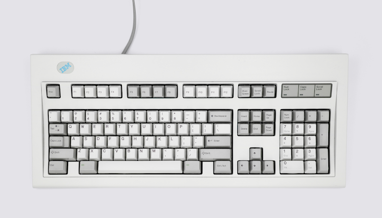
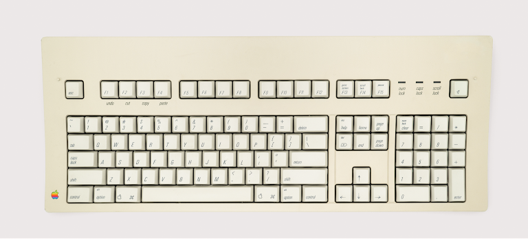
This was 1990, just a few years after Apple lost its keyboard way by releasing a model called the Apple Extended which was basically a photocopy of IBM’s Model M. Okay, the Extended wasn’t as clicky and it seemed slightly more modern. But it had the same intense layout, the same twelve function keys, even the same PC-friendly labels like Num Lock, Scroll Lock, and Print Screen. This was the very keyboard that started the “is this called Option or Alt?” confusion, the same one that threw in the towel and added Ctrl despite Command already being there, and the same one that had two different keys with two different functions labeled the same way: Delete.
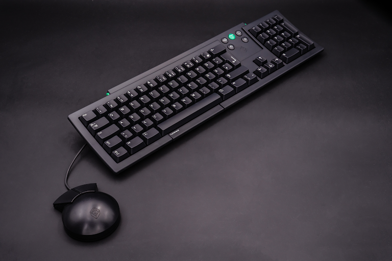
NeXT designers went a different way. Their keyboard was so elegant it wouldn’t feel out of place on a mechanical keyboard enthusiast’s desk today. Its color scheme predicted the disappearance of beige as computing‘s default color long before it actually happened. It was also perhaps the first mainstream keyboard to have brightness and volume controls. On the other hand, function keys, belonging to the old world of unpleasant text terminals, were nowhere to be found.
What replaced function keys were many small human details. The teal Command keys were color coded with common functions such as undo, copy, and paste. The keys to access different characters were labeled with a gentle “Alternate.” And that annoying vestige of typewriting, Caps Lock, was gone, available only as “Alpha Lock”—a combination of pressing Command and Shift, coming with two matching lights on either side of the keyboard.
And the next version of the NeXT keyboard made things even more interesting. To be fair, Caps Lock was back, although it was at least tucked in a corner. The spacebar was surrounded with two Help keys, meant to make using the computer even easier. But it was below the spacebar where the keyboard took its biggest swing—by adding another bar labeled Command.
The spacebar always had it easy. Sure, it has been the most hardworking key on the keyboard at its inception, and remains so even today—whenever you press the spacebar, close to a million people in the world do it at the same moment.
But the rest of spacebar’s life has been one of luxury. On typewriters, the key has always had so much less to do, as it advanced the mechanism without having to output anything. On computers, it required special plastics and stabilizers. On either, it occupied much more room than other keys – and whenever computers tried to renege on that (cough, cough, ZX Spectrum), people were up in… well, maybe not arms, but at least fingers. Speaking of which, the spacebar has always been the only key on the keyboard designed to accommodate two fingers, rather than one.
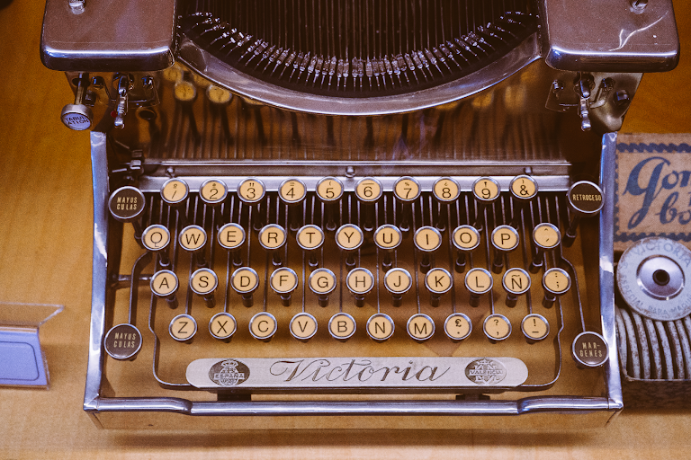
Or, at least, it had been so in theory. In practice, ten-finger touch typing has always busied only nine digits, as most people pressed the spacebar with their right thumb, leaving the left thumb doing nothing at all, or—after the home computers came around—occasionally pressing a modifier key.
Hence the brilliant idea of the designers who created the NeXT keyboard: What if we gave thumbs more to do? The Command bar they put under the spacebar did exactly the same thing then as the Command key does on a Mac, or what Ctrl does on Windows—you would press Command+C to copy, or Command+Z to undo, and so on—but it worked wherever either of your thumbs happened to be. It aspired to be easier to use than the traditional one or two modifier keys flanking the spacebar. It felt smart then, and feels even more so today, where Command keys are used so much more when driving every computer.
A cat, not a mouse
When Canon released Canon Cat, Jef Raskin’s “fuck you” computer after Macintosh, everybody talked about the keyboard.
Raskin joined Apple in 1978 and quickly rose through the ranks of the company. It was Raskin who proposed the “computer for the person in the street” that was eventually named Macintosh. But Raskin and Jobs both had oversized egos and both clashed at Apple. Eventually, years into the project, Raskin got fed up with Jobs and quit, saw the Macintosh released from the outside, and then witnessed Jobs being kicked out of Apple in 1985.
But Raskin was still invested in bringing his version of the Macintosh to the market, and he did under the auspices of the office tech company Canon. This was in 1987, and Canon Cat was distinct from both the homely (and underpowered) Macintosh and the ultra-capable (but overpriced) eventual NeXT machine. Both the Mac and NeXT bet on a combination of the keyboard and the mouse. But the Cat remained keyboard-driven.
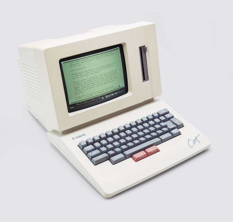
However, this wasn’t the keyboard of old typewriters. It was fascinating, a hybrid of the world of yore—complete with a key for ½ and ¼ fractions, and keys to set margins—and a completely new universe where computers tried to do something very new. In the upper right corner was a key for Undo. There was no Caps Lock, or Alpha Lock—there was just Lock. The key to issue commands wasn’t called Ctrl or Command. It was named simply Use Front, referring to the labels at the fronts of their keys.
But the most interesting part of the Canon’s Cat otherwise small keyboard were the two stark red keys located just under the spacebar. They were both called Leap.
Renaming Ctrl to Use Front or Caps Lock to Lock was perhaps window dressing. But these two distinctive red Leap keys betrayed huge aspirations. The Cat was a rare computer that looked at the century of typing and said: what if rather than slapping a display on top of a typewriter, we actually use the power of the microprocessor hiding inside to do something much smarter?
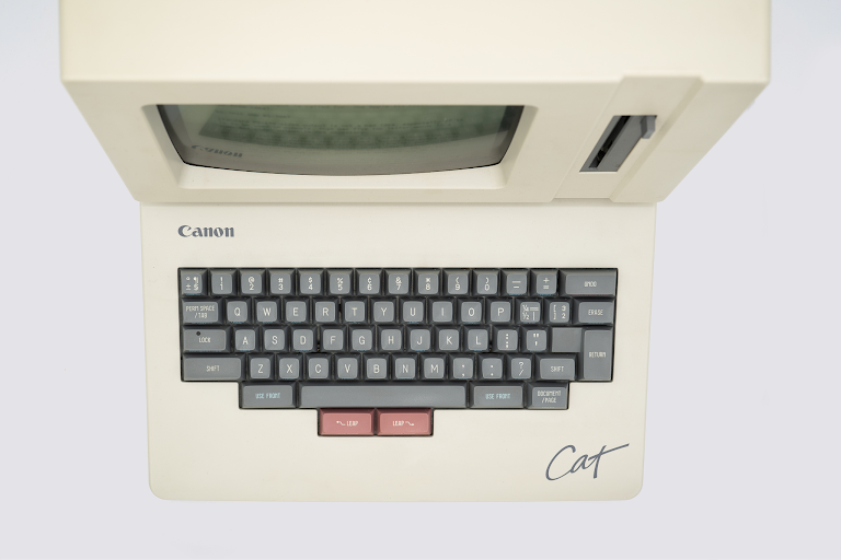
The Cat’s software envisioned your entire document as an endless piece of text, and the Leap keys were there to find your way in that document. Operating them was simple: You held the right Leap with your thumb, typed a word, and your cursor would jump to the next instance of that word. Or you could do the same, but use the left Leap—and you’d jump to the previous instance.
That was it. It might have seemed just like a slightly more streamlined version of Ctrl+F, but the devil was in the beautiful details. First of all, there was no mouse to move your hand to, or a visual interface to slow you down. And putting leaping under users’ thumbs allowed the function to act less like a Caps Lock and more like a Shift. Once you mastered it, it allowed you to search much, much more fluidly than any interface before it. You were not limited to text, either. You could add markers—there was a separate key for this—to allow you to quickly leap to a heading, a document title, and so on, using the same set of gestures. You could use Leap keys for selection and as arrow keys. And leaping again was as simple as pressing one of the Use Front keys and one of the Leap keys.
In 1987, arrow keys had only started making themselves comfortable on other computers. The Cat’s Leap keys already felt their much more evolved version, allowing for interactions typewriters never made possible—and putting them under your thumbs.
At various moments in time, both the NeXT machine and the Cat computer were called “the spiritual heirs to the Macintosh.” Unfortunately, none of their grand keyboard ideas—a Command modifier key under the thumb, or searching via Leap keys—got a chance to shine.
The Command bar wasn’t as pleasant to use as the other keys. It was squeaky, sharp under your thumbs, and easy to press by accident whenever you got your mouse close to the keyboard. Soon, the NeXT machines ceased to exist anyway, with the company refocusing solely on software. And not long after that, Apple took over NeXT and then NeXT took over Apple. A few of the keyboard ideas from NeXT resurfaced on Mac keyboards. The Command bar was not one of them.
At various moments in time, both the NeXT machine and the Cat computer were called ‘the spiritual heirs to the Macintosh.’
The Cat fared even worse. Its Leap-based interface was immediately recognized as fascinating and promising, although not without its quirks. (As an example, the machine’s preview in Byte magazine noted “Aborting a Leap operation is as easy as adding a few nonsense characters to the search string; the Cat won’t be able to find it, and you’ll be back where you started. Raskin suggests slapping your hand lightly in the center of the keyboard, an action likely to produce the required gibberish,” without acknowledging how strange that idea was.)
The review was right in recognizing that the Cat would “surprise anyone who thought that interface design was a dying art.” Except there weren’t enough people willing to be surprised. The Cat sold poorly, and its first edition ended up its last one.
Both machines inspired people: the first web server and web browsers were written on the NeXT machine, and Raskin’s Cat (and particularly his later book about building it) influenced many designers. But the computers suffered a shared fate. They presented an interesting, unique vision—it just wasn’t particularly clear whom that vision was for. NeXT was too expensive for an educational machine, and the Cat too confusing for a cheap office electronic typewriter.
Okay, so NeXT and the Cat failed, but that shouldn’t prevent their thumb key experiments from being resurrected by more successful future machines, right? Unfortunately, one unrelated development rendered that dream impossible.
Apple’s Macintosh Portable landed exactly in between the Cat and NeXT computers, and with a similar-sounding thud. As a Mac, it needed a pointing device, but portable computers mean uneven surfaces, which mice were not able to traverse. And so, the Portable opted for a trackball, and put it to the right of the keyboard—or left if you were so inclined. So, not long after that, did various trackball attachments for early Windows laptops. But those all made the portable computers simply too wide.
The Portable’s sequel was the PowerBook, released in 1991. Its designers reshuffled the setup, pushing the keyboard toward the screen, and the trackball underneath it. This was a far better approach. Moving the thumb or fingers from the spacebar to the trackball took little effort, and the space around the trackball served as a nice wrist rest.
This wasn’t the only reason that PowerBook sales took off, but it didn’t hurt. A few more years, and the trackball would get replaced by an even nicer-to-use trackpad. This combination and orientation felt so natural that it quickly rendered every other approach awkward. In time, everyone followed this trend, and still do so today. Even the most popular second choice—the IBM ThinkPad’s red rubber pointer tucked in between G and H—succumbed to the power of the trackpad underneath the spacebar.
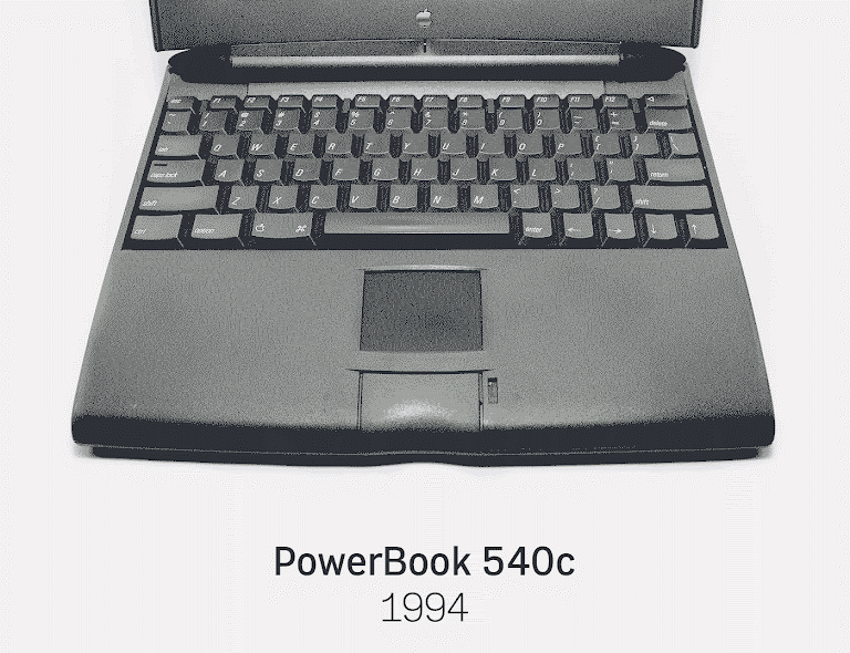
Within a decade, trackpads started supporting multi-touch gestures, and no two years passed without them getting slightly bigger and bigger. It wasn’t long before they occupied the entire area between the spacebar and the edge of the computer, rendering any dream of any new sub-spacebar keys or bars impossible. Command and Leap had their chance, and they blew it. No one else would be given a try.
Made in Japan
Except, there was one more idea.
One of the challenges in writing about the history of typing is that keyboards, and QWERTY, are incredibly American-centric. Even “international” layouts like QWERTZ or AZERTY were just small modifications of QWERTY that came from the mothership: Remington Typewriter’s offices in Ilion, New York, infamously designed by a person who wasn’t even a linguist. The vast majority of interesting local layouts – the Turkish F, the Chinese typewriter, the original Thai keyboard – eventually lost to QWERTY, too.
But it’s important to look at keyboards elsewhere, because once in a while you can find something truly wonderful. And for thumbs, that place is Japan.
The Japanese have perhaps the world’s most complicated writing system: thousands of kanji characters, two alphabet-like systems called hiragana and katakana, and—the extra penalty for most writing systems in the modern hyperconnected age—the need to make room for Latin characters.
Before the arrival of microprocessors, any input system meant to accommodate thousands of characters almost always included some version of “a lot of keys married with a lot of Shifts.” This combination didn’t allow for touch typing, but it was better than nothing.
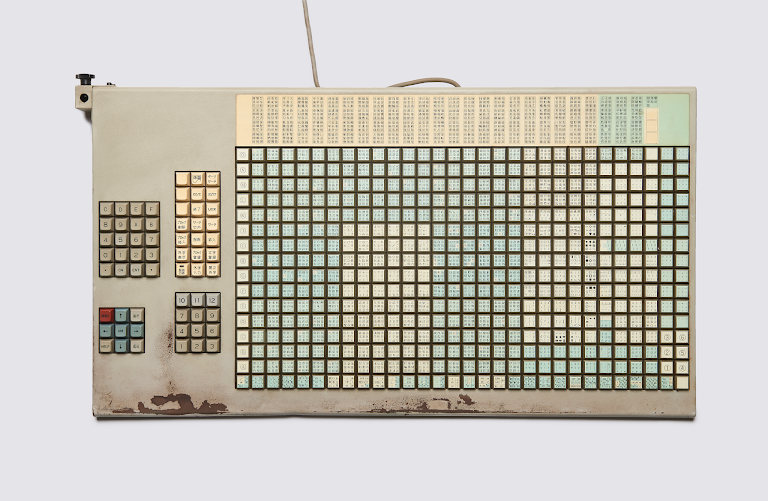
The arrival of computers allowed for more smarts to be inserted in between the act of typing and what was output on the screen. In the same way keyboards today can autocomplete, autocorrect, and even predict what you write, Japanese engineers in the 1970s started figuring out a system to describe kanji using hiragana, and automatically convert it at the end of typing. This wasn’t too far from writing out the emoji you want to use with a word (like “heart” or “hotel”) and then tapping to turn it into a graphic— as a matter of fact, the Japanese computers were where we learned early lessons about assistive typing that in later decades spread throughout the rest of the keyboarding world.
But even looking at hiragana alone, there are more characters than would fit on the keyboard. For the engineers at Japanese computer giant Fujitsu, the answer was simple: two shift keys, located where the spacebar normally is, with a few extra thumb keys underneath to initiate or prevent conversion between different parts of the Japanese writing system. The spacebar—used much more sparingly in Japanese—could be shoved to the side.
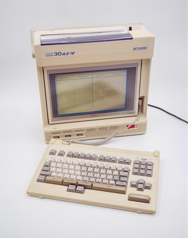
This was already interesting, but it wasn’t everything. These weren’t just regular shifts, with their push Shift/push key/release Shift mechanic once necessary when typewriting and then inherited wholesale by later devices. Just like NeXT was perhaps the first mass-market keyboard to turn a modifier key into a modifier bar, and the Canon Cat the first to truly reinvent the mechanic of fingertip searching, the Thumb Shift keyboard from Fujitsu questioned the very nature of shifting.
Its creators proposed this: you can use our thumb shifts the way you normally shift, but we’ll going to give you an even more powerful way. You don’t have to hold the Shift key any more. You can press any of the two shifts at the same moment you are pressing the letter with your other finger. And you don’t have to be very precise, either. If you do this with a small delay, or even out of sequence, the magic of our software will fix things for you.
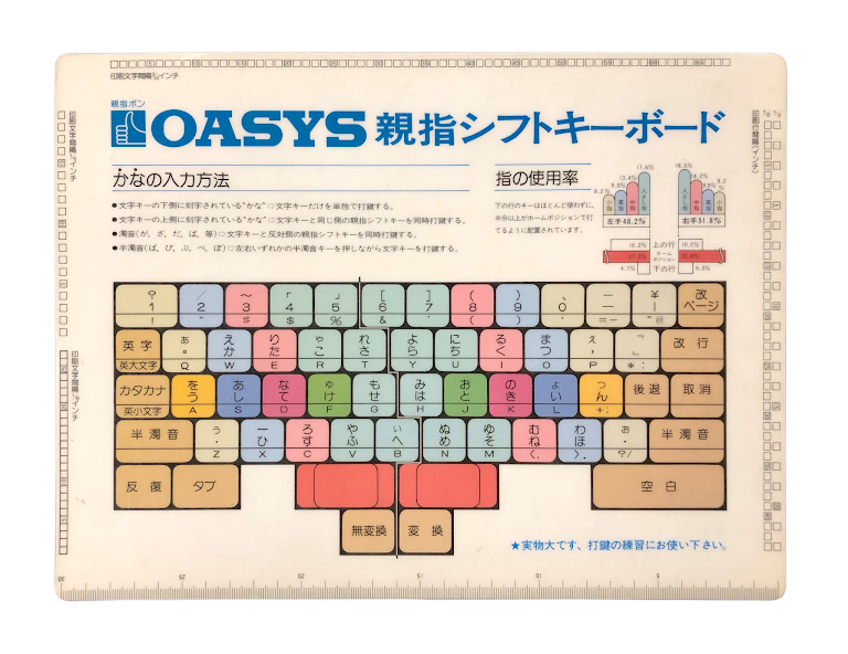
Like Leap keys or a Command bar ,it wasn’t perfect. But the whole system was good enough to power the popular line of Fujitsu’s Oasys word processing computers for two decades and counting—much, much longer than the western thumb experiments, and including increasingly portable editions of those computers.
And even when Japanese typing—like all typing—surrendered to QWERTY (today, many people in Japan use Latin words first, and then convert them to hiragana and kanji with keyboard presses or via onscreen menus), thumb shift retained a small ardent following of people who continue making keyboards where thumbs finally have something interesting to do.
The NeXT keyboard, the Canon Cat, and the Fujitsu Thumb Shift are the most important thumb experiments in the modern era of computing, but they are not, of course, the only ones.
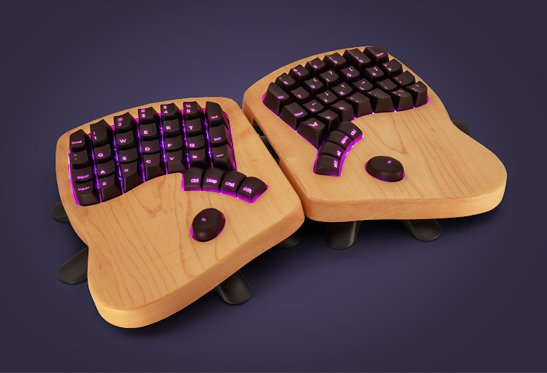
The Kickstarter sensation Keyboardio Model 01 had multiple thumb keys, inspired by another, much more short-lived Japanese keyboard, the Tron TK1.
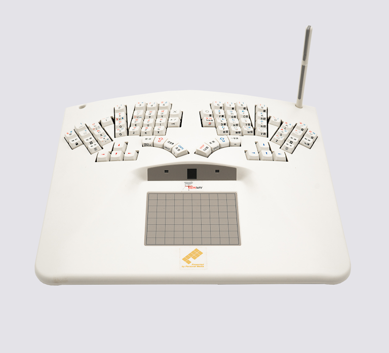
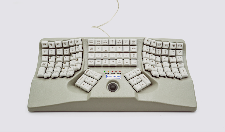
Maltron, a British oddity with its own custom layout, found a way for a trackball and thumb keys to coexist.
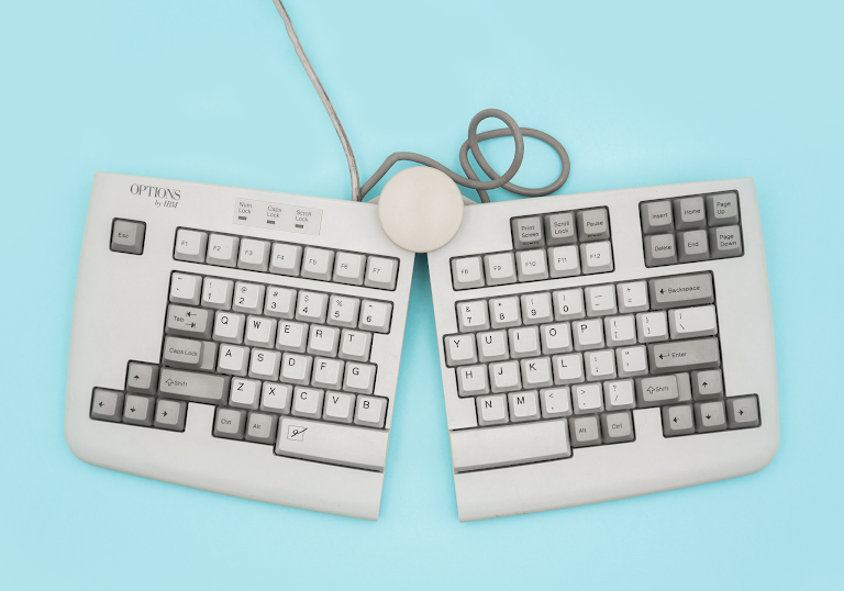
And even more traditional approaches sometimes split the spacebar in half so that your left thumb could do something else—most commonly press Backspace, that incredibly popular key usually located in the suburbs of the keyboard.
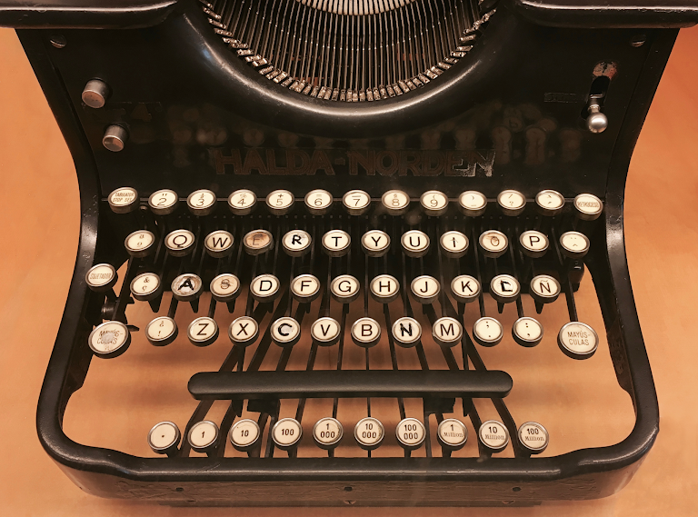
Some gaming keyboards still put stuff under the spacebar for power gamers, in the same space older typewriters put decimal tabulators for power spreadsheet typists long before spreadsheets migrated on screen.
But the trackpad today is a strong opponent—even Apple’s iPad keyboards come with one. Afraid to move it, Apple and Microsoft awkwardly continue adding new modifiers keys such as Fn or Globe, shrinking the spacebar just as the trackpads underneath are getting larger and larger.
Raskin fought to make another Cat, perhaps a portable one, and perhaps one with a mouse attached, but we’ve never gotten to see it. We know that Jobs hated the Apple Extended keyboard, but even if Apple keyboards softened a bit after his return, even today they still come with function keys, Ctrl and Command, and always at least one mystifying convention to resolve (the latest: is it Fn or is it Globe?).
I don’t think we ever learned what Jobs thought of the Cat, or what Raskin thought of the NeXT machines. In a cruel twist of fate, both men eventually succumbed to pancreatic cancer, diagnosed within a year from each other.
Apple’s recent keyboard experiments—the Touch Bar, the butterfly switches, the slightly better looking but less usable arrow keys—ended up so disastrous that I think no one wants the company to mess with keyboards ever again. So perhaps we’ll never get another era like the early 1990s where you could look around the market and find not one, not two, but three experiments with spacebar and its surroundings—three different approaches to putting thumbs to good use, and to righting some of the wrongs established by typewriters a century before.
As it often happens with technology, nobody won the battle, and soon the war moved somewhere else. Where the thumbs eventually got their chance to shine ended up far away from the keyboards we talked about, and almost by accident. It happened in the 2000s, with the ascendance of the BlackBerry first, and then the arrival of the iPhone second. But that’s a whole different story.
Marcin Wichary is a designer and the author of the upcoming book about the history of keyboards called Shift Happens. The book is presently available to be backed on Kickstarter.
(35)