Surprising Differences Between Pinterest and Instagram That Will Give You an Edge Over the Competition
— November 22, 2016
Everyone knows that Pinterest and Instagram are the go-to social media if your niche is particularly visual. But did you know that there are differences between the two? These differences are so important that…
If you only have time to do one, choosing the right one may make the difference between success or failure, depending on your niche and goals. If you have time for two, understanding the differences provides a framework to develop an incredibly powerful visual campaign, each of which complements the other brilliantly.
To illustrate, imagine for a moment that you’re a landscape designer. You have a beautiful, content-rich website where you answer visitors’ landscaping questions and sell your services. As a smart solopreneur, you plan to promote your business on social media.
Since your niche is highly visual, you choose both Pinterest and Instagram as your channels, knowing that these usually do well for a visual topic like landscape design.
To make the most of your efforts on both channels, you want to know…
- How do I create the perfect Pinterest post?
- How do I create the perfect Instagram post?
- How do I choose the right channel for a specific photo? Or will the same photo do equally well on Pinterest and Instagram?
Great questions! Here are the answers. You don’t have to be a landscape designer to grow a sapling start into a magnificent, productive social presence!
Elements of a Great Pinterest Post
An effective, engaging pin doesn’t just happen. A pin needs to be…
- Beautiful — have a high resolution, visually pleasing, vertical image (“portrait”)
- Helpful — include a keyword rich, helpful text overlay and/or description
- Actionable — link to a valuable resource
How is that different from Instagram? Hold on a sec, we’ll get there.
Pinterest is a platform where people primarily focus on what may happen in their lives in the future. They discover, save, collect, categorize and plan for something that hasn’t happened yet.
When creating pins, remember that pinners will “save” (pin/collect) them to come back to later. And folks will find your pins and re-pin them for weeks and months after your original pin! Pinterest has, by far, the largest “useful lifetime” of any social media.
Portrait-format (vertical) pins perform better on Pinterest. Why? Because they occupy more screen space, increasing the chance of being seen. This is especially important for mobile devices, which the majority (80% and growing) of Pinterest users are on. The current recommended aspect ratio for a Pin is 2:3 (width:height).
Unlike Instagram, pin links play a big role on Pinterest, helping establish the credibility of the content. A good pin should always lead back to a reputable website that’s relevant to the pin’s content. Even more importantly, Pinterest’s algorithm views good quality sources as one of the most important aspects of a Pinner’s experience.
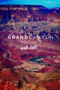
Consider adding a text overlay to your image (see image to the right) to help make what it’s about really clear. This practice is perfectly acceptable (and common) on Pinterest.
Also, take your pin a step further by including a strong description that starts with your primary keywords positioned in the first few words of the description.
At times, doing both may seem a bit repetitive, but not everyone looks at descriptions beyond the first few words. If a pinner doesn’t click to expand the pin, at least s/he will still be clear what the pin is about from the image, text overlay and the beginning of the description.
Another important difference between the two platforms concerns hashtags. While hashtags are highly popular on Instagram and are clickable, they are practically non-existent on Pinterest. Hashtags help people find what they’re looking for on Instagram, much like they do on Twitter.
On Pinterest, however, hashtags are not clickable and, therefore, don’t lead to other pins/posts with the same hashtag. Hashtags can be used for searching on Pinterest but results are often irrelevant. Occasionally a business will use a unique branded hashtag across their profile and board descriptions to help increase brand recognition. Other than that, there’s little (if any) benefit in using hashtags on Pinterest for marketing purposes.
Armed with the above information, decide what the goal of each pin is and where in the purchase cycle you wish to reach your audience. For example, do you want the pin to help…
Build awareness — about your business and products
Increase engagement — inspire people to click for a closeup or save (pin) the idea for later
Increase clicks (on the pin URL) — drive traffic to your website
Convert sales — turn pinners into buyers.
In summary, how-to, instructional and actionable pins outperform other content on Pinterest. Create pins with beautiful vertical images that help pinners solve a problem, learn how to do something (diy), plan for an upcoming life event or help them turn their dreams into reality.
Grand Canyon, Pinterest Example 1
This pin shows a beautiful, original image of the Grand Canyon in vertical format. Colors, lighting and composition showcase the canyon’s many layers, giving an almost surreal effect.
The text overlay makes it very clear what information the viewer will find after clicking the pin. The first few sentences of the description get right to the point about taking kids to the Grand Canyon’s south rim.
Clicking the pin takes you to a highly relevant page about a family’s adventure to the Grand Canyon. Exactly what’s expected.
The article is comprehensive, as the author explains amenities in detail. She includes what you need to know before you go, hotel options, driving tours, hikes, best views for watching sunrises and sunsets, where visitor centers are and more. She also has several more beautiful, original photos taken during her family’s recent Grand Canyon adventure.
This pin has all the elements needed to be found in Pinterest’s Guided Search tool – fabulous high resolution, vertical image, clear text overlay, description starting with best keywords, link to helpful article.
Grand Canyon, Pinterest Example 2
This pin also shows a great view of the Grand Canyon with a woman sitting and looking out over one of its many amazing sights.
There’s nothing wrong with the image itself, except that its size is not the recommended vertical one. The caption is clear but there’s no text overlay, so again, it’s not immediately clear what the pin will lead to when clicked on. Also, the description is repetitive, offering no new information (from the caption) to entice someone to click.
The pin, however, does link to an excellent article with fabulous, original images of the Grand Canyon. If the author had created a more compelling pin in the correct vertical size, she would likely have increased clicks through to her fantastic article.
The article redeems the less-than-optimal pin. The possible cost, though, is that pinners will scroll right on by.
This pin has several elements that could be improved upon.
Elements of a Great Instagram Post
People use Instagram to follow news about their favorite celebrities and brands, discover great visual content for a topic they’re interested in, or simply to be inspired by quotes, stunning photo shots or engaging short video clips.
In short, it’s all about the photo. Whatever the topic, a stunning photo wins. Grammers post their “A game” only. You could make 5 pins about the Grand Canyon if you had 5 different reasons for why folks might want to re-pin. But you’d post your best one to Instagram.
To create the perfect Instagram post, you need to…
- Create a top quality photo (or video). A good photo isn’t enough. It needs to “wow” your audience through its uniqueness, composition, color combination and emotional appeal.
- Draft a snappy, relevant caption. Lighten it up with emojis.
- Use the occasional call-to-action to increase engagement, but only when there’s a natural fit with the post. Examples would be asking a question or inviting followers to tag a friend who may enjoy the post. Stay away from “click on bio link” type of CTAs unless for very special occasions. First and foremost, your outstanding content has to drive engagement, not obnoxious CTAs.
- Of all social media, #HASHTAGS are most important at Instagram. Use the right set of hashtags. Include the most important ones in your caption. Add the rest of your 30 hashtag maximum into the first comment. Developing an optimal set makes a significant difference until your account is very large (at least 10,000 followers).
- Make sure your post fits into the overall look and feel of your Instagram profile. Some, for example, turn the profile’s photo-grid into a checkerboard look, while others create more elaborate effects. While few will actually visit your profile page and see that sharp presentation, those who do are deciding whether to follow you. So it’s worth thinking about.
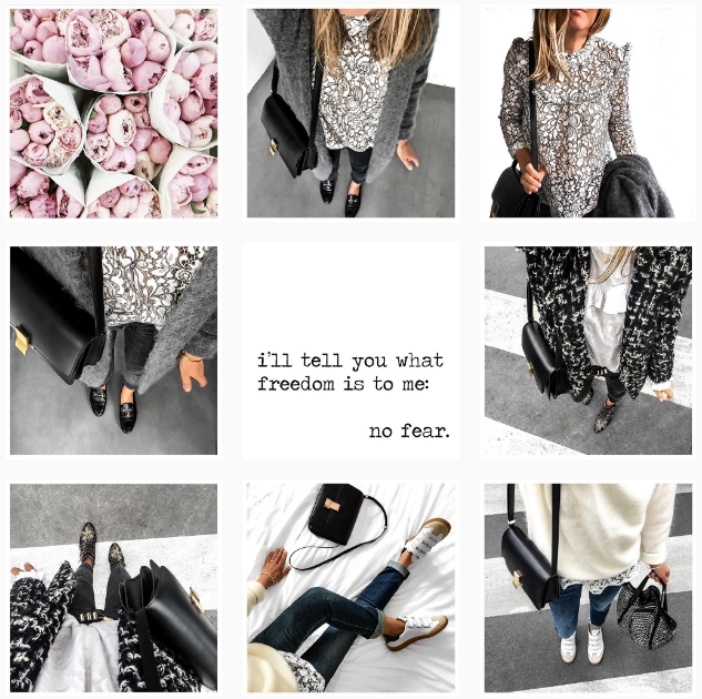
Example for an elaborate Instagram photo-grid (@theworkinggirl): The Working Girl arranges her fashion shots around a simple black and white quote. Note how well each photo fits into the overall look and feel.
Unlike Pinterest, Instagram users don’t collect and store posts as reference, to plan for their future vacation, gardening or craft projects. They enjoy the posts “in the moment.” If they like a post, they “heart” it, comment on it, or tag friends to share the post with them. The interaction ends there.
A few will discover and engage with your photo hours and even days later, but the “lifespan” of an Instagram photo is far shorter than the one of a Pinterest pin.
On the other hand, you can save your highest engagement photos and reuse them a few months later. No one will remember. Use software such as Later to queue them up for re-posting or save them and do it manually. Change the caption, but use the same hashtags.
The best outcome you can hope for is that they follow you. It’s unlikely, though, that a user will make this decision based on a single post. If she likes your post enough, she’ll check out your profile, and then decide if you’re worth following.
That brings us back to why planning your content is super important for Instagram. Each post has to be great in itself and fit perfectly into your account’s well crafted visual story.
Let’s look at two examples to illustrate these points…
Grand Canyon, Instagram Example 1:
The post shows a stunning photo shot of the Grand Canyon in square format. Colors, composition, lighting are all perfect. The caption adds to the photo by giving relevant information about ideal times to visit, and why this particular spot of the Grand Canyon provides a more serene, less crowded experience.
Several relevant hashtags, including a branded one, are woven into the caption. The poster could have used more hashtags in the first comment, but as “usInterior” already has a large following, the use of all 30 hashtags is less important than for a smaller account.
Now click through to the account itself. What’s your first impression? “Wow, such beautiful nature shots!” Right? The account has a very consistent look. They post gorgeous landscape or animal photos and pay special attention to the color composition.
Grand Canyon, Instagram Example 2:
Although the photo’s subject is the same as in our first example, the image looks flat and boring. The foreground is hidden in shadows, and the background does nothing to compensate for it. The image also doesn’t use the recommended 1:1 aspect ratio (i.e., it’s not square).
The caption consists of a single word (“Lost”) and a bunch of very generic hashtags. Generic hashtags are not only boring, they are hard to get found for because the competition is so fierce and fast-moving.
NOTE: Many articles suggest using the most popular hashtags. Bad advice. Use the ones that are highly specific with numbers that range from 10,000 to 1 Million.
When you click through to her account, the Grand Canyon photo looks like the odd one out between shots of herself and some healthy food images. She has some good photos there from her life as a model, but overall the account lacks a consistent theme, and certainly has no “wow” factor.
So… What’s the Best Channel for Your Photos?
Image quality is important for both Pinterest and Instagram. But at Pinterest you can get away more easily with a slightly sub-par image because the image source (i.e., where the image links to) and the reason for engagement are more important.
At Instagram, you’re reliant on your image and the caption to make it stand out from the rest. Don’t underestimate the importance of a short, snappy caption. Develop your own style!
The image orientation is another differentiator. Does your image lend itself well to portrait style? Or would it look better if cropped into a square?
Certain image features also seem to play a role, at least according to Pinterest and Instagram studies done by Curalate, a leading visual analytics and marketing platform.
Here are some of their results…
| Image Feature | ||
| Lightness | Medium to high lightness better than low lightness. | High lightness better than low lightness. |
| Background | Low amount of background better than high amount. | High amount of background better than low amount. |
| Dominant colors | Multiple dominant colors better than a single dominant color. | Single dominant color better than multiple dominant colors. |
| Blue vs Red | Red as dominant color better than blue. | Blue as dominant color better than red. |
| Saturation | Moderate saturation better than very low saturation. | Low saturation better than moderate saturation. |
| Texture | Smooth image better than a textured image. | Textured image better than a smooth image. |
These results are not “hard rules.” They may or may not apply to your audience. Use them as guidelines for testing different types of images at your Pinterest and Instagram accounts.
Summary of the Differences Between a Great Pinterest Pin and a Great Instagram Post
| Element | ||
| Image Ratio | Portrait; Recommended Ratio 2:3 | Square; Ratio 1:1 |
| Image Size | 735 px x 1102 px | 1080 px x 1080 px |
| Image Quality | Aim for a beautiful high resolution image | Use only images of highest quality and/or improve them with image editing tools. |
| Image Filtering | Typically no filters are applied. | Filters are often applied. If you do it, stick to just a few to create a consistent look. |
| Text Overlays | Work well for all kinds of posts. | Work well for quotation photos.. Many niches feel that text ruins the pic. Use with care if it’s not a quote! |
| Image Caption | Write compelling, keyword-rich descriptions. You have 500 characters, but descriptions are truncated after the first 3 to 4 lines in the Pinterest Feed. Pack the most important part into the beginning. | Make them snappy and relevant. Include a call to action. Although you have a 2,200 character limit, shorter is usually better. Pack the most important part into the beginning. |
| Call to Action | Use only for your own pins to drive traffic to your site. | Use sparingly. It’s about building your “Brand of One,” not about getting traffic. |
| Hashtags | Avoid using hashtags. They don’t add value because they aren’t searchable as they are in Instagram. | For discovery, hashtags are super important. Use all 30 of them, but only if they’re relevant.Keep your caption clean – NO hashtags in the caption, unless you’re going for an effect. Either place them all at the end of your caption or add a comment and put them all there (they “work” just as well in a comment). |
| Links | Always link the pin to a relevant, high-quality source. | Adding a link to posts isn’t possible. Instead, ask users to check out the link in your bio if this works well with the post’s topic. |
Whether you use Pinterest, Instagram or both to market your business, be aware of the substantial differences. To maximize results, step into the different mindsets of your Pinterest and/or Instagram user.
Bookmark and refer to this article again, until you’re confident you understand the differences required to make the perfect post for each platform.
Digital & Social Articles on Business 2 Community
(46)


