Tech’s age of excess is done. Welcome to the new pragmatism
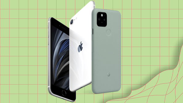
For weeks now I’ve been trying to articulate to friends why I love the Pixel 5—a phone that costs hundreds of dollars less than an iPhone 12 Pro—when I loathed the Pixel 4. There’s almost nothing to this new phone. It’s a screen, an unlock button, and a hole-punched camera on the front. But it’s quick, it takes nice photos, it has great battery life, and the back feels like no material I’ve ever held in my hand. It’s aluminum coated in a bumpy, almost leather-like bio-resin.
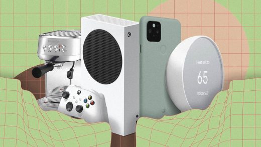
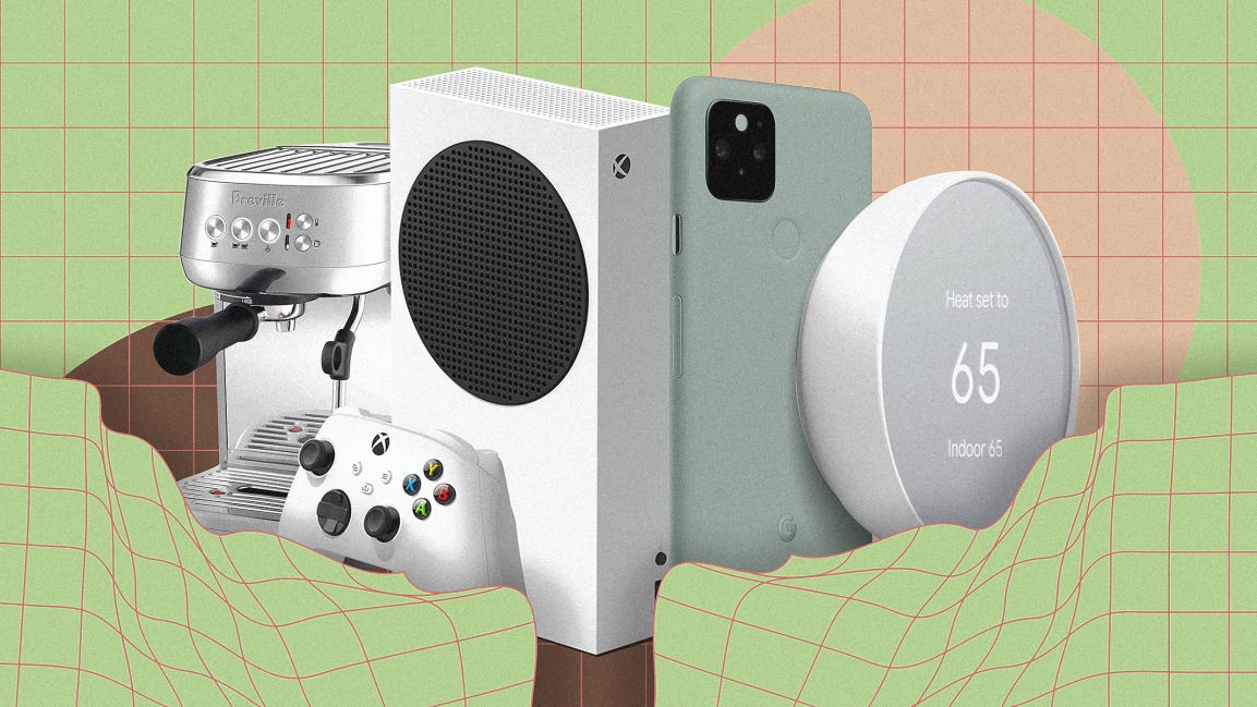
These products are simpler and less expensive than high-end flagships. But they are also appealing to a discerning consumer while keeping the essential features and user experience from their pricier peers. In tech, the cheap versions used to be the crappy versions, and that’s just no longer true. “Individuals are figuring out what’s essential in their life, who they are and what they need,” says Google’s head of hardware design, Ivy Ross. Technology companies are responding with a sweet spot of design that includes everything from cheap, desirable phones to inexpensive video game consoles that you almost hate to hide away in a cabinet.
What’s changed
For the past few decades, tech companies have been on a quest to build thinner, faster, and more capable gadgets. Each new generation of hardware attempts to make the previous obsolete with gee-whiz features or “Wait, you still use an iPhone 7?” body shaming so that people keep upgrading and companies keep lining their pockets.
[Photos: Apple, Google]
But in the smartphone market, fewer customers are upgrading their phones every two years, and many want to spend less on their next phone than their last one. That makes sense. Phones aren’t fundamentally different than they were five years ago. To compensate for fewer sales, Apple doubled down on high-end merchandise for years. Remember its $10,000 gold Apple watch? Or the iPhone X, which started at $999 and used invisible light to puppet your face with an animoji on the screen? It was a strategy of excess (ironic for a company synonymous with minimalism), and it couldn’t last forever. You can’t meet ambitious growth targets by aiming at the high end alone.
That is especially true now that tens of millions of Americans are out of work, and middle-class customers don’t have the cash on hand to upgrade to a $1,000 phone. New pragmatism fills this void for consumers and businesses. Consumers get a nice, affordable phone. Businesses get to keep selling phones at all.
New pragmatism, to be clear, is not the same thing as the low-tech minimalism that appeared over the past few years to offset the nagging demands of the attention economy. As people got eaten alive by notifications, some companies released virtually featureless devices, like dumbphones, to help consumers stay connected without feeling overwhelmed. New pragmatism products aren’t meant to cure you of your phone addiction. But they will take it easy on your bank account. They’re a response to the financial hardship of a squeezed middle class, a trend that was underway long before COVID-19.
Over the past year or so, Apple has also quietly phased out one of the highest tech differentiators across its line: a feature called Force Touch, which could measure how hard you pressed the screen. Force Touch was a fascinating piece of technology that could sense a whole new physical dimension of user intent. But it was never essential, and it got scrapped for good with this year’s WatchOS update.
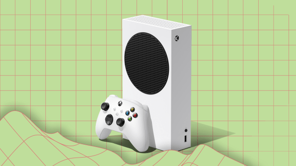
This new pragmatism is playing out with video game consoles, too. Microsoft introduced two models, the Series S ($299) and the Series X ($499) this year. “We knew from the get-go that we’d have two products,” says Carl Ledbetter, partner director of design on Microsoft’s device team. “We knew one would be the best flagship, and we knew we needed something more accessible to more people.”
The Series X can play video games at higher resolutions and frame rates, and it can play games off discs. It’s the flagship. But the Series S is small enough to fit easily on any shelf. It features a fetching design to any student of Dieter Rams (whereas the X is a more forgettable black box). And based upon some complicated internal architecture decisions, the Series S is capable of the same early benefits that you get with the X: It can load games super-fast, and you can swap between multiple games at the same time. The experience is largely indistinguishable by design.
Microsoft has always released smaller, cheaper versions of its new consoles—but generally speaking, that jump to smaller and cheaper requires years of refinement and new breakthroughs in chip manufacturing. In 2020, Microsoft is ostensibly launching both the flagship Xbox and its refined remake on day one.
It’s a clever strategy for convincing people to upgrade their consoles even if they don’t necessarily have a lot of money or space. When the last generation of consoles launched in 2013, Microsoft was selling a vision of the future, with voice control and body tracking, none of which is available on the series S or X. Now, it’s selling 60-year-old Rams-style design, and with gusto. Microsoft’s head of Xbox, Phil Spencer, has gone on the record saying that, despite having less power on day one, the Series S will be the next-gen console to outsell the Series X over time.
The Pixel 4 added a 3D tracking front Soli sensor, which unlocked your phone with your face. Lights constantly glowed on top of the screen to tease this feature, which even allowed you to swipe in the air to skip Spotify tracks. The Pixel 5 reverted to an older approach. It removed that new front camera and added a fingerprint unlock at the back. The result is an overall quieter phone that asks less of you. (It also debuted for $100 less than the Pixel 4 did last year). “The Pixel 5 is stripped down to, say, ‘Time out, maybe this is what we just need here,’” says Ross. “I think if there’s truly tech, not just tech for tech’s sake, that truly advances things [we’ll include it]. We have to be discerning.”
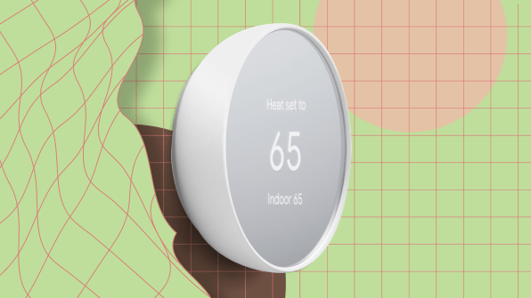
The company took a similar stance with its new $130 Nest thermostat. It was designed from the get-go to be cheaper than the original Nest model, and therefore to open the market of potential Nest buyers. As Olsson explains, the team took a different approach from the circular glass screen with a techie metal bezel. Instead, they were inspired by a mirror and turned the Nest into a reflection of your environment.
“You used to trade aesthetics for price, and you shouldn’t have to do that,” says Ross. “And I think we’re proving it. There were people who believed beauty and aesthetics have to be in that higher range. . . . I’m so proud of [the Nest] because it looks better [than the original].”
Yes, along the way they cut out features such as having the Nest manage your home’s temperature on the device (instead, the new Nest uses the cloud). But the cost savings of these changes added up. The new Nest requires roughly half the parts of the older models and is priced at half as much as well. And yet it still features thoughtful touches, down to the color of its batteries and a tiny level on the backplate when mounting it. “To do these details right, it doesn’t cost you more,” says Olsson of the design. “It’s more effort. But it matters in the long run.”
It also helps to have less complicated products as COVID-19 pinches supply chains. “The nice thing is that’s been a philosophy to us from the beginning, to boil things down from a minimalist but approachable vibe,” says Olsson. “It’s a dance, but it totally makes sense now when resources are more constrained, and everything is a little bit harder to do.”
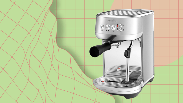
Phil McKnight, the global business manager of beverage for Breville, tells me that this $299 version of the Bambino is a “huge” product for the company. And yes, it’s aimed at a particular consumer who values design but is on a budget. Namely, all of us.
(19)

