The 20 worst phones of the century, and how they got that way
These days, nearly every significant phone is a touchscreened rectangle with a quorum of features, from voice assistant to GPS navigation, that are industry-wide standards. They’re great—but most of them are great in pretty similar ways.
The history of terrible phones, however, is pockmarked with models that were genuinely unique. Some were too clever for their own good; others weren’t clever enough. They added new features they didn’t need, or left out ones they did need—or, oftentimes, did both.
Such phones don’t merit celebration, exactly. But they’re worth commemorating nonetheless. Maybe they even offer some lessons for the companies designing new models even as we speak.
Herewith, our picks for the 20 most memorably bad phones introduced since 2000—plus another five that came oh-so-close to making our list.
The worst of the worst, in order
[Photo: Evan-Amos/Wikimedia Commons]
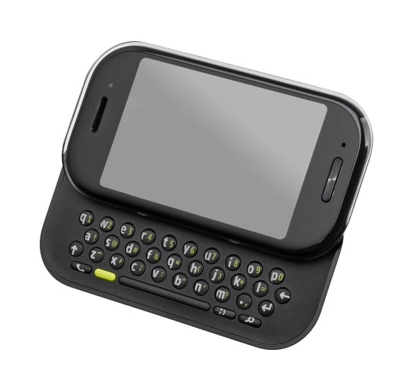
1. Microsoft Kin One and Kin Two (2010)
In the spring of 2010, Microsoft, which was getting ready to launch an ambitious new smartphone platform called Windows Phone, unaccountably came out with two phones that weren’t based on it. Actually, the Kins may not have counted as smartphones, since they didn’t have an App Store. But the devices, which the company targeted at “the social generation,” did include a mess of features designed for hip young people who loved Facebook, Twitter, MySpace, and other networking sites. The problem was that they were ugly, sluggish, rife with troubling design decisions (social posts went out only periodically, not as you created them), and generally unappealing. Even Microsoft’s launch event, held at a San Francisco nightclub, felt halfhearted, as if the company knew it was making a mistake.
Mitigating factor: Kin Studio—a feature which let you get to your phone’s photos and other content from a desktop browser—looked neater than the phones themselves.
Upshot: A Verizon exclusive, the Kins lasted only two months on the market before the carrier pulled the plug. That puts them in the rarified company of such legends flops as HP’s TouchPad among the most short-lived gadgets of all time.
[Photo: Flickr user aaltonen]
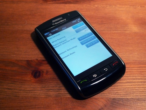
2. BlackBerry Storm (2008)
When Steve Jobs unveiled the original iPhone in January 2007, Research in Motion—the maker of BlackBerry, and at the time, a smartphone kingpin—didn’t take Apple’s new device all that seriously. In late 2008, however, RIM released the BlackBerry Storm, which grudgingly slathered an iPhone-esque veneer to the classic BlackBerry Experience. The Storm ditched the iconic BlackBerry physical keyboard for a touchscreen—and when you pressed it, the entire display clicked, as if it were one giant key. New York Times critic David Pogue compared the experience to using a manual typewriter, and found the phone so rife with bugs that he dubbed it the “BlackBerry Dud.”
Mitigating factor: Reviewers such as PCWorld’s Yardena Arar concluded that the Storm might have been a pretty good BlackBerry if it had stuck with the classic keyboard rather than sacrificing it for the sake of creating a superficially iPhone-like feel.
Upshot: For years, RIM had built exceptional smartphones. But the Storm showed that it didn’t have a clue how to evolve in the iPhone era—and later products, such as the Playbook tablet, only made matters worse.
[Photo: Matt Ray/Wikimedia Commons]
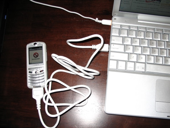
3. Motorola Rokr E1 (2005)
By 2005, the consumers who had made Apple’s iPod a phenomenon were salivating for a device that was both a cell phone and an iTunes-compatible music player. They got one in the the form of the Rokr, which Steve Jobs announced at an Apple event in September. But there was nothing iPod-like about the phone, which was limited to a dinky total of 100 songs and forced you to download them from a computer via a archaic, woefully slow USB 1.1 connection. The Rokr was the “one more thing” announced at the same Apple event as Apple’s impressive iPod Nano, which Motorola CEO Ed Zander felt moved to dis in an interview: “Screw the Nano … Who the hell listens to 1,000 songs?”
Mitigating factor: If all you wanted to do was make phone calls, the Rokr E1 was apparently competent enough.
Upshot: After collaborating on the E1, Motorola and Apple went their separate ways and designed music phones on their own. Moto released additional Rokr models that synced with RealNetworks’ RealPlayer or Microsoft’s Windows Media Player rather than iTunes. And Apple … well, you know.
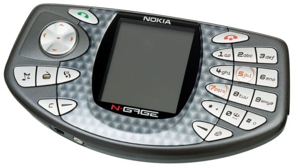
4. Nokia N-Gage (2003)
This attempt to take on Nintendo’s Game Boy Advance with a hybrid Symbian-based cellphone and gaming system was a clear act of hubris at the height of Nokia’s power. The N-Gage was thrice the price of Nintendo’s handheld, and it came with an awkward button layout and tall aspect ratio that made games like Sonic N less enjoyable to play. It didn’t help that the N-Gage only launched with six games, while the Game Boy Advance was backwards compatible with Nintendo’s entire Game Boy catalog. Perhaps worst of all, the speaker and earpiece resided along the N-Gage’s top edge, which made people look like they were conversing through a taco.
[Photo: Evan-Amos/Wikimedia Commons]
Mitigating factors: Some critics enjoyed Pocket Kingdom: Own the World, an RPG that you could play online from anywhere. More importantly, the N-Gage gave us “Sidetalkin,” a proto-meme in which people photographed themselves holding increasingly ridiculous objects–home game consoles, pizza boxes, actual tacos, and so on–to their ears.
Upshot: In 2004, Nokia released the N-Gage QD, which was smaller and didn’t have the embarrassing side-mounted earpiece, but it still fell well short of Nokia’s sales targets. Nokia tried to revive the N-Gage brand for a mobile gaming service in 2007, but that effort only lasted a couple of years. The likely killer? Apple’s iPhone, which at last delivered the kind of gaming phone that people wanted.
[Photo: Flickr user Aaron Yoo]
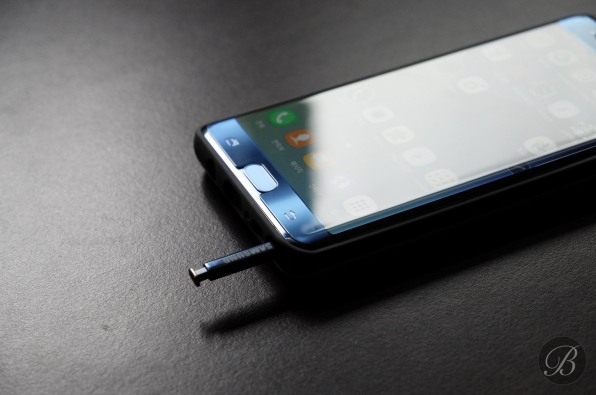
5. Samsung Galaxy Note 7 (2016)
Unlike other phones on this list, Samsung’s Galaxy Note 7 promised to be a top-notch handset, earning high praise from reviewers ahead of its August launch. But it’s also the only phone on this list to be banned from air travel by the Federal Aviation Administration, due to defective batteries that were prone to smoldering, catching fire, or exploding. Samsung’s initial recall failed to solve the problem—one replacement Note 7 even caught fire on a plane and the company threw in the towel in October, discontinuing the phone for good. And just in case any Note 7 diehards got any ideas about ignoring the recall, Samsung bricked their phones with a software update.
Mitigating factor: If not for its battery hazards, the Note 7 would have been a hit, with a gorgeous curved display, long battery life, and a camera that could rival the iPhone. “It was the best phone Samsung ever made — before it started exploding,” wrote Engadget’s Chris Velazco.
Upshot: Samsung started selling a “Fan Edition” of the Galaxy Note 7 (with a smaller, safer battery) in mid-2017, but only in South Korea. And while virtually every Galaxy Note 8 mentioned its predecessor’s battery debacle, the new phone apparently sold well. That makes the Note 7 the rare bad phone that led to something good.
Too little too late
Palm Treo 700w (2006)
Apple’s 1997 Macworld Expo keynote—at which Bill Gates appeared, via teleconference, to announce a Microsoft partnership with Apple that elicited boos from the audience—is one of the most famously tense moments in computing history. But for fans of Palm Computing—the creator of the Palm Pilot and Treo—Gates’s live appearance at a 2005 Palm press conference in San Francisco was even more dismal. The Microsoft CEO was there to help announce that Palm would release a Treo smartphone running Windows Mobile, an intermingling of two platforms meant to result in a phone with appeal for corporate buyers. Given the years of fierce competition between the two companies—and the Palm OS’s status as a defining Treo feature—it felt like abject surrender on Palm’s part. The phone, when it arrived early in 2006, was missing most of the software touches that made other Treos delightful. It also felt like it lacked a soul.
Mitigating factor: Palm did give the 700w some useful tweaks, such as a “Today” summary screen and the ability to speed-dial favorite contacts by assigning them to their own keys.
Upshot: The Treo 700w was followed by a marginally improved version, the 700wx, later in 2006. But the arrival of the first iPhone in January 2007 instantly turned all Windows Mobile devices into dinosaurs. Palm went on to bet the company on an all-new phone called the Pre—and ended up being swallowed, and then destroyed, by HP.
[Photo: Flickr user Yosomono]
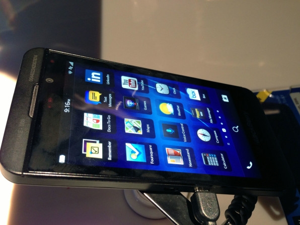
BlackBerry Z10 (2013)
The Z10 was the first phone that ran on the BlackBerry 10 operating system, a belated (and oft-delayed) attempt to modernize BlackBerry phones for the touchscreen era. While the hardware was adequate, BlackBerry 10’s shortage of apps was an instant death sentence, and the operating system was loaded with little annoyances. For all but the most serious BlackBerry devotees, there was no reason to even consider the Z10, and even those fans were better off waiting for the keyboard-equipped Q10 that launched later in the year.
Mitigating factor: The Z10 did include some interesting ideas on the software side, like gesture-based navigation, a “Hub” app that aggregated different communication sources, and a software keyboard whose word predictions hovered over the next sequential letter.
Upshot: BlackBerry put on a brave face and kept loading BlackBerry 10 on new phones until 2015, when the
company finally gave up and started making Android phones instead.
ZTE Open (2013)
If there was ever a tech company you want to instinctively root for, it’s Mozilla, the nonprofit whose Firefox browser permenantly changed the web for the better. And the goal behind its Firefox OS—to provide an operating system for use in super-low-cost devices for emerging markets where even a cheap Android phone might be unobtainable—was laudable. But compared to phones that cost just a bit more, the $80 ZTE Open was slow, unresponsive, and much worse at making phone calls, taking pictures, and other basic tasks. And Firefox OS, which was supposed to be streamlined and simple, felt downright rudimentary.
Mitigating factor: The phone was available in your choice of blue or orange—Firefox’s signature colors.
Upshot: As the cheapest Android phones fell to sub-$100 price points, Firefox OS lost much of its original rationale for existence. The platform never caught on, and Mozilla officially terminated it in 2016.
Misplaced luxury
[Photo: Flickr user bl4h]
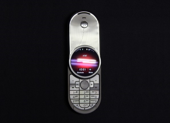
Motorola Aura R1 (2009)
A decade ago, two of the hottest applications for wireless phones were taking photographs and surfing the web. Photos and web pages, in case you hadn’t noticed, are both rectangular. But Motorola’s Aura R1–a $2,000 dumbphone—had a round display and was therefore fundamentally terrible at displaying anything with corners. Like Vertu, Moto was fixated on the idea of building a phone that felt like a fancy hand-crafted wristwatch; the Aura even had a window that let you see the gears that rotated as you swiveled it open. Which was cool—but a waste of Moto’s time as the iPhone was busy changing the phone market forever.
Mitigating factor: In 2009, Moto released a special edition of the Aura to commemorate the 40th anniversary of the Apollo 11 moon landing. It presented the first unit to Neil Armstrong, who certainly deserved a free phone.
Upshot: Companies such as Motorola saw luxe phones as a market unto themselves, with pricetags that put them out of the reach of mere mortals. In 2010, Apple’s iPhone 4 brought slick industrial design and posh materials to a phone designed for a whole lot more people—a move that came to influence the whole industry, and made phones such as the Aura feel even more pointless.
Aesir AE+Y (2011)
Superstar designer Yves Béhar helped create this phone for Denmark’s Aesir. It was as dumb as the dumbest low-end burner phone, with no internet access or apps. But the company gilded its lily with had high-end features like a ceramic case and discrete buttons. Even the metal screws were an upgrade from the plastic norm. Heaven help you if you lost the phone in a taxi: It went for $8,100, or $60,000 for an 18K gold version.
Mitigating factor: According to Aesir, the AE+Y was designed with antenna strength and and audio quality in mind—and who could object to that?
Upshot: Aesir’s founder said that he intended the AE+Y to be as relevant in a decade as it was the day it launched. If you know of anyone who’s still using one, drop us a line.
Vertu Constellation Quest Blue (2012)
Vertu, a spin-off from Nokia, was the brainchild of a prolific Nokia designer who proposed the idea of an ultra-luxury phone division in 1997. The brand didn’t come out with any phones until 2002, but when it did they were fashioned of precious materials, laden with jewels, and priced up to $19,450. Vertu cared only about glitz, not technology: The blinged-out Constellation Quest Blue, launched almost five years after the arrival of the first iPhone, ran the antediluvian Symbian operating system and didn’t have a touchscreen. How much did it cost? We don’t know—the price was only available on request.
Mitigating factor: The Constellation Blue featured an exclusive ringtone recorded by the London Symphony Orchestra, which sounds pretentious but neat.
Upshot: Vertu (which eventually went bankrupt but resurfaced last year) was founded to answer the question “Why shouldn’t a phone be as luxurious as a high-end watch?” The answer—because phones aren’t long-term investments, let alone heirlooms!—doesn’t seem to have occurred to the company’s founders or customers.
Gimmickery gone awry
[Photo: Sonic22/Wikimedia Commons]
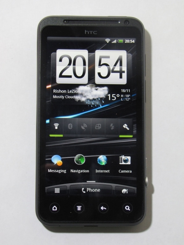
HTC Evo 3D (2011)
The EVO 3D’s signature feature consisted of a glasses-free 3D display and dual cameras for shooting 3D photos. The novelty of those features quickly wore off, at which point users were stuck with a middling camera, weak battery life, and a design that lacked the handy kickstand of HTC’s superior EVO 4G.
Mitigating factor: As a gadget reviewer, showing off the EVO 3D at parties was pretty great.
Upshot: HTC never made another 3D phone, but it did bring back dual cameras a few years later with the excellent HTC One M8.
[Photo: ETC@USC/Wikimedia Commons]
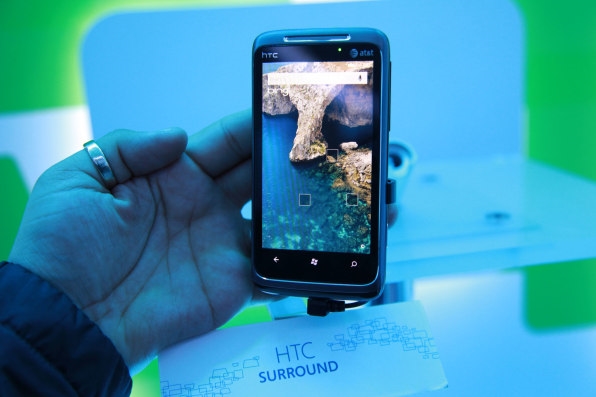
HTC Surround (2010)
Offenses: Given the rough shape of Windows Phone 7 at launch, Microsoft really needed some standout phones to put its new mobile operating system on the map. The HTC Surround failed to fit the bill, with a slide-out speaker that added bulk but didn’t do much to improve audio quality. Combined with a shortage of apps and missing features like copy-and-paste on the software side, the Surround helped ensure that Windows Phone 7 would fall further behind than it already was.
Mitigating factor: The Surround was one of the few HTC phones that shipped with a kickstand, which is a rare-but-handy feature.
Upshot: Ever the trouper, HTC continued to release Windows Phones into 2014, including much better ones like the colorful HTC 8X. But the Windows Phone platform was never able to catch up with iOS and Android, and Microsoft effectively stopped working on it in 2017.
[Photo: Jim.henderson/Wikimedia Commons]
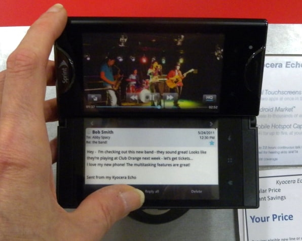
Kyocera Echo (2011)
To stand out in a crowded field of Android phones, the Kyocera Echo had a secondary screen that folded outward on a hinge, letting users run two apps simultaneously, type on one screen without covering up the other, and stretch out individual apps to cover both displays. The technology just wasn’t ready, though, as users ended up with bulky hardware, weak battery life, and software that was often poorly optimized. Being a Sprint exclusive probably didn’t help.
Mitigating factor: Even the most hardened critics have to admit that running two smartphone apps side-by-side on separate screens is pretty cool.
Upshot: The two-screen phone concept went into limbo until late 2017, when ZTE released the Axon M as an AT&T exclusive. It was a much better device than the Echo, but had a lot of the same fundamental problems. Maybe someday, phones with foldable displays will fare better.
Red Hydrogen One (2018)
Although Red has built its reputation around large format, high-resolution pro cameras, the Hydrogen One instead focused on 3D, with a glasses-free “holographic” display and dual-lens cameras for snapping 3D photos. And much like HTC’s Evo 3D from seven years ago, those throwaway features seemed to compromise on everything else, with reviewers panning the phone’s dim display, bulky construction, and subpar camera performance in 2D. Meanwhile, Red’s long-promised add-on modules–the main attribute that the Hydrogen One has in common with Red cameras–have yet to materialize and have even disappeared from the company’s promotional materials.
Mitigating factor: Those modules could be interesting someday, though the troubled history of modular phones would suggest otherwise.
Upshot: The Hydrogen One just launched late last year, so its fate isn’t sealed yet, but the fact that it only gets a footnote mention on Red’s main website doesn’t bode well.
Acts of hubris
HTC First (2013)
Mark Zuckerberg has long seemed wistful that iOS and Android gained traction before he was in a position to create his own rival: “One of my big regrets, he told Fast Company in 2015, “is that Facebook hasn’t had a major chance to shape the mobile operating system ecosystem.” So it’s not shocking that his company came up with Facebook Home, an alternative home screen and lock screen for Android that emphasized friend activity over apps. HTC’s First was the first (and, it turned out, only) smartphone to come pre-loaded with it. The idea was interesting, but it made a hassle out of launching apps and was less useful than just loading Facebook proper. Meanwhile, HTC’s hardware had a subpar camera, which was an unfortunate choice for a phone whose key selling points revolved around sharing photos.
Mitigating factor: Some eagle-eyed reviewers noted that you could disable Facebook Home entirely and get a bloatware-free phone running stock Android at a reasonable price.
Upshot: One source told BGR’s Zach Epstein that the HTC First only sold 15,000 units in its first month. Carrier partner AT&T promptly discontinued the phone, selling off inventory at 99¢ on contract. While a Facebook phone might’ve been unappealing in 2013, the concept just seems dreadful now.
[Photo: Romazur/Wikimedia Commons]
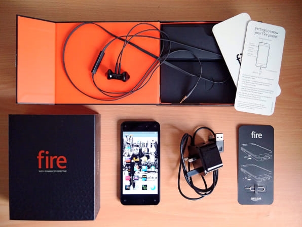
Amazon Fire Phone (2014)
Rumors of an Amazon smartphone started popping up in 2011, fueling speculation that aggressively priced hardware and simple software would pose a real threat to Google’s Android ecosystem. The eventual product was in fact no less expensive than other flagship phones, but it had far fewer apps–including none from Google–and unrefined software. The Fire Phone’s unique features, which included face-tracking cameras for perspective-based graphical effects and a button for identifying things in the real world, weren’t useful enough to move the needle.
Mitigating factors: The phone included a year of Amazon Prime membership, so users could enjoy movies, books, and music out of the box. The “Mayday” feature that instantly summoned a support rep over video chat was also neat.
Upshot: Realizing the phone was a flop, Amazon quickly slashed prices and liquidated its inventory, taking a $170 million write-down in the process. CEO Jeff Bezos—who was deeply involved in the Fire Phone’s development, but seemingly less hands-on with more recent hits such as the Echo—has since put a positive spin on the ordeal, claiming that it helped the company learn from its mistakes.
Just plain odd
Toshiba G450 (2008)
Offenses: This tiny phone/MP3 player sported bizarre design elements such as a numeric keypad that was divvied into two circles. It also lacked basics like Bluetooth and a camera. Just reading CNet’s review (“Each button performs a different function depending on what part of the menu system you’re in at any one time”) is enough to make you wince.
Mitigating factors: The G450 doubled as a cellular modem for your laptop—which, in 2008, was a handy gadget to have. You could also use it as a USB thumb drive.
Upshot: Though it was released after the iPhone, the G450 was a dry heave from the pre-iPhone era when phone makers aspired to cram multiple bits of functionality into one device, and ended up with something that wasn’t great at anything.
[Photo: Philphos/Wikimedia Commons]
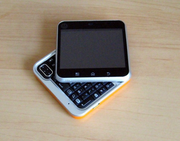
Motorola FlipOut (2010)
Back in 2010, Motorola wasn’t yet convinced that all smartphones should be oblong rectangles. So it released the FlipOut, a square-shaped phone whose screen swiveled out to reveal a physical keyboard. In a way, it was like a collapsible BlackBerry, but much of the smartphone-using world was already moving away from physical keys. The Flipout’s 2.8-inch screen was too dinky to make Android usable, and Motorola’s MotoBlur interface didn’t make it any more appealing.
Mitigating factor: Sliding out the display revealed a mirror on the rear panel for taking selfies, which was a novel idea before front-facing cameras became the norm.
Upshot: Although Motorola put out a handful of subsequent phones with physical keyboards, it never released a smartphone with a screen as small as the FlipOut. And for the most part, neither did anyone else.
Dishonorable mentions
These bad phones—some of which were nominated by our Twitter pals—didn’t make our 20-worst-phones cutoff, but are too distinctively off-putting not to cite.
LG 1010 (2002): The page for this innocuous-looking Sprint flip model at Phone Scoop is rife with comments from phone sales people reporting that an alarmingly high percentage of units—like, um, 90%—would lose signal and never get it back, rendering the phone a brick. One says it happened to a customer’s 1010 within two hours of purchase.
[Photo: RyJones/Wikimedia Commons]
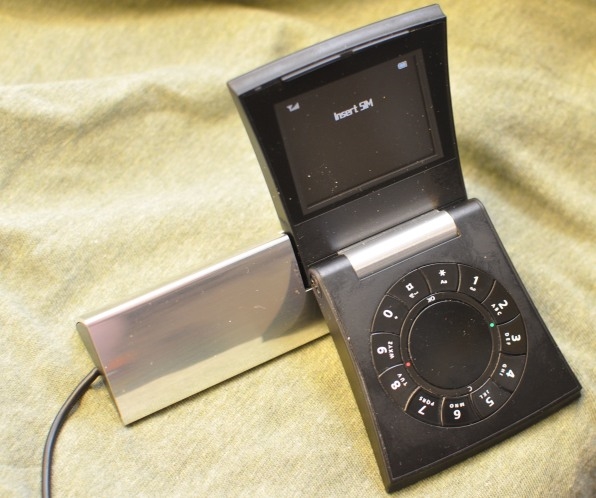
Bang & Olufsen Serene (2005): B&O collaborated with Samsung on this $1275 phone, which put a circular dialpad on the top half, a screen on the bottom, and the camera on the side. (You could flip it around to put the screen up front if you chose.) “It looks like a hoax, but it isn’t,” wrote one pundit.
[Photo: Flickr user Cesar Cardoso]
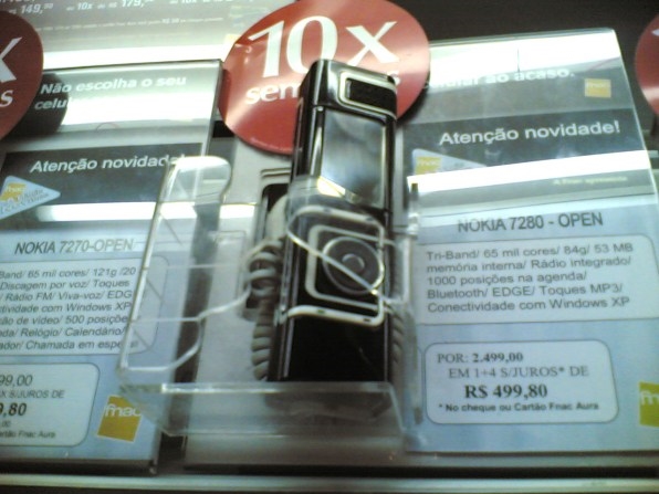
Nokia 7280 (2005): The tube-shaped “lipstick” Nokia impressed reviewers with its daring design, but didn’t have a dialpad. You could, however, enter numbers via an iPod-like scroll wheel—slowly and tediously.
Pantech Jest (2010): For years, phone makers and wireless companies liked to slap names on new models that were simultaneously evocative and generic. The Jest had one of the weirdest monikers of all—but it wasn’t a bad match for the phone itself, a square-shaped oddity with a tiny slide-out keyboard.
HTC Rhyme (2011): Aimed at women, the purple Rhyme’s signature feature was a “charm” accessory that flashed if you were getting a call. That was theoretically helpful if the phone was buried in a purse, but the charm occupied the headphone jack, was tough to fasten to a handbag, and blinked too dimly to be visible in all environments.
Fast Company , Read Full Story
(61)

