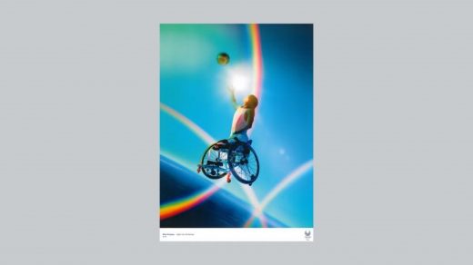
The 2020 Olympic posters are here. They’ll warp your brain
The manga series Akira, created by Japanese Artist Katsuhiro Otomo, and first published in 1982, was set in the future: 2019. And though written long before a host city announcement was made, the backdrop for the action in Akira is eerily accurate: the fictionalized Tokyo was prepping to host the 2020 Olympics. This prediction and its relative implausibility might make you question the nature of time and space. How could Otomo have known? And while that’s a discussion for another day, the Tokyo Olympics have, in some sense, bridged space-time with the release of official posters to celebrate the Olympic and Paralympic Games—including manga.
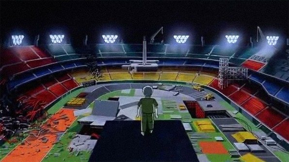
[Image: Bandai Entertainment]
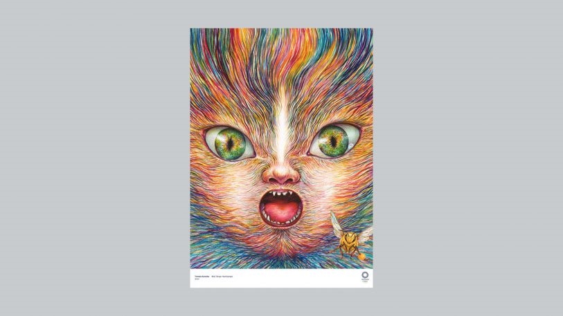
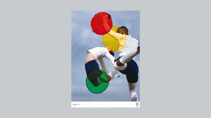
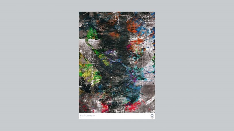
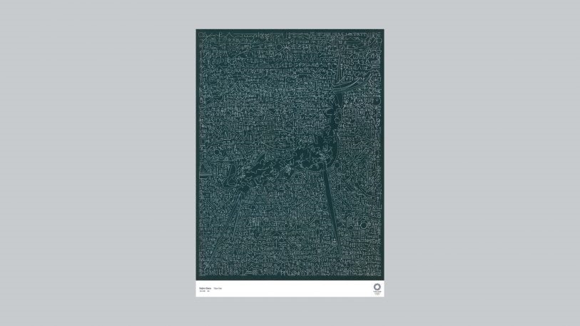
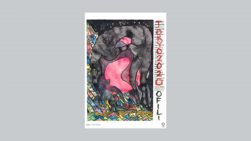
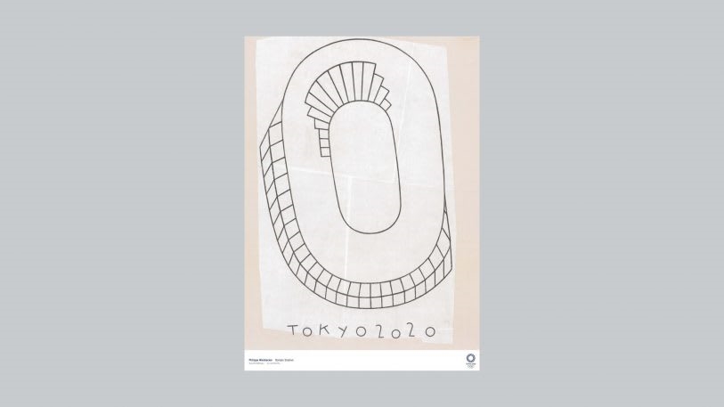
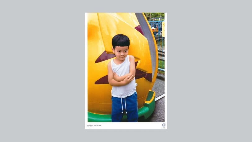
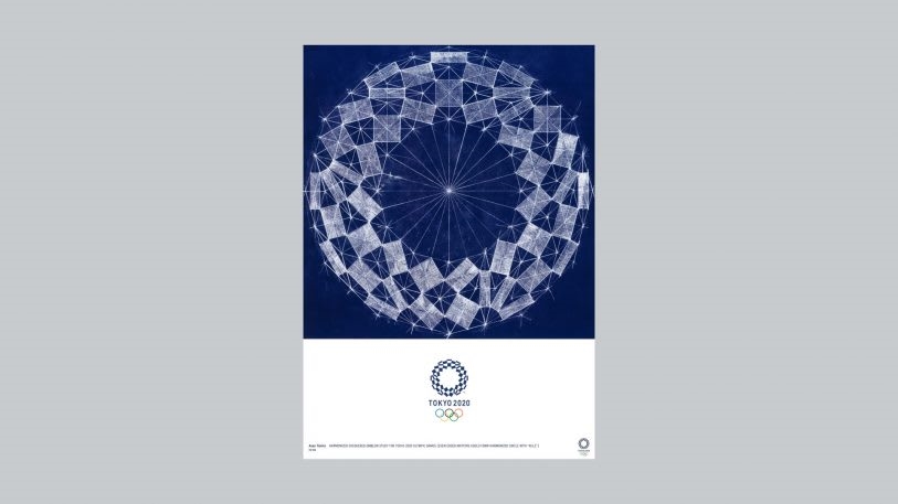
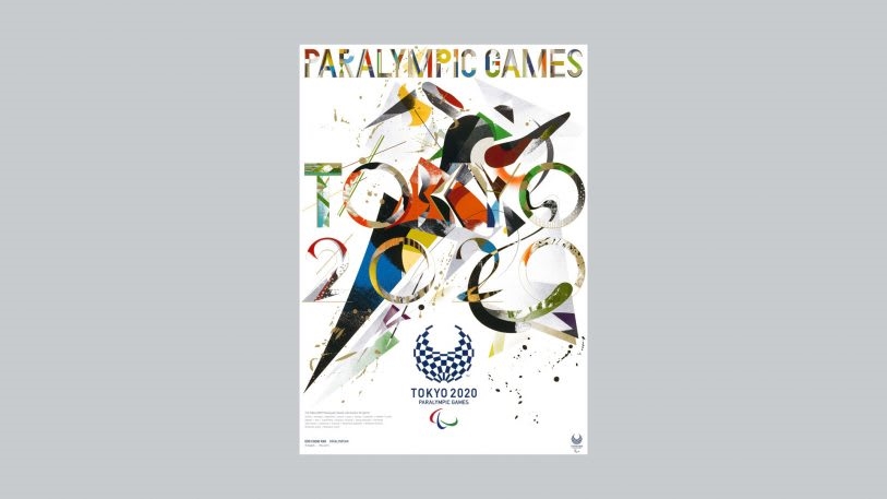
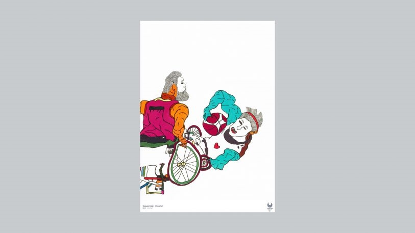
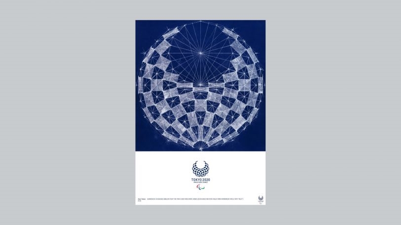
The call for official posters is part of an over century-long tradition. An artist selection committee of nine, ranging from museum professionals and journalists to practicing designers, chose a total of 20 fine artists, manga artists, graphic designers, calligraphers, and photographers from across Japan and beyond to bring their unique perspective to the Games. The inspired results are as diverse as the artists who created them.
[Image: courtesy Tokyo2020]
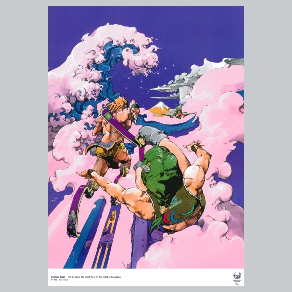
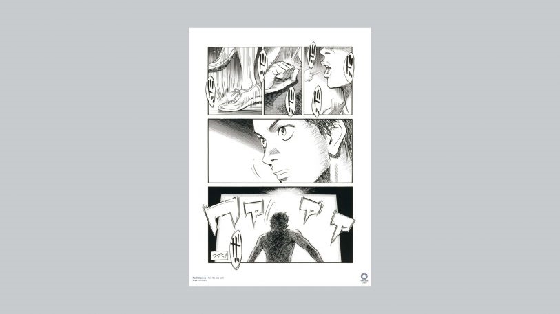
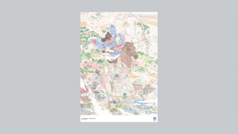
First let’s talk manga. There’s the composition by manga artist Hirohiko Araki for the Paralympic games. The poster depicts the “gods of sports” descending on Japan from thousands of feet above Mt. Fuji, and the perspective of the piece places the viewer directly behind them. With cotton candy-colored clouds resembling waves in the style of The Great Wave off the Coast of Kanagawa, by Katsushika Hokusai, Araki bridges traditional Japanese printmaking with his own craft of manga, and the result is playful determination familiar to anyone in sport. There’s also a poster by manga artist Naoki Urasawa in the “sports manga” genre.
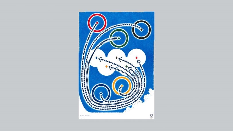
Of course, there are many more posters to get lost in than just of the manga variety. “In a world where we tend to be driven by abstractions and information technology, the entire image is hand-drawn because the Olympics are about competing by pushing the limits of one’s own physical and emotional ability,” wrote graphic designer Taku Satoh in his artist statement describing his design. The composition shows five Olympic rings against a bright blue background, trailed by dotted lines indicating their relative trajectories. In addition to the physical method used by Satoh to indicate an individual striving for personal best, the lines create a sense of movement, causing the eye to move around the page.
[Image: courtesy Tokyo2020]
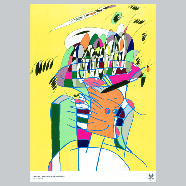
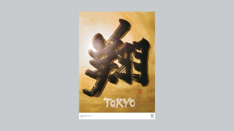
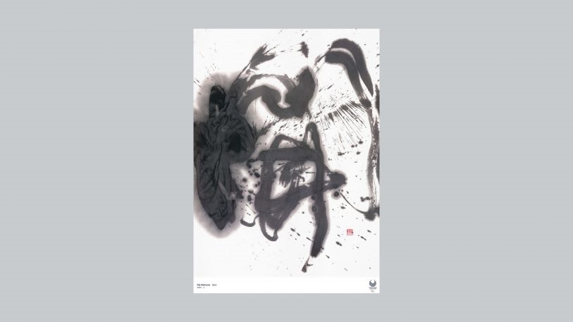
Artist Chihiro Mori offers a Cubist take on the Olympic rings; artist Tomoko Konoike takes us on a path of the surreal with a composition that explores our own unique umwelt (environmental factors that shape our perspective and behavior); calligrapher Shoko Kanazawa communicated both commitment and enthusiasm, along with a sense of depth and authenticity, through a single black calligraphic mark on gold foil.
These posters, along with over a dozen other designs, will be shown in the entrance of the Museum of Contemporary Art Tokyo through February 16. Unfortunately there is not a poster by Katsuhiro Otomo, who created the original Akira series. Seems like a missed opportunity to bend space-time, if you ask me.

Fast Company , Read Full Story
(35)

