The 4 biggest UI trends shaping Apple’s future
This week is Apple’s biggest event of the year—the Worldwide Developers Conference (WWDC). It’s not where Apple announces new hardware like phones or tablets, but it is where Apple reveals the future of its software platforms. And at this year’s keynote, Apple announced dozens of new features for iOS, iPadOS, WatchOS, tvOS, and macOS.
Most of these updates are iterative improvements to apps like iMessages or platforms like AppleTV. But when you add them up, you start to see important trends within these updates.
Apple is strategically evolving its interfaces in four ways that were clear during the WWDC keynote—aggressively leveraging artificial intelligence, letting you switch smartphone modes, leaning in to virtual presence, and doing the thing none of us can resist in the age of constant connectivity: tuning everyone else out.
Everything is AI
Apple has never been considered the leader of artificial intelligence research that Google or Facebook might be. But Apple demonstrated at WWDC that it is aggressively, and invisibly, working AI into its interface to shape new experiences.
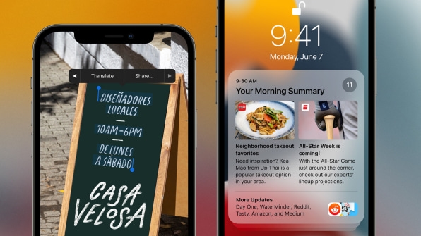
Where did we see AI lurking at WWDC? The system can now scan your photos to spot words and phone numbers inside of them, letting you call a number that you’ve photographed. It will translate speech to other languages in real time. Even Apple’s own AI assistant, Siri, is now closer to you than ever. (It runs completely on the iPhone instead of in the cloud, so it’s faster and you won’t lose connection.)
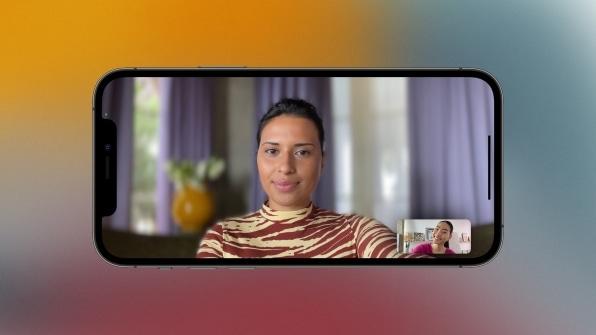
AI is isolating your voice from background noise in FaceTime calls. It’s blurring the background of your image, too, so you stand out.
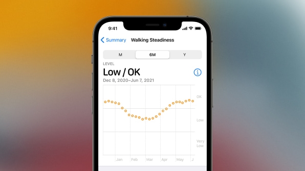
But perhaps most interestingly, AI is being tasked with helping your mental and physical well-being. Apple is now using AI to group together your notifications into little, newspaper-like summaries that can all arrive together in one single message. And as your iPhone tracks your steps and the pacing of your footfall over months, it can now analyze that data against clinical research to send you a notification when it seems you might soon have a fall—which is a particular concern for elderly people.
While these ideas aren’t new, Apple is demonstrating something important: The future of interface is built upon the foundation of AI. Our software cannot simply be designed around logical workflows and dazzling graphics any longer.
Your iPhone gets modes
We carry our smartphones everywhere. We bring them to work, to the couch, and to the bathroom. The problem is that as our contexts change, our phone stays the same.
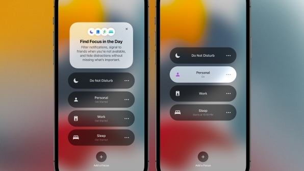
So far, Apple has tried to build a one-size-fits-always interface so that your iPhone can live in any situation. But at WWDC, the company announced a mode called Focus. Focus lets you actually change your home screen’s apps and widgets—and even who and what apps can message you—when you’re trying to work or sleep or just hang out.
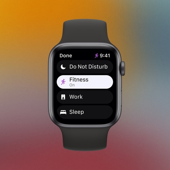
Apple presented Focus as a productivity tool—a way to manage your phone to tune out the things you don’t want. That packaging makes sense to sell it to a broad audience, but philosophically, Focus is saying something else. It’s a concession that as the iPhone took over the world, its single interface couldn’t scale to every context.
We’re seeing similar work at Google. As its VP of design, Matias Duarte, told us last month when debuting its Material You design language, “We use our devices and apps throughout the day. They’re with us more intimately and in more places than our shoes, clothing, and glasses. So why are they all stuck in this backward world? We can really be designing personally for each individual.”
Whether it’s Apple or Google, the bottom line is that our phones are getting modes. They will have something like their own UX metabolism through the day that, hopefully, is in sync with our own.
Virtual presence without virtual reality
For years, Apple’s FaceTime, iMessages, and even the phone itself have allowed people to communicate through sharp visuals and sounds. This week, Apple revealed that it’s not content with where these platforms are. They don’t just want you to communicate more clearly; they want you to feel the presence of another person, with all the tiny social cues we lose in platforms like Zoom.
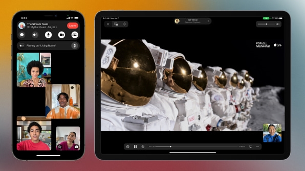
Now, when FaceTime displays multiple people talking at once, the app will localize their audio to where their panels are on the screen. It’s a virtual presentation of people in a room so that you can feel closer to the people you’re talking to, decreasing cognitive load in the process. Having tried audio systems like this before, I can say it’s the sort of effect that seems meaningless on paper but can be powerful when done right. You take a lot of cues from what you hear, and usually when you talk to someone on any platform, that sound is flattened. Apple’s new feature has the potential to make video calls much more dynamic.
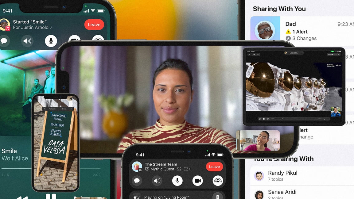
FaceTime will also get a feature called SharePlay, which lets you load a video, song, or even an app for a group of people so you can all share a piece of content together, virtually. Of course you could always share links for these things via iMessages, but now, Apple wants to facilitate the generally in-person experience of consuming content together. (One major limitation is that Apple appears to be making this possible only within the Apple ecosystem of apps thus far.)
Facebook has a similar feature called Watch Together; Netflix offers its watch “Party”; and there are several YouTube platforms to let people watch videos in sync. Now Apple is baking this sort of technology right into its phone. And as a result, SharePlay is introducing the potential to turn more personal moments on your phone into communal experiences.
Procrastination at last
The cost of having a phone on you all the time is that everyone knows you have your phone on you all the time. You are always reachable—technically, at least. Real life, of course, gets in the way of being able to talk to everyone else all the time.
In iOS 15 (in developer preview now, out later this year for everyone else), you’ll be able to set yourself as away, so those messaging you can see that you aren’t seeing their messages. (In emergencies, they’ll still have the option to reach you, though, which clears a big mental hurdle for those of us who have trouble unplugging.)
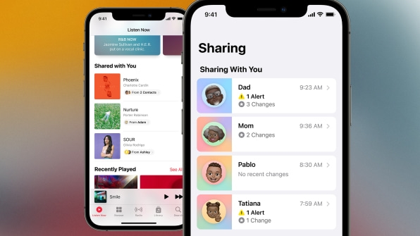
What about those big group chats, where people drop in all sorts of links with stories you mean to read but might not have time for? Now, iOS will save those links. Shared stories get a special tab in Apple News. Shared music gets a special category in Apple Music. All of this is automatic, meaning you don’t need to save a link manually, or keep a tab open that you’ve been meaning to read for weeks on end.
With these procrastinating changes, Apple isn’t just letting you put other people off, ducking out of social and work obligations. Apple is leveraging UI to acknowledge your life as something bigger than your phone. These updates are important to help rebalance our lives in the connected era. And in offering them, Apple is no doubt going to keep us using our phones as a result.
(38)


