The Bathroom Gets A Starchitect Makeover
Leave it to Bjarke Ingels to try to make you fall in love with your toilet-paper holder.
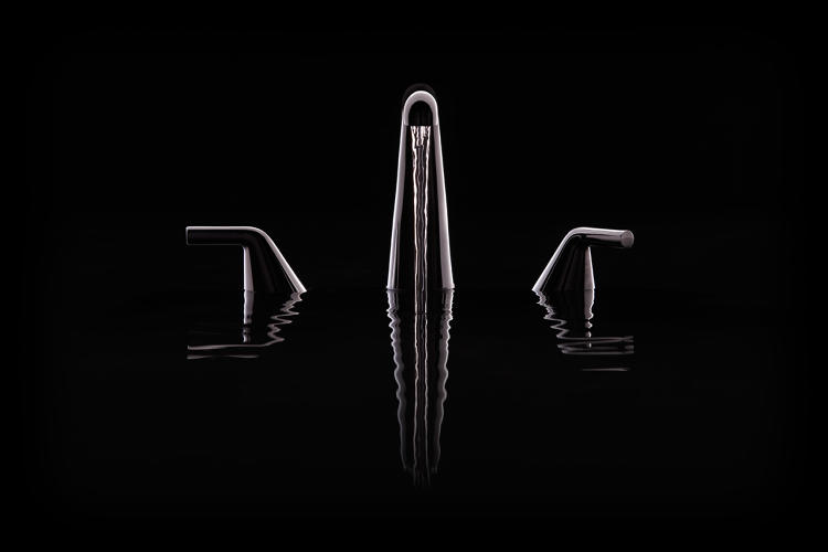
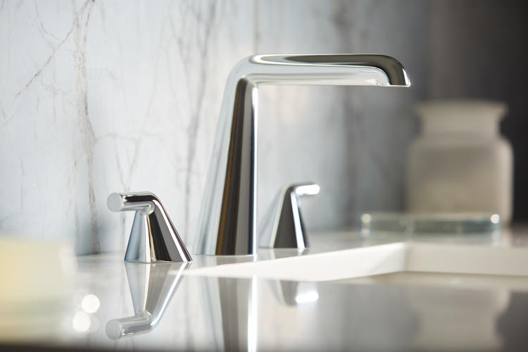
This week, luxury bathroom and kitchen product company Kallista is unveiling a new collection designed in partnership with Danish starchitect Bjarke Ingels’s firm BIG and his design consultancy KiBiSi. The Taper collection—which includes a sleek, seamless faucet, a toilet-paper holder, shower accessories, and towel bars—is designed to “merge the practical with the sublime,” as Ingels says, in an attempt to do the seemingly impossible: get people excited about, and drop a lot of money on, faucets ($1,095) and towel bars ($350 to $425).
The partnership is a first for both parties involved: It’s BIG’s first foray into the home interiors industry and Kallista’s first collaboration with an architect. As a strategic move, the partnership with Ingels helps Kallista and its parent company Kohler gain more cred within the international design and architecture communities, broadening the company’s sphere of influence against competitors like Rohl, Waterworks, and Dornbracht. Kohler, which was founded in Wisconsin in 1873, often collaborates with interior designers, “but in order to stay modern and contemporary, we broadened the search for partners beyond interior designers,” as general manager Adam Horwitz says in a phone interview. And to widen their geographic scope as well—appealing to luxury-obsessed design fans around the world—they intentionally chose from a pool of 100 “hot, rising star” architects, jewelry, and fashion designers born outside the U.S. Ingels, who is co-designing Google’s newest headquarters, museums in France and Utah, and an energy plant that doubles as a ski resort, ultimately won out.

In designing Taper, the architect focused the idea of Gesamkunstwerk—a German term that translates to “total work of art.” Such an object aims to “merge the practical and the sublime,” Ingels says. In the early 20th century, the Bauhaus movement applied this concept to architecture, sculpture, and painting, advocating a holistic view of elements of an artwork should relate to one another. “There’s often no relationship between the big idea of a building and the way things are inside, down to the little details,” Ingels says.
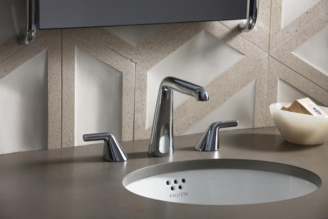
To connect his interior designs for Taper to the aesthetic of larger-scale building projects, he drew inspiration for the collection from the BIG-designed skyscraper Vancouver House. One of Ingels’s goals was to create a faucet that was as simple and effortless-looking as possible, and that mimics the sculptural gesture of Vancouver House. Ultimately, he made the faucet reflect the simple geometry of the pipe from which water is sourced: instead of combining several distinct parts, it’s composed of three seamless pieces of stainless steel, one for the spout and one for each handle. “Most faucet designs have lots of different components that come together—they look like complicated pieces of machinery,” Ingels says. “What we tried to do was make the design of the faucet the most blatant translation of the dimension from where water is delivered (the pipe) to the dimension where it’s delivered into the hand or body of the user.”

Even the humble toilet-paper holder—an object that doesn’t usually hold much aesthetic power—gets a refinement in the Taper collection. Instead of annoying springs that easily fall off, the holder is held on by magnets, so all you have to do to remove or add a roll is pull out the handle. The rod can also expand or contract so you can use it for 4- or 4.5-inch-wide toilet-paper rolls. (Four-inch rolls are becoming more popular because they save paper.) While calling any toilet-paper holder design “sublime” might be pushing it, this one’s certainly more elegant and easy to use than most.
“In general, our design sensibility in both architecture and interior design is perhaps well explained in the distinction between complexity and complication,” Ingels says. He defines complexity as “a form of refinement, a high form of simplicity.” In computer programming, for example, complexity is the capacity to transmit the maximum amount of information with the minimum amount of data and keystrokes. The more complex it is, the fewer gestures you need. Complication is the opposite—it’s busy, overwhelming, and inefficient. “Whenever we design a building, we try to distill the design to get the maximum impact with minimum means,” Ingels says. Now, he’s applied this thinking to bathroom design, and the results are like practical sculpture (they’re as expensive as sculpture, too!).
Browse the Taper collection, which ranges from $350 for a 12-inch towel bar to $1,095 for the faucet here.
Fast Company , Read Full Story
(135)


