The Beauty Of Failure: 12 Rejected Designs That Actually Don’t Suck
Recently Rejected, an online graveyard for unpublished, rejected, or unfinished design work, illuminates the creative process.
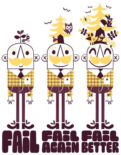
All creative people know that only a tiny percentage of the work they do ever sees the light of day. More often than not, work either ends up in the trash, gets brutally revised, or rejected by finicky clients. And enough rejections can leave designers convinced their work sucks and that they should give up and become accountants.
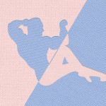
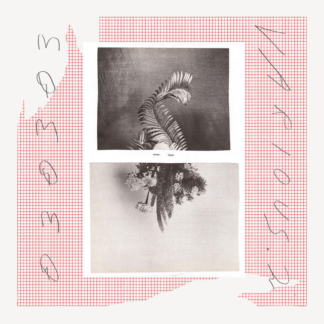
Artist and art director Mario Hugo, who founded the agency Hugo & Marie, knew that he wasn’t the only designer sitting on troves of unseen work. Hoping to give unfinished work a proper burial, he sent out a call to designers and illustrators and gathered projects that had been rejected or never published. Recently Rejected, Hugo’s newly launched website, shines a spotlight on this underappreciated material—and much of it is beautiful. From rejected covers for Wired magazine to unseen T-shirt graphics to project sketches for Coldplay, the images on the site are comforting reminders that rejection and failure are inevitable parts of the creative process. This can be easy to forget when designers usually only share polished final products.
“I’ve never thought of rejection as inherently negative—the title of the site is a tongue in cheek, playful meditation on process,” Hugo says in a phone interview. To wit, Hugo believes each of the projects on his site deserved to be rejected: “Ultimately, these works just didn’t make the edit.” Often, rejection comes down to either compatibility between a designer and a client, or appropriateness for the brief. “Maybe a musician didn’t feel an album cover properly reflected the music. Other concepts simply suited the topic better. A lot of very interesting, artful creative stuff just isn’t right for the brief.” (The site and its message bring to mind animator Don Hertzfeldt’s rejected cartoons for the Family Learning Channel, which later were renamed “Rejected” and enjoyed viral popularity online.)
The site illuminates the often overlooked steps it takes to get to a finished product. How often do you get to see other designers’ blood, sweat, and tears? “The site is like the death rattle of an old file that would otherwise remain tucked in an older folder,” Hugo says. You can see artist Micah Lidberg’s colorful pastel and pencil sketch for a fashion collection, filled with strange garden characters, and compare it to his finished work, offering insight into how he changed mediums and fleshed out the sketch into a vibrant illustration. Then there are Merijn Hos’s shape studies—pencil sketches of fanciful abstract shapes—which are more seeds of ideas than fully realized compositions, but which remind us of the importance of doodling as a way to spark creativity.
The site is still in its infancy—Hugo hopes it will evolve into a destination for behind-the-scenes creative content, including editorial features on process.
Check out Recently Rejected here.
Fast Company , Read Full Story
(111)


