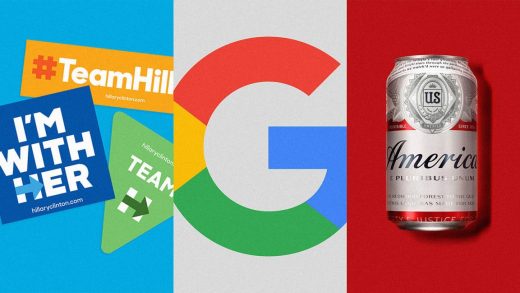
The best and worst brand designs of the decade
As 2019 comes to a close, it affords an opportunity to look at how design has changed on a larger scale: over a decade. This list is in no way conclusive, nor will it be able to catch all of those branding wins, losses, and changemakers that made an impact on the design industry over the years. But with the benefit of time, we’re giving the era a bird’s-eye view. So here goes—the best, the worst, and the most controversial brand designs of the decade.
Best
[Photo: Budweiser]
Budweiser
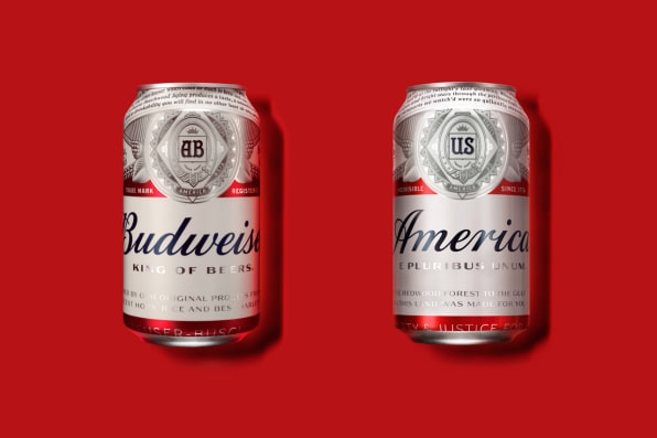
What’s incredible about the Budweiser identity is how well Jones Knowles Ritchie, the creative agency behind the rebrand, has sold the 140-year-old brand as a set of values. Its branding sets up a value system about the company itself, as “America’s Beer,” but it also establishes a sense of identity on the part of the consumer: to drink a Bud is to communicate your personal values. Budweiser is patriotic, its red and white label as American as apple pie. It’s the kind of beer Joe Six Pack would open, but with 14 custom type elements on the label, boy, that label is refined.
For that reason, it has found success in the apparel market, too: Consumers are buying Budweiser the brand on goods you can’t even drink. Perhaps you’d like an oversize Budweiser T-shirt from Urban Outfitters for $39. Or perhaps, you’d like a Moschino riff on the Budweiser brand as a $310 swimsuit. Somehow, Budweiser became cool, whether or not you drink it out of a can.
Google
In the little over two decades since Google was founded, it’s expanded immensely. But in 2015, it dropped some extra baggage, and we said goodbye to the serifs on Google’s wordmark and hello to its new sans serif custom typeface Product Sans. That change was just a small part of the new brand identity the tech conglomerate rolled out that year as it sought to establish an overall sense of visual minimalism across the many, many more places users would come into contact with the brand—without losing the brand identity.
In addition to dropping the serifs now associated with its years as a mere search engine, Google made the new wordmark scalable for varying digital applications. It also created a shortened “G” logo for use on even smaller scales. And it animated the mark as a functional tool to support user experience, for instance, transforming into dots that let you know pages are loading. The new system serves both form and function. It kept its kooky colors. But it also adapts to you, no matter where you find it.
MTV
In 2015, MTV got weird. (Weirder?) The channel became known for changing American youth culture, and the TV and music that catered to them, when it launched in the early 1980s—so much so that a generation was named after it. While that’s some nice caché, that generation outgrew the brand, and following a 2008 refresh that largely unified its look across affiliates, the company needed an overhaul for a new generation of teens: digital natives. So, they turned to the web for inspiration and created an early-web anti-design fever dream of a system: acid-trip colors, pixelated GIFs, Comic Sans. “One thing we wanted to make sure about this rebrand was that it didn’t stick to one specific, static aesthetic,” Sean Saylor, then MTV International’s creative vice president, told Fast Company. “We wanted it to constantly be evolving and iterating, like the internet.” MTV for the internet age.
[Photo: Corey Torpie/courtesy Tandem Design NYC]
Alexandria Ocasio-Cortez campaign
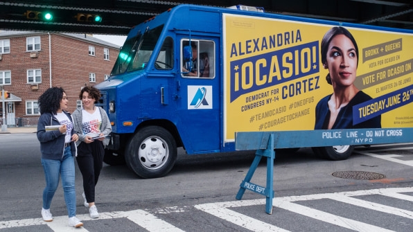
In 2018, 28-year-old first-time candidate Alexandria Ocasio-Cortez defeated incumbent opponent Joe Crowley in her district and won a seat in Congress. She did so with fresh campaign branding, designed by Tandem Design NYC. The campaign leaned heavily on inspiration from previous grassroots political campaigns from Cesar Chavez to the United Farm Workers movement in the 1960s.
The Tandem NYC team overcame the typographic challenge of fitting Ocasio-Cortez’s very long full name within small compositions—on top of introducing bilingual and sheared type treatments, which created a sense of movement. The brand also introduced a fresh color palette, anchored in purple with vivid yellow accents that eschewed traditional visual tropes in politics like red, white, and blue.
Worst
Gap
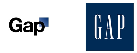
Gap overhauled its logo in 2010, ditching the white all-cap serif type within the navy blue box it’s known for with a new one designed by Laird and Partners. The new logo featured a black Helvetica wordmark, with the navy box de-emphasized and placed in the top right corner of the logomark. (See, still there!) “We believe this is a more contemporary, modern expression,” Bill Chandler, then vice president of corporate communications, told Fast Company at the time. “The only nod to the past is that there’s still a blue box, but it looks forward.”
It was met with an immediate wave of criticism. It spurred a redesign contest. The Gap logo got a Twitter handle. And ultimately, amid the outcry, the Gap logo got scrapped.
Trump campaign logo
When the Trump campaign announced Mike Pence would be joining the ticket as Donald Trump’s running mate, they also released an official logo. The logo, a rather unfortunate take on the American flag, depicts a T for “Trump” interlocking with—some say penetrating—the “P” abbreviating Pence below it. Needless to say, the logo was soon removed from the campaign’s site and replaced with the stacked version that is, well, also bad. But at least it’s not NSFW?
But, as objectively “bad” as the updated design of the logo was—not to mention the Make America Great Again hat—debate rages as to whether despite all odds, “bad” was actually most effective in communicating to his target audience—potential Trump voters. And maybe the conversation we need to be having is not whether or not a logo is good or bad, but is it effective? (Don’t worry, this logo was not.)
Most controversial
[Image: Wolff Olins]
The Met
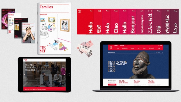
It could be safe to assume that many people don’t know what a “ligature” is. It is the term for a single glyph created by the combination of two letterforms—like æ. Seems harmless, right? So, as an unassuming individual with just that little bit of information about ligatures, you might be surprised to learn that in 2016, that little glyph incited a serious case of mass design hysteria.
The specific cause? Design agency Wolff Olins had unveiled a new brand identity for the Metropolitan Museum of Art , designed to be “welcoming and accessible while retaining gravitas and flexibility across user touch-points, communications, and locations.” The identity was meant to create a sense of cohesion between three physical locations and bridge the brand’s web experience with, oh, 5,000 years worth of art. Not many brands house a collection that goes that far back. To do so, the team took a design approach that combined serif and sans serif letterforms to connect letters and “to acknowledge the Met’s unique ability to embrace both classical and modern art as part of a united whole.” Red was adopted to convey a “timeless, cross-cultural symbolism of passion and vitality.” “The Metropolitan Museum of Art” was also abridged to “The Met,” which many people use to refer to the museum verbally, but which caused a freakout when seen visually. Vulture‘s Justin Davidson called it a “typographic bus crash.” HuffPost, eloquently, just wanted to know: “Whyyyy?!?!” All considered, the Met, and the 5,000 years’ worth of art within it, still stand.
Slack
In January 2019, Slack unveiled a new logo designed by Pentagram partner Michael Bierut and his team. Slack was previously well known for its multicolor hashtag. The Pentagram designers evolved the mark into a proprietary symbol: a multicolor pinwheel made up of shapes they call “droplets” and “lozenges.” Reactions to the design were strong. The combination of the pinwheel shape with the individual forms that made it caused Boing Boing to give the mark the unfortunate moniker of “penis swastika.” The name got picked up everywhere. Now that’s a constructive design critique.
But Slack was prepared for a meltdown. “With products like Slack, which people encounter everyday and are so engrained in their lives, changing the branding is bound to cause dissonance and backlash,” Bierut told Design Week. “Slack was completely prepared for this and anticipated that 95% of its audience would hate the change because they love Slack so much.” Some even learned to like it.
[Image: courtesy Hillary for America]
Hillary Clinton campaign
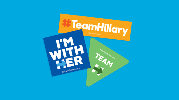
The Clinton campaign’s brand identity seemed to have everything going for it. It was sleek, adaptable, and beautifully designed by one of the most well-known design agencies in the world, Pentagram. And yet, it failed: After Clinton lost the presidential election in the fall of 2016, some began to wonder if the sleek look of the campaign was part of the problem. Why didn’t strong design make the difference?
The loss spurred industry questions about authenticity, relevancy, and corporatism. It led to self-reflection. And it spurred a reckoning. The reasons for why and how the Clinton campaign’s design was ineffective—especially compared with the Trump campaign logo—are still debated, and in some sense, left unanswered.
(49)

