The best and worst branding of 2018
Another year. Another bajillion dollars invested in branding. Some of it was good. Some of it was terrible. But in an era when every rando with a Twitter account has become a vocal critic, be sure, every rebrand was a risk of some sort.
In 2018, we saw brands invest more in their own custom typefaces to seep deeper into our consciousness. We watched as a new blue wave of politicians attempted to take back the country with Hollywood panache. And we also saw a lot of sans serif branding. I mean, a lot. Here’s a look back at some of the best and worst projects from 2018.
The best
The Alexandria Ocasio-Cortez campaign
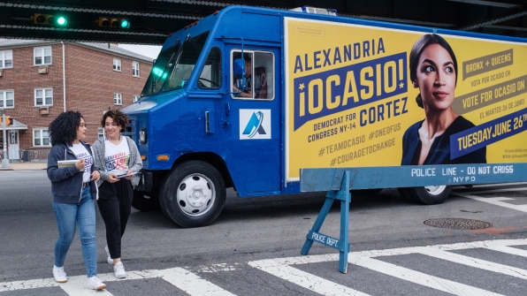
One of the great political success stories of 2018 was the rise of New York’s Democratic Socialist Alexandria Ocasio-Cortez. She beat incumbent Joe Crowley in the Democratic Primary with only $200,000 in funding to his $3 million. Now at 29, she’s the youngest person ever to have a seat in Congress. One of the many factors contributing to her win? Exquisite branding. Designed by the firm Tandem Design NYC, it borrowed the visual language of grassroots movements led by labor and civil rights activists like Dolores Huerta and Cesar Chavez, making it some of the most hopeful, disruptive, inspiring political branding since Obama ran in 2008.
Uber
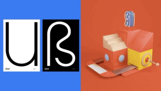
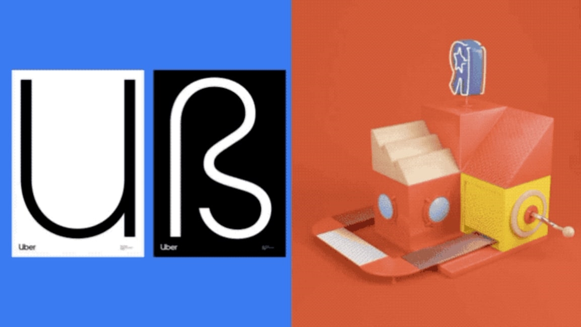
The branding firm Wolff Olins translated the visual manspread that was “U B E R” into an approachable, friendly-looking brand identity. Since Uber’s brand equity was saddled under countless terrible stories, and its circuit board app icon made no sense, it was a smart play that repaints the company as more accessible, and readies the company for its inevitable IPO.

How do you always know something made by Google is really Google’s? It’s an increasingly large problem for the increasingly large company. But the company’s new “Material Theming” tool translates those colors and curves you know as Google into every bit of its interface. Better yet, any brand that wants to use Material Theming can do so.
Toys “R” Us
The permanent closure of Toys “R” Us stores was one of the most unfortunate losses in retail this year. But before the toy giant was chopped up and sold by a holding company, it had tapped the branding agency Lippincott to reimagine its brand. And it was perfect, refreshing the company’s quirky old wordmark as a series of 3D games. Unfortunately, it never saw the light of day. Read our exclusive on it, and try not to get a tear in your eye.
The Weather Channel
We all know the Weather Channel for its Local on the 8s and using the same U.S. map that every other weather broadcaster uses to tell us if we should bring an umbrella. But this year, the channel took some risks and decided to reinvent its brand as an immersive augmented reality weather experience. Think: tornadoes ripping down studio walls, floods floating cars away, and fires flashing across California foothills. It was so wild, it worked. And at a time when weather is becoming more extreme–and those extreme weather events are becoming more common–it was also an important public service. The drama is real.
Avengers: Infinity War
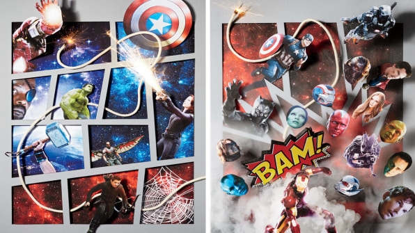
Disney bought Marvel in 2009 and has proceeded to turn it into a tremendously lucrative, ever-expanding brand. Nowhere was that more apparent than with the release of Avengers: Infinity War this year. Ten years and 18 movies in the making, it mixed characters, stories, typefaces, editing, marketing, and soundtracks into a single, giant slurry that may go down as the culmination of one of the greatest branding plays in history. Infinity War alone grossed $2 billion worldwide. And of course, there’s a sequel coming in 2019. The ride may never end.
The okay
American Express
American Express took 30 years to update its logo, and then hired the esteemed design firm Pentagram to do it. Pentagram proceeded to sharpen the letter forms, make the background solid blue, and cut the name to Am Ex. It was good, but safe. Perhaps it sets the stage for some more subversive updates down the line?
Mailchimp
No one can say Mailchimp played it safe moving by beyond its mid-’00s monkey branding for a sketched, frazzled, bohemian lifestyle look that seems inspired by what happens when a Matisse knockoff artist tries to to draw a New Yorker cartoon. At the same time, the email marketing platform kept its chimp logo. So now the brand is left in a weird middle place, between two disparate brand sensibilities. I kind of wish they’d just murdered the monkey logo and given us some brand brief like, “We realized the chimp was in all of us all along!” In any case, Mailchimp attempted to try something other than another copy-and-pasted tech brand, which should count for something.
The worst
BE BEST
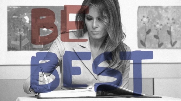
It was the campaign and word mark designed by First Lady Melania Trump herself. And you’d never know it! That is, if it didn’t look like the highlighter scrawl of a White House hostage sneaking out a desperately coded Post-It in the middle of the night by Secret Service pigeon. BE BEST. BEBE ST. STEBE B. In any case, I’m convinced when all those Mueller records come to light, it will come to mean something very important.
Coca-Cola
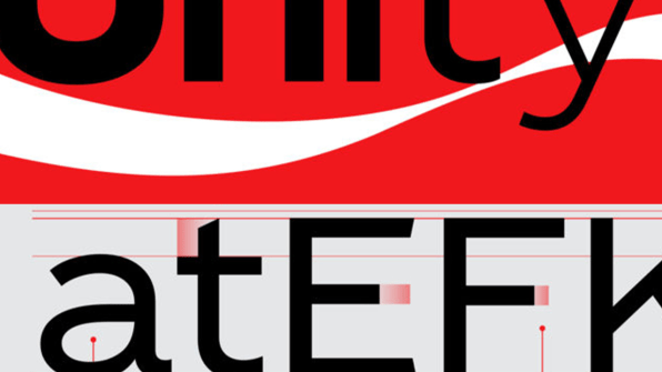
Oh, Coca-Cola. People won’t drink Coke. People won’t drink Diet Coke. And you release . . . a font called Unity. A font presumably meant to bolster your longstanding marketing story: That Coca-Cola can unify the world. I guess when you’ve already played the trump card of bottling tap water then selling it back to us as a $2 Dasani, there’s not much left to do to save Big Soda.
Blanding
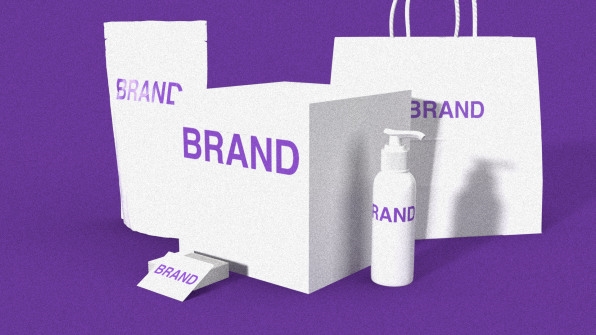
The worst of all the branding trends has to go to blanding–that millennial-bait, Instagram-ruling hyper-minimal lifestyle approach to products and logos that ruled 2018 but seems destined for a reckoning. You can almost hear the Jeff Foxworthy routine in it. If 99% of your logo is white space, you might be a bland. If you sell just one product and it’s not the iPhone, you might be a bland. If your name sounds like the name of a 1945 animated ghost cartoon, you might be a bland. If your marketing tacitly implied that it’s too much color on your favored boxed fusilli label that’s been keeping you up at night–not the crushing realization that 99% of all wealth on the planet is owned by less than 1% of the people–you might be a bland. We could go on for two whole standup specials, but you get the point.
(45)

