The best interactive design of the year
We live in the future. Cars drive themselves. Computers beat humans at Go. Voice assistants aren’t just here; they’re 50% off on Amazon. We can put digital holograms into meat space and our fleshy bodies into software. We can even bring the late ’80s Michael J. Fox into the modern era. That’s real life time travel!
More and more, computation feels boundless. Ultimately, though, it’s the ways we interact with computers that ensure we can enjoy those technological advancements. It’s also design’s role to mitigate, or provoke, the ensuing risks. The best interactive projects of 2019 include ergonomic breakthroughs in VR, artificial intelligence that serves as a check on data-guzzling corporations, and one very hilarious website to buy a purse.
Q genderless AI

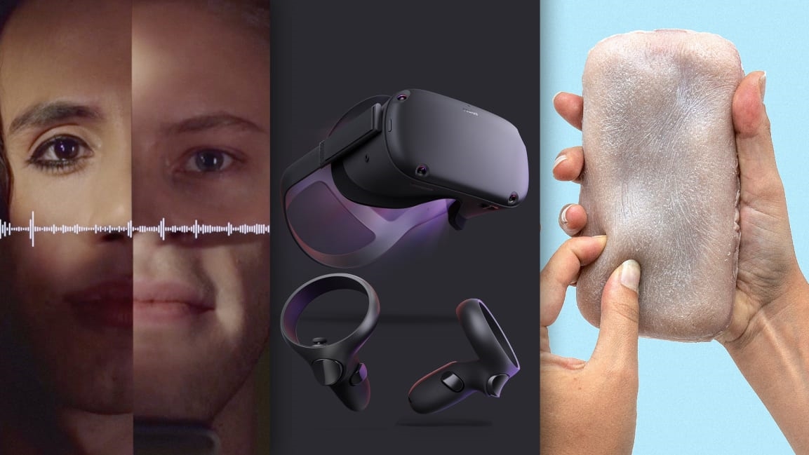
Ask a room full of designers why voice assistants are women by default, and you’ll get some nervous giggles that bury hard truths. (I know because I’ve done it!) But as society has come to recognize gender as a spectrum, it’s absurd to talk about male or female assistants at all. Q is the world’s first genderless AI, sampled from the speech of many nonbinary people, averaged together into one voice. And Q just makes a whole lot of design sense, too, given that computers have no conception of gender in the first place, so why should we ascribe it? [Link]
Virtual reality for everyone

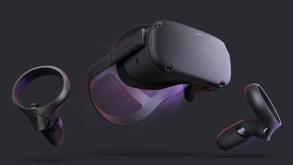
Facebook may have cost us our democracy, but at least it brought us the first, truly usable, self-contained virtual reality system that requires no wires or external cameras. The Oculus Quest, which launched this year for $400, is the iPod of VR. That’s because it solves not one but half a dozen huge shortcomings with virtual reality’s core interface—and most practically, how you can blindfold someone with a VR headset but ensure they don’t punch through a wall. [Link]
A privacy assistant for your voice assistant

Our voice assistants, like Google Home and Amazon’s Echo, are always listening. Technically, they’re supposed to only perk up and begin to eavesdrop with a “wake word,” but to hear that word, they have to be listening all the time! Project Alias is an open source piece of hardware/software that can literally stick onto a voice assistant and deafen it with white noise. Only when you tell it the wake word (and since Alias never connects to the cloud itself, it’s never sharing anything private you say) does it allow Google or Amazon to hear you. Alias could be a precursor to a whole new UX layer that’s built to protect us from big corporations. [Link]
Gleeful shopping
Online shopping tends to be about the goods rather than the experience. But Repeller, an experimental store by the fashion blog Man Repeller, is quite the experience. It’s an unpredictably zany, fun, and net-artsy take on buying apparel and accessories. Put it this way: When is the last time Amazon created a custom Mad Libs? Repeller teases a wave of ecommerce that could be about the journey of shopping rather than the destination. [Link]
A phone with flesh

[Photo: courtesy Marc Teyssier]
Stroke. Tickle. Pinch. These are the gestures of Skin-On Interfaces, an experimental take on smartphone UI that imagines your phone is not a slab of aluminum but a chunk of flesh. On one hand, it’s incredibly creepy. On the other, Skin-On Interfaces effectively demonstrates just how far we are from interacting with gadgets with the full, gestural language of humanity. [Link]
Humans born from a button press

I hit F5. I just created life. I hit F5 again. A new soul hits my screen. This is the power of This Person Does Not Exist, which combines a cutting-edge generative AI, which can produce convincing human faces from thin air, and a stupid-simple interface for doing so. In the era of Deepfakes, we’re entering a war on what’s real. This Person Does Not Exist articulates how Photoshop was only the beginning. Faking identity no longer requires skill when clever AI meets barebones UX. [Link]
Robot feeding

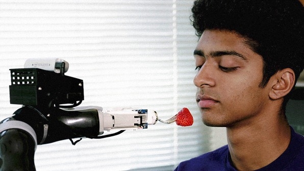
A million people in the U.S. cannot feed themselves, but a University of Washington research project is building a robot arm that’s capable of seeing food, poking it appropriately, and angling it at the perfect trajectory for one’s mouth. Perhaps that sounds simple. It is not. This is deep, automated ergonomics work (imagine forking a squishy banana versus a cherry tomato). And while in its early days, it’s a humbling demonstration of the soft skills robots will need to learn if they’re ever to care for us. [Link]
UI lit by room
Phones of today automatically turn up and down their brightness to match the brightness of the room. It’s a handy feature that saves your eyes from burning out of their sockets in a dark space. But Apple alum Bob Burrough imagined where this technology could go next. He developed a screen system that could actually respond to lamps, and other direct sources of light, to illuminate more like a book than a smartphone. It’s a wild effect the first time you see it. And then? It just looks normal. We should be making digital phones work more like normal analog objects. [Link]
Mind-blowing cabinets
These wooden cabinets by Sebastian ErraZuriz shapeshift, with panels that fan out and drawers that nest like matryoshka dolls. It’s enough to make you never want to see the minimalist design of Ikea again. Hello maximalist UX. Let’s make living our lives not as easy as possible but as fun as possible. [Link]
(65)


