The Blue Screen of Death in Windows 11 is going black
Windows 11 hands-on: A cleaner OS to keep you productive
Judging from the first Windows 11 Insider Preview, Microsoft’s next OS is shaping up to be much more than a mere Windows 10 update. The company is fundamentally shifting the way many aspects of Windows works, with a centered taskbar and redesigned Start menu, among other changes. But it’s still Windows, so at its core it still works like it always has. There’s the focus on productivity that Microsoft leaned into with Windows 10, along with subtler improvements that makes for a more pleasant user experience. At this point, Windows 11 feels like an OS that will please PC diehards and mainstream users alike.
Gallery: Windows 11 Insider Preview
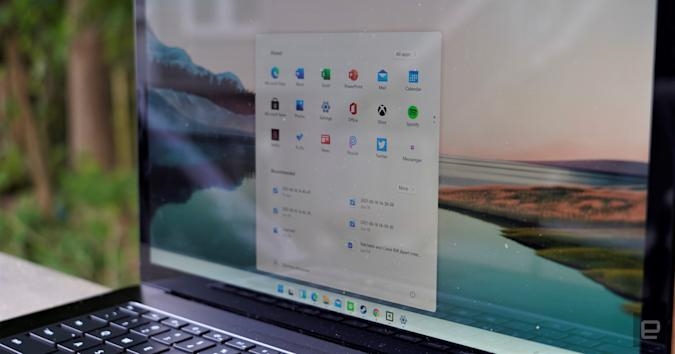

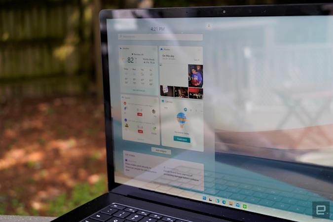
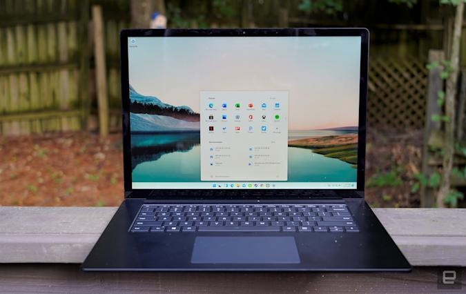
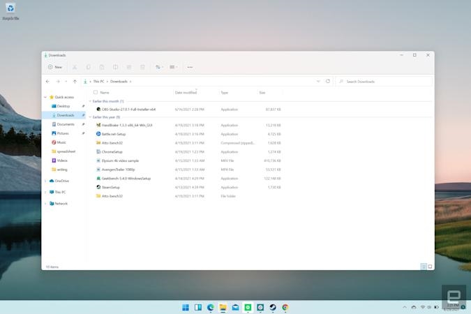
At first glance, the Windows 11 Insider Preview, which started rolling out on Monday, doesn’t look much different from the leaked build we covered a few weeks ago. The centered and icon-filled taskbar still looks distinctly Mac-like; the rounded window corners give off a slightly more polished vibe; and the redesigned Start menu is sure to be controversial. It features pinned app shortcuts up top, recommended files at the bottom, and a link in the top right to see the entire unfiltered Start Menu.
This Start menu is certainly different, but after testing out the leaked build for two weeks, I’ve grown to prefer the changes. I’ve never met anyone who used the Live Tiles in Windows 10’s Start menu, and those were just a distilled remnant from Windows 8’s horrific full-screen Start page. It’s nice to be rid of that legacy, once and for all.
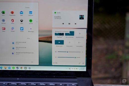
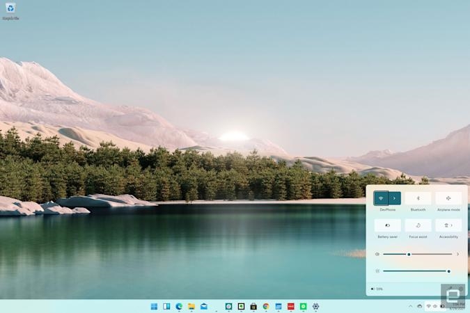
As I dug further into the preview build, I noticed small tweaks throughout that just felt, well, nice. Instead of combining notifications and system shortcuts into a single right-hand pane, they’re now broken up across two screens. Hitting the clock in the Windows 11 taskbar brings up all of your notifications, along with a full calendar. The system shortcuts, meanwhile, are combined into a single screen that pop up when you press the Wi-Fi, sound or battery icons.

From there, you can join other wireless networks, and turn Bluetooth on and off, along with airplane, battery saver or Focus assist modes. Sliders along the bottom also let you manage your volume and screen brightness. This isn’t that different from Windows 10, but the overall look is a lot cleaner and easier to read. (Maybe I’m just sick of hitting the “More options” to expand Windows 10’s shortcut settings.)
Microsoft is also clearly pushing a taskbar UI that only features icons in Windows 11. It’s something the company started doing with Windows 7, but up until Windows 10 you always had the option to turn on labels for taskbar icons (at least, until they started piling up too much). While it tended to make Windows look a bit messy, I always liked being able to see what a window contained before I actually clicked on it. Windows 11 no longer has label options of any kind, and there’s no indication that Microsoft wants to bring them back. They just don’t fit into the neat aesthetic the company is aiming for now.
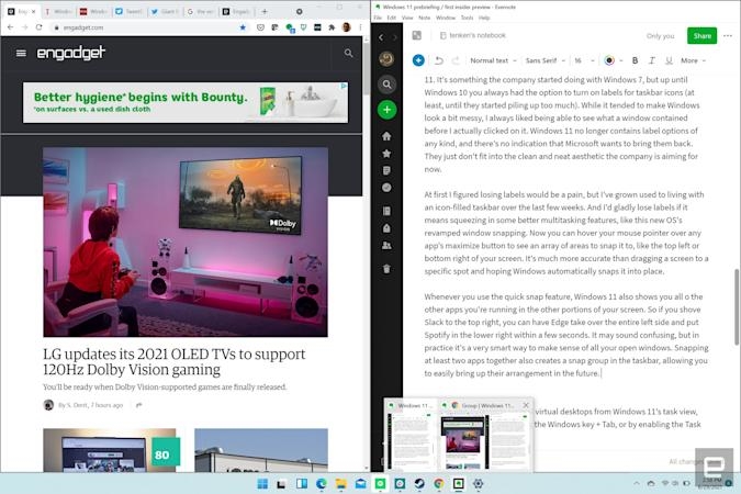
At first I figured losing labels would be a pain, but I’ve grown used to living with an icon-filled taskbar over the last few weeks. And I’d gladly lose labels in exchange for better multitasking features, like this new OS’s revamped window snapping. Now you can hover your mouse pointer over any app’s maximize button to see an array of areas to snap it to, like the top left or bottom right of your screen. It’s much more accurate than dragging a screen to a specific spot and hoping Windows automatically snaps it into place.
Whenever you use the quick snap feature, Windows 11 also shows you all of the other apps you’re running in the other portions of your screen. So if you shove Slack to the top right, you can have Edge take over the entire left side and put Spotify in the lower right within a few seconds. It may sound confusing, but in practice it’s a smart way to make sense of all your open windows. Snapping at least two apps together also creates a snap group in the taskbar, allowing you to easily bring up their arrangement in the future.
And if you want to take things to another level, you can customize several virtual desktops from Windows 11’s task view. You can reach that by hitting the Windows key plus Tab, or by enabling the Task View shortcut in the taskbar. That’s useful for creating entirely different work modes — say, one desktop for managing email and Slack, and another for focusing purely on writing. Having different spaces could help you stay in your productive “flow”, a concept Microsoft has practically made its corporate philosophy now. (Drink every time someone says “flow” at the next Windows event.)

One major addition with this Windows 11 preview is the new File Explorer, which wasn’t fully baked in the leaked build. Now, in addition to file and folder icons, there’s also a simplified toolbar at the top of the screen. But while it’s far sleeker than the Windows 10 explorer, which could get seriously cluttered if you had the Office-style Ribbon toolbar open, it’s also a bit confusing. There are the usual cut, copy and paste commands, but it took me a while to figure out one of the other buttons lets you rename files. I suppose it’s still easier to figure out than the Ribbon though, so I’ll call it a win for Microsoft.
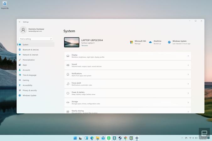
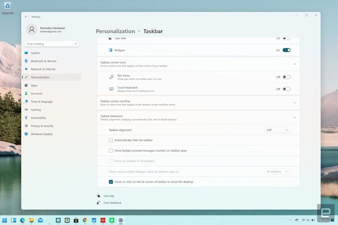
The new Windows 11 settings app is a clearer upgrade. Like before, it’s where you’ll go to tweak just about everything in your PC, but now it’s organized neatly into two panes. Along the left, you can choose the section, like “Bluetooth & devices,” or “Network and internet.” Along the right, you can drill down into specific settings. And if you don’t have a clear sense of what you’re looking for, the search bar at the top left can point you in the right direction (this is also true for every search bar throughout the OS). It seems like a silly thing to get excited about, but the new settings app could make it far easier for less tech-savvy users to adjust their systems. I can’t help but applaud that.
Among other notable additions, there’s also a redesigned Microsoft Store app in Windows 11. It has a navigation bar along its left side, rather than section tabs from before. Again, this seems to be a deliberate step away from Microsoft’s aging Metro design, which was all about top-level tabs. Widgets also make a return in this OS, something we haven’t seen since Windows 7. Now they pop up on the left side of the screen when you hit the Widgets button in the taskbar. At this point, they’re just simple square apps that can show you the weather, your calendar entries, or upcoming esports matches at a glance. There’s room for Microsoft to make them more useful, but it’s unclear how much the company plans to invest in widgets moving forward.

Some of the Windows 11 features I’m most excited to try aren’t yet available in this preview. That includes the ability to run Android apps, built-in Microsoft Teams chat, and AutoHDR for older games. Similarly, I haven’t been able to test some intriguing new features that actually have been included, like the ability to automatically change your refresh rate while inking or scrolling. That’s only possible on high-refresh-rate monitors that you typically find on gaming screens. Unfortunately, then, my Surface Laptop 4 review unit won’t cut it. Still, I can imagine it being useful. Normally, I just leave gaming notebooks at their highest refresh rate, which makes scrolling and any sort of screen movement look buttery smooth. But that’s not the best idea if you’re trying to conserve battery life.
Even though this is the first Windows 11 Insider preview, it’s easy to understand Microsoft’s vision for its next OS. It’s all about delivering a polished, uncluttered experience to make you more productive. If you’d like to try it out yourself, I’d strongly recommend testing it on a secondary computer. There are still some bugs that require the occasional reboot (and Microsoft is still trying to sort out installation requirements). Sometimes the auto-snap features just disappear, for example, and the old File Explorer Ribbon interface reappears. Microsoft clearly has a lot of work left to do. But at the very least, Windows 11 appears to justify an entirely new version number.
https://www.engadget.com/Gizmodo notesfeatured a Green Screen of Death since 2016July 2, 2021pic.twitter.com/KHbWDZT85nhttps://t.co/ARCRBQBubmadded QR codes to it in 2016The VergeWindows 11
(48)

