The Complete Guide to Data Visualization for Marketers, Creatives & Data Junkies
The Complete Guide to Data Visualization for Marketers, Creatives & Data Junkies

We live in a time where big data is coming in on a per-minute basis; sorting this massive data and understanding it is an exceptional task. Data Visualization, in this sense, facilitates this data management task with the aid of creative yet straightforward graphical representation of the data, enabling us as users to interpret the resulting information appropriately.
It is critical for marketers, creative professionals, and data junkies to be sure about the importance of data visualization in their respective domains. We are naturally attracted to visually appealing shapes and colors; therefore, we can understand things better if represented in a visually efficient way. When a movie, drama serial, advertisement, or even a painting attracts our attention visually, it is much easier for us to grasp and remember its message. We can also realize the efficiency of visual-based content that has better retention and attention level within our brain in terms of our memory and ability to absorb information.
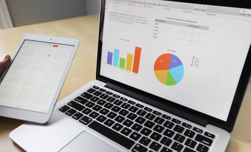
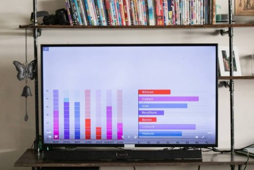
The same goes for visuals that represent data. We can imagine a bar or a pie chart. We immediately begin to notice different trends and proportions, making understanding and extracting the information more accessible.
What is data visualization?
To be more precise, data visualization is the technique that takes the information obtained through data collection and analysis and translates it into a visual context to make it more understandable. Its objective is to help people understand the data better and deliver their message effectively to the identified stakeholders. Using these graphical representations, we can draw better outcomes, share ideas quickly, and make better decisions by grounding them on facts and other industry-based insights.
The process of using data visualization tools to interpret and represent information, which drives business operations and decision-making, leads to ‘Business Intelligence’ based marketing strategies. Business intelligence-based marketing strategies create business knowledge from data analysis; they can transform data into information and information into knowledge. It is essential since it’s not only a matter of collecting or even analyzing the data but processing it and getting maximum productivity, turning it into an adequate reference for decision-making.
Data visualization offers the ability to acquire privileged information such as analysis of customer profiles and driving characteristics. This can guide entry into new markets, budget optimization, better buying decisions, among other components of a business journey.
Marketers, creative professionals, and especially the data junkies rely heavily on the available data to determine where to locate their efforts, who to target, and how to allocate their resources efficiently. To be effective, they need to convert raw numbers into actionable insights that will facilitate their strategies. The benefits of data visualization for getting business intelligence allow companies to visualize their data in various ways that can produce more actionable results.
The basic process of Business Intelligence based Marketing follows below:
- Observing data collection
- Comprehension of the raw data collection
- Predicting the outcome based on sorted and visually represented data
- Collaboration between departments and addressing the weak spots identified
- The decision and execution, creating the way forward
Basics of Data Design and Introduction to Some Helpful Tools
Today, several easy-to-use digital tools can be of great help when viewing the collected data. In most tools, we will find a good variety of data design templates to choose from. They can even automatically suggest which data design will suit better based on the data we want to process.
Data design is the best graphical representation of the data through efficient and lean design aesthetics. Data designs help to enhance the message of the visual data for any audience. It also means that better data design can help get through the message more efficiently to the audience than not-so-effective data design. Varying colors, design formats, graphics, and even the choice of presentation software all fall under the characteristics of the data design.
Different data visualization tools can also connect to cloud-based databases and store the information on designated devices or the cloud. Only to give some examples, we’ll recommend some tools below:
Google Data Studio
Google-based tools are often excellent value-holding applications. In this data visualization tool, you can connect to information sources directly and start working. It allows us to manage our dashboards and share them later in the cloud. It offers excellent value and data design templates for quick data processing tasks.
Google Chart
Although it’s another Google-powered tool, the Google Chart is very effective; it is a delight to share charts on your website. If you want to show dynamic visuals and constantly updated information, this tool can assist you well. It is compatible with most web browsers. The downside is that you need programming knowledge to implement it.
Tableau
Being among the most well-known data visualization tools in the market. This allows managing significant volumes of data and importing tables from Excel. It also creates interactive graphics that can be inserted and shared on websites and different devices without hassle.
There are numerous more options for choosing the best data visualisation tool; however, it depends on the users and the processed data to select the best tool for a company’s use.
Types Of Data Visualization and How They Work

It’s all about the message different graphics depict when understanding big data through data visualisation tools. By highlighting trends, patterns, and other values, we can understand the real story behind these raw data clusters. Data-enabled marketers, creative professionals, and data junkies can foresee possible outcomes about a particular business situation if they have access to visualized data. Predictions can happen like if the marketing roll-out campaign raised the sales volume or not for a specific time, we can show this forecast with the help of a line graph or even a bar chart.
At first glance, it would seem that every graph looks nice and works, but it is not the case. We must analyse what information we want to represent and what we would like to highlight to choose the visualization that best conveys our message. The most common are:
- Infographics
- Tree, heat, and point distribution maps
- Histogram
- Timeline
- Charts (linear, pie, bar)
- Diagrams
- Maps
- Dashboards
- Paintings
- Boards
- Bubble cloud
- Matrix
- Net
- Other more specific ones emerge from these previous ones, such as:
- Scatter, Area, Bullet, Gantt, Flow Charts
The Benefits of Using Data Visualizations in Marketing
Using data visualization, marketing professionals can easily see if their marketing strategy works or they need to re-strategies based on the identified Key Performance Indicators (KPIs) at a particular time. Marketers can also monitor specific time-bound or promotional campaigns and their different metrics accordingly.
Marketers, in general, can benefit from data visualization in the following ways:
- Data visualization allows you to unlock and access large amounts of data
- It enables you to analyze data that would otherwise be impossible
- It helps you collect more data and sort it as per your marketing campaign needs
- Encourage the absorption of data at lesser time
- Accelerates your decision-making process
- Saves time for employees, managers, and business decision-makers
- Present results and trends to several stakeholders
- Identify the profit or loss of a company and its reasons
- Shows relationships between operations and their results
- Identify anomalies in marketing strategies
- Encourage positive interaction with data
- Accessibility for all employees of a company
- Improves communication between the brand and society
- To define a variety of KPIs and other metrics
Data Refinement
The problem with massive amounts of data is that while getting an answer is easy, finding actionable new ideas can be costly if there is no agile way to scan terabytes of data. Data visualization tools help speed up the analysis process while refining it. And enables companies to react quickly to industry changes, track their success more effectively, and find data worth exploring more rapidly.
Budgeting for Marketing Campaigns
To manage a budget in a marketing campaign, one can track how different decisions regarding buying and selling of assets are performing. We can analyse the price changes and predict future situations making sure we achieve buying efficiency.
Identifying your target audience
The most effective marketing strategies and campaigns work because they can send the right message to the right people at the right time. One of the most significant benefits of data usage is its ability to gather information from various dissimilar channels and provide a complete view of a company’s customer base across all channels. The best companies that use this type of marketing analysis to assess demographics can better define their audiences and target them more easily by searching for the right metrics.
Improving the quality and speed of your reports
Another great benefit is that it is programmed to capture data from various sources and turn it into a clean stream for analysis and visualization. By reducing the time, it takes to standardize data; companies can react to an ever-changing marketplace with agility.
We can be clear now that data visualization opens up a world of possibilities to improve in any business or marketing activity, to be more direct.
Data scientists are data management specialists, and companies often hire them to explore more long-term possibilities of new investment ventures.
Conclusion
To conclude, we can say that the advantages of good data visualization outweigh its cons by far. It helps to communicate quickly and effectively. Improves the ability to memorise crucial information. Facilitates the effective distribution of information in any channel. Allows you to make faster and more accurate decisions. Helps identify factors that influence customer behavior and indicates which areas of a project or company need improvement. You can also predict sales volumes and timelines to achieve specific targets.
We can mention here that every data metric has unique information to share with the stakeholders. A collection of various targeted metrics that can pinpoint particular insights will add value to a great extent. So, companies who are already investing in data visualization to make a better decision-making process will reap benefits with time.
The post The Complete Guide to Data Visualization for Marketers, Creatives & Data Junkies appeared first on ReadWrite.
(74)


