The haunting secret behind the grotesque realism of ‘The Last of Us’
You might think that designing a TV series based on a hit video game like The Last of Us would be a straightforward task. After all, everything—the settings, the characters, the fungi—was already there. Making a show from it should be a simple matter of transferring assets from one medium to another, right?
The reality is that it’s much, much harder to do than that. Bringing a digital fantasy to life in a truly believable way required the production design team behind HBO’s hit zombie series to build an entire new world, for real. And then destroy it.
Like other high-quality fantasy TV dramas—like Game of Thrones or Andor—The Last of Us couldn’t be made in any other way. The production design team needed to build a parallel reality as tangible as our own. No green screening. No StageCraft volumes.
“Craig Mazin wanted everything to be hyperreal,” production designer John Paino says of the series cocreator. Mazin—who was also behind HBO’s Emmy-winning Chernobyl—knew very well that depicting dystopia realistically raises the stakes of a show. People feel it more viscerally. They care more about the characters.
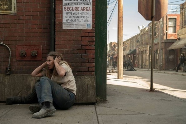
“The reality of everything gives the show its gravitas,” Paino tells me, adding that everything in the series (aside from CGI long shots showing the large-scale devastation of cities) was crafted as a physical set. Everything had to be walkable. Everything had to be touchable. And in the process of building a physical world, the original game had to be expanded.
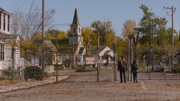
In a video game, Paino explains, players follow paths from point A to point B. For a TV show, the design team had to build a world in which the actors and the camera can move freely. “I approached [this challenge] not differently than if we were going to do a period piece in 1950s America,” he says. The game served as a look book for crafting the post-apocalyptic period piece.
Built to be destroyed
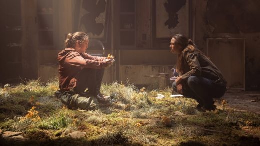
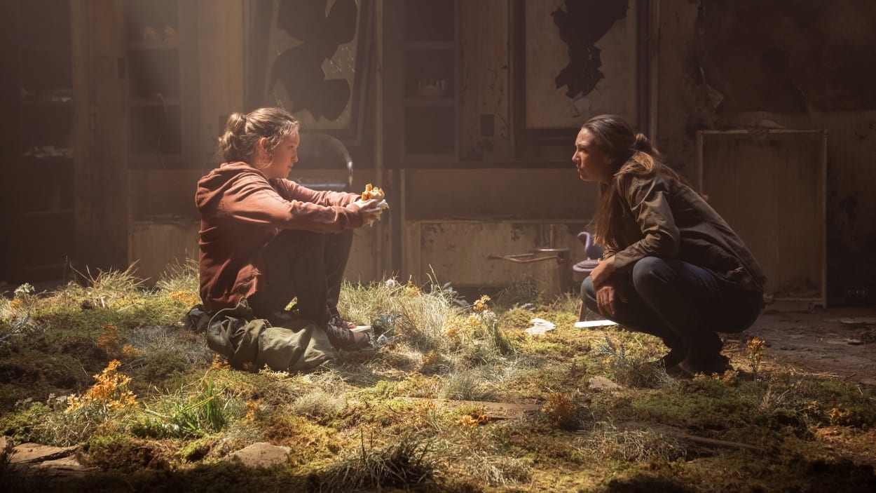
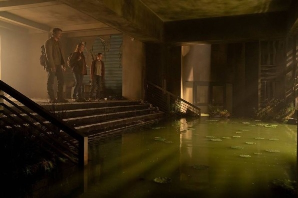
A striking example of this is on display in the beginning of the series when Joel, Ellie, and Tess find themselves at the fictional Bostonian Museum. The interior wasn’t a real place; rather, Paino’s team built it from scratch, from the wooden stairs to the bricks on the walls. Even the sabers, guns, china, and colonial uniforms inside the museum’s cases were painstakingly collected by the team as if they were the curators of a real museum.
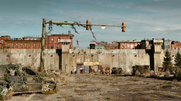
The exterior shots, filmed in the Canadian cities of Edmonton and Calgary, were augmented with complex dressing or, in the case of the Quarantine Zones, full structures made of concrete. Paino says that the Quarantine Zone walls were 35 feet tall and at least 100 feet long.
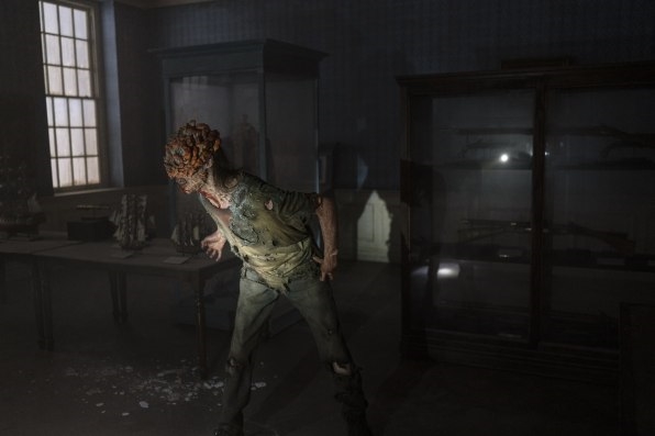
All of these physical pieces needed to look as if they had suffered years of neglect. To achieve the specific sense of degradation, Paino explains that they “built things and then broke them down” rather than creating things that look old and broken from the start. The team would build sets then wear them down, wreck them, or, as Paino refers to the process, “desiccate them,” as if 20 years had truly passed since the fungi invasion. “We would like the worldbuilding to be at that level,” he says. “And that’s what we always shot for.”
Fungus Among Us
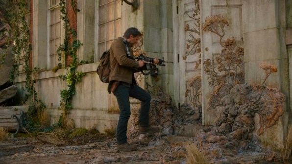
Despite the elaborate worldbuilding, the show’s main character is undoubtedly fungi, the creeping destroyer of the world that is omnipresent throughout the series. More than the architecture or any other production element, the fungi had to feel real without feeling excessive. “We wanted it to feel so real that the actors could look at it and go, ‘Oh, yeah, this is creepy,” Paino says.
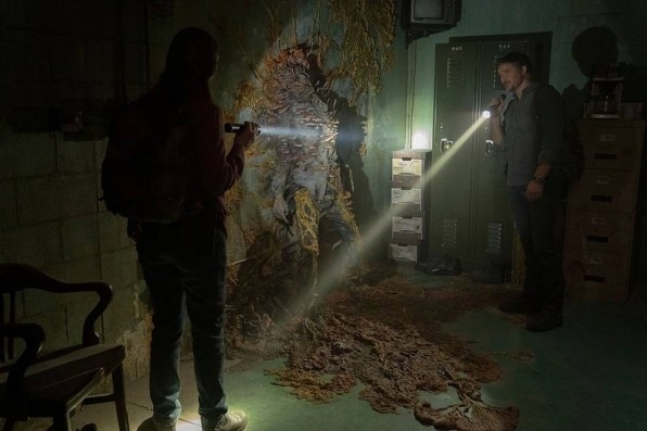
In the “before” times, the fungus was bright, like the neon signs that once existed. Postapocalypse, the fungus took on dingy browns and greens. For Paino and the creators of the show, the fungi had to become a character that existed separately from the zombies designed by make-up artist Barrie Gower. “We wanted to have some sense of melancholy in this world. To hark back to a world that won’t come back,” Paino says. Gower designed how the fungus lived in the world, ensuring that when it went through objects or crept along a wall, it felt realistic and believable.
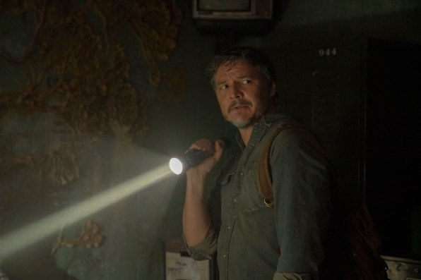
They researched how fungus reproduces and spreads, ultimately coming up with a grotesque pattern that drew inspiration from the ant-eating Cordyceps fungus. At the same time the designers also worked on finding interesting ways for the fungus to move through the world metaphorically, as a way to tell a story without saying a word.
“One of my favorite little bits in the museum was the colonial china, those teacups,” Paino says. “We got reproductions, we broke them, and put the fungus going through them.” Those tiny details make all the difference. They create dueling feelings of horror and romanticism, like when you explore old photos of times and places long gone by.
Paino believes that this attention to detail is what makes the show feel so real and so moving. “It’s not a shoot-’em-up,” he says. “It’s a story about real people in a real world.”
(15)

