Pentagram’s Paula Scher and her team have just unveiled their new visual identity for the U.S. Library of Congress (LOC)—America’s oldest federal cultural institution, and the largest library in the world—and an online brigade of armchair design critics have words to say about the august institution’s new look and feel, which will begin to roll out as soon as this fall.
On one side of the aisle, it’s “absolutely beautiful and intelligent,” a welcome change for a stodgy federal entity. On the other, it’s a loud, shouty design of Waffle House caliber that should be read in a burly “monster truck rally voice.” More respectful critics, meanwhile, have simply mourned and memorialized the one that preceded it.
Where do you side? Well, let’s step back and take a closer look: The Library of Congress’s previous logo and wordmark, designed by the legendary New York firm Chermayeff & Geismar & Haviv in 2010, features a blue geometric abstraction of an open book. Half of its pages are colored in 13 stripes, a nod to the American flag, and curled to look like it’s patriotically waving in the wind. A stately all-caps, sans-serif wordmark accompanies the logo, in a safe and somewhat austere style that recalls a large corporate publishing house, like Harper Collins or Random House. It’s not hard to imagine a sober logo like this on the spine of a book, for example. “The logo itself looks governmental,” says Scher, functioning more in a “traditional stamp-like manner of consistency.”
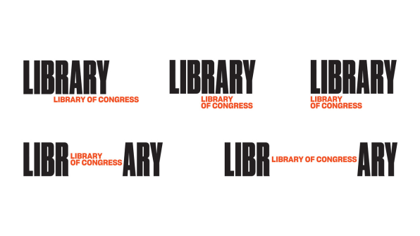
Pentagram’s update, by contrast, is decidedly less literary, though not for lack of words: An oversized, all-caps “LIBRARY,” boldly set in a thick sans-serif called Druk Condensed Super in black, is paired with the institution’s full name, “Library of Congress,” in a smaller stack of red words to the right. To the lay reader, it’s a bit of a verbal trip-up—LIBRARY Library of Congress—but makes a bit more sense when you see the branding in action.

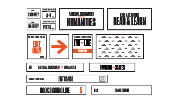
Scher’s take on LOC’s branding isn’t comprised of a static logo, but rather a “dynamic” design, one that flexibly changes with the addition of rotating content. Acting as proverbial bookends to display and frame the LOC’s wide-ranging catalogue of more than 32 million holdings—which include not only books, but also films, photographs, audio recordings, manuscripts, maps, and fine art—the main “LIBRARY” wordmark is then variably spliced apart to sandwich a rotating set of images: a violin, a Dorothea Lange photo, a flower specimen, a still from film footage. The content is rich and variable, making the logo perform as a sort of curatorial platform and showcase of LOC’s diverse collections.
“Dr. Carla Hayden, the new Librarian of Congress (Obama’s very last appointment before he left office), is the first person to ever hold that position who was an actual librarian,” Scher says. “She wanted Americans and the rest of the world to understand how vast the treasures are in the world’s largest library, and that they can be visited and accessed by everyone. The library contains an amazing breadth of stuff, every American movie, newspaper, recorded music, American sports stats, images and media, gun collector ephemera, type foundry fonts, even all winning entries of in AIGA competitions . . . You name it. It’s there.”

“Using tall typography as a metaphor for books made it possible to insert all sort of images onto the shelf,” she added.
The redesign is a decidedly less bookish take on an institution that has always been about more than books, and gives visibility to the rich spectrum of multimedia content held by the LOC, even educating the viewer and challenging their assumptions. It’s a clever implementation of a dynamic entity: a digital-friendly brand, likely to look better on-screen than elsewhere, for a constituency and cultural audience that, eight years on from Chermayeff & Geismar & Haviv’s last rebrand, has also been instrumentally and irrevocably shaped by digital culture.
The idea of a dynamic brand that acts as a vessel for rotating content, in fact, is so clever that Pentagram has already used it in another project—for its 2013 rebranding of London’s esteemed Serpentine Gallery. While designed by a different team within the firm, an announcement post from Pentagram’s own news blog paints the Serpentine logo the same way: “The logo acts as an aperture, opening for different content and different ideas in an ever-changing way.” Switch out “bookend” for “aperture,” and it’s ostensibly the same concept, albeit with different typefaces and palettes. Perhaps Pentagram is leaning on the internet’s eroding effect on our collective cultural memory—of the low likelihood we’d remember the Serpentine identity from five years back (a lifetime, in Twitter years), and the fact that it takes more bells and whistles to interest our wired, low-attention span, GIF-loving brains.
“Ironically, I didn’t think of the Serpentine gallery when I designed this,” Scher said, pointing out that several of the firm’s recent projects, including one for The Wing, involve a dynamic element, though none seem as closely aligned as the Serpentine identity. “That’s just Pentagram,” she adds. “The notion of creating a basis for revolving imagery isn’t new, but it is effective.”
In the end, all publicity may be good publicity in the world of branding. It’s hard to recall another time people got so riled up about a library—and that may be, whether unwittingly or not, the whole point of Pentagram’s LOC rebrand to begin with: To encourage Americans to more closely read between the lines.
(74)