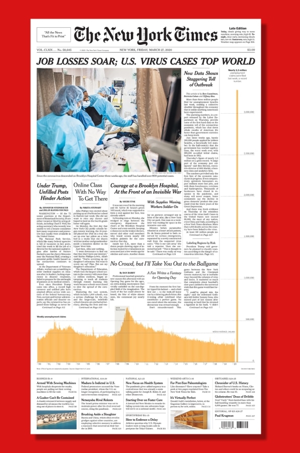
The most powerful single image of the COVID-19 crisis yet
There are a few front pages of a newspaper that are so striking, they become iconic: The stock market crash on Black Tuesday in 1929; the incorrect Chicago Tribune headline “Dewey beats Truman.” We can now add today’s New York Times to that list. It features a chart of job losses that are so staggering, it spans the entire front page.

[Image: The New York Times]
The Times gave over the right column—the most important real estate on a newspaper’s front page—to a graphic element that shows how unemployment claims during the coronavirus pandemic have skyrocketed in the United States. The graph charts weekly unemployment claims from the Department of Labor beginning in 2000 at the left of the page and progresses toward the right to the present. Visually, most of the data points are within inches of each other. The highest previous weekly unemployment claim was 665,000 during the 2008-09 recession, on March 28, 2009. But that data point is dwarfed by this week’s claims, which climbs past other headlines, above the fold, all the way up the right-hand side of the page: nearly 3.3 million. That’s about five times more—and five stories above—the previous highest unemployment claim level.
When creating graphics, information designers must choose the best way to present data, particularly whether to use a logarithmic or linear scale on the y-axis. A logarithmic scale visually compresses the data so it fits on a page, which makes it a great way to show a wide range of information within a single chart, but it can also mislead readers about the scale of the problem. With a linear scale, the value between data points on the y-axis (say, intervals of 500,000 unemployment claims) is constant, but it can be hard to display a huge range of data. In this instance, The New York Times opted to use a linear scale that didn’t compress the data. Strikingly, the graph didn’t fit within the normal bounds of the story.
Those soaring unemployment claims show how stark the crisis is in the United States and how abysmal the government’s response has been. Other countries are helping employers make payroll and keep employees on staff. The United States is not. And while the Senate just passed a stimulus bill meant to offset this unprecedented blow to the economy, the benefits to struggling Americans are a temporary Band-Aid compared to the policies other countries are enacting to shore up their economies against the health crisis. This visualization throws the failing of our government into stark relief.
(14)


