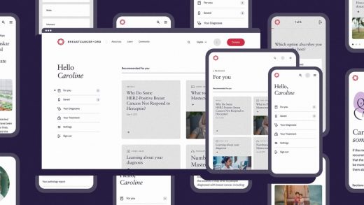
The new Breastcancer.org thinks beyond pink
Organizations like Susan G. Komen have transformed the diagnosis of breast cancer into a global movement. Come October, Breast Cancer Awareness Month, pink will take over the world again in cross-branded partnerships to promote breast cancer awareness.
But the much smaller Breastcancer.org isn’t an awareness organization. The nonprofit, started more than 20 years ago by an oncologist and used by nearly 200 million people since, was built to walk someone through the realities of dealing with cancer. The site relaunched this week, as part of a redesign spearheaded by the digital agency Work & Co. Before, it was a corporate-feeling page. full of links to news and resources, teasing its identity through plenty of pink highlights. Now, you might be surprised to see a few muted pastels and a massive amount of white space—along with no overt donate button, newsletter popup, or other self-promotional components.
“There is absolutely a brand differentiation component to it. Not just Komen, but all breast cancer advocacy really leans into pink to raise awareness,” says Lisa Kline, CMO of Breastcancer.org. “Our roots were not awareness but knowledge . . . we wanted to lean toward another direction.”
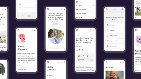
Instead, Breastcancer.org has been designed not to induct you into a tribe, but to feel inclusive to anyone facing breast cancer—whether that’s as a patient or a friend or family member. Part of getting there was to make sure that men, who also can get breast cancer, felt as welcome as women. (While colors have no gender, pink still carries a social stigma for some men.) While many nonprofit resources are loaded with generically produced stock photography, Work & Co used a minimal amount of any photography, so that anyone can see themselves in the site—no matter their identity.
“When users are first coming to it, a lot of them are just diagnosed. They’ve had that moment where they just got diagnosed at the doctor’s office . . . they heard the diagnosis, but [the doctor] didn’t explain anything,” says Lauren Shapiro, Group Director of Design Work & Co. “Maybe they get into the car, it hits them they were diagnosed, and breastcancer.org is that resource they land on.”
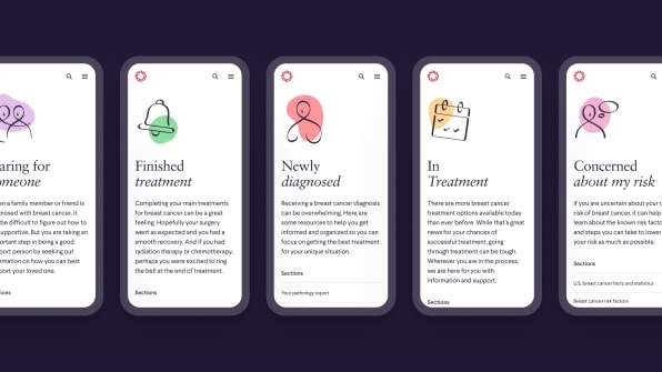
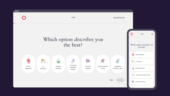
The site is designed around this initial moment of shock and confusion. When you first arrive, you can choose an archetype of who you are—whether that’s someone who was just diagnosed, or someone more ancillary, like a caregiver. No matter what you choose, you will land on a page providing more information and resources about the prognosis in clear language. This approach is refreshingly old school when it comes to website design, right down to the fact that these pages can read like very long FAQs, which require plenty of scrolling to reach the bottom.
“The pages are somewhat long compared to traditional, compact everything, and simplify it [content],” says Shapiro. “But we heard loud and clear from users that information is empowering. We don’t want people to miss it, so our pages are longer.”
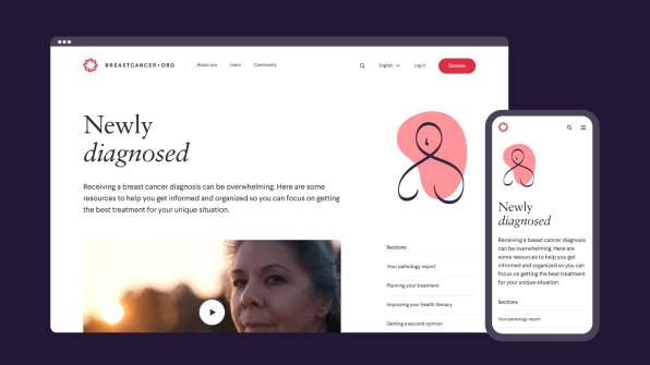
The white space, coupled with type spacing, is designed to be legible—which is especially important for the aging population and people in chemo who can experience vision problems during treatment. These pages are also interspersed with podcasts and some videos you can play right on the site, which require no reading at all. These different styles of content aren’t just about some “pivot to video” strategy; they’re intended to best serve someone dealing with cancer, however they feel that day. And notably, clicking any piece of content doesn’t usher you away from the site. It’s important information, presented as calmly and predictably as possible.
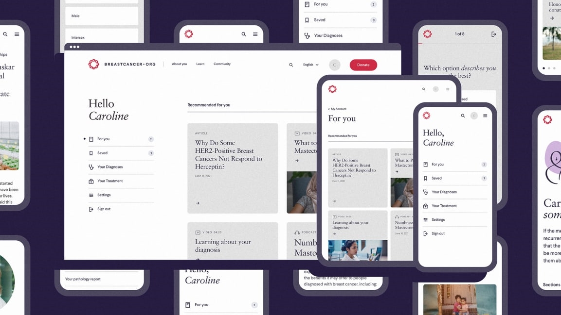
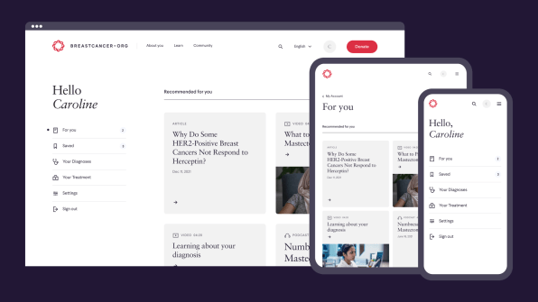
In the near future, Breastcancer.org plans to tailor more of what you see to be based on where you are in diagnosis and treatment. Today, the site asks if you want to make a profile—though it doesn’t dare ask this off the top, as many sites and apps do, because the organization wants to serve people best in those frightening first moments of diagnosis. (I myself never encountered this ask from the site, though I did find the option to create an account buried deep on one page.)
But assuming you do make an account, you can actually enter your diagnosis and treatment information. Using this data, Breastcancer.org will show you only the most useful stories—which is both a practical and emotional concern. The backend of the site has been constructed to allow content to be personalized.
“If you’re diagnosed young, and you might be concerned with things like fertility preservation, we want to be able to give you that information. On the same hand, we don’t want to talk to someone already in their 70s about fertility preservation,” says Kline. “We also don’t want to scare someone with early stage breast cancer by seeing content for metastatic (late stage cancer), or end of life issues.”
Eventually, Breastcancer.org hopes to go even further, and allow you to import your own medical chart into this system. By referencing your specific health data, it could annotate your treatment with even more specific and specialized content, such as pointing to new experimental trials that your hospital might not be involved with.
“You’re getting a whole load of health information, including physician notes about treatment, but what do I do with all this information?” says Kline. “It’s powerful if you know what to do with it.”
(36)

