The new Google AdWords interface is coming soon. Are you ready?
Bagpipe music in AdWords? Contributor Mona Elessily lists pros and cons of the new Google AdWords interface as she sees and hears it.

Google is gradually rolling out a new AdWords user interface. Word has it this change will be complete and available to everyone sometime in the first half of 2018.
Many of us using the new interface have been asking questions like “Have you seen this feature/report/functionality in the new interface?” If you are frustrated by the new interface, you are not alone.
Realizing others may have the same frustrations, I chatted with folks in my office and got their take on the pros and cons of the new Google AdWords interface.
Pros of the new Google AdWords interface
Let’s start on a positive note and talk about the pros of the new interface.
I like the way the program page loads; it’s more fun now. Reminds me of the way the new Air Canada home page comes online. I like looking at quirky “spinning” things while I wait for a page to load.
Some of the alerts at the dashboard level appear to do a better job of highlighting recent performance changes in a potentially actionable manner. If a group of products is showing a lot more or less often, there’s a chance my competitors are changing their pattern.
It could also be that we aren’t keeping up with seasonality in either direction. There can be a lot of swings in behavior seasonally, and they can be sudden. So that type of information is a help.
From an aesthetics standpoint, I thought the old AdWords home tab was unattractive, even ugly. Looks better now.
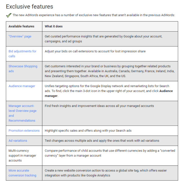
With the new interface, the early bird gets the worm. Promotion extensions on ads are only available in the new interface, and that can give you a competitive advantage.
There are a lot of new features in this version, for example, the Audience manager. It lets you set a campaign targeting people who have already engaged with your website or content in some way:

In addition to the Audience Manager, there are a number of helpful new features, such as bid adjustments for calls and promotion extensions.

The cons
Let’s take a look at the not-so-helpful changes AdWords has made.
I don’t like having to reset all of my columns. Say I’m digging in at the campaign or ad group level. There are thousands of ad groups I am used to looking at across a few accounts. Why won’t Google just port over my current columns?
The new ones I’m seeing clog up the screen with irrelevant columns, and they don’t use my key performance indicators (KPIs). I hate modifying columns, especially when I have to do it repeatedly just to keep working as I was before.
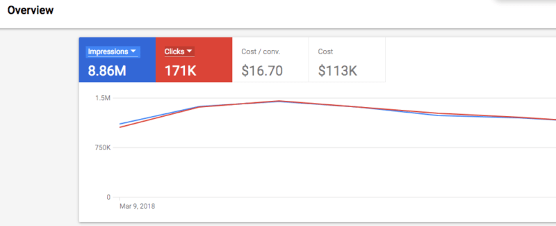
And is it just me, or is the line graph above the rows of ad group information too big?
I want to see a bunch of rows of information, and I’m stuck viewing what, the first two or three ad groups? The state-of-the-art use of white space, large fonts and waste areas toward the top of the screen further cram the actual information down the page where I cannot see it. And I am on a full-size monitor!
When I switch to a 15-inch laptop, the graph takes up half of the page:

Another con for me is that when I first visit an ad group, it appears the keywords aren’t even sorted by clicks, impressions or cost. Shouldn’t that be the default?
Zero-impression keywords are listed in my field of vision. Now, we’re all used to that happening when one “loses state” occasionally, but it feels like it’s going to be happening a lot.
The “your change has been saved” dismiss box makes a ceremony out of every bid change. I guess you have to see this, but it feels slow and intrusive compared with the old version. If they want to make it really memorable, I suggest an automated bagpipe recording be played in honor of each and every bid change!
As for the look of the new interface, overall the system feels more “dashboard-like” and aesthetically appealing, but this is a workhorse for many of us, not a viewing platform.
When I was talking with Andrew Goodman (from my company) about the dashboard, he had this to say:
I know we’ll get used to it, but now, I work very quickly and efficiently in accounts and this interface is going to discourage me from optimizing. Is this what Google wants?
I agree new features are welcome, but new features aren’t the same as the user interface. All kinds of different changes are being mashed into this overall release. It may be hard to put some of the new functionality into the old interface because the old interface may not be able to support it. I’m sure audience management and ad testing will improve over the current interface.
At some point, this type of change is inevitable. An example is when you switch to “month view” by clicking on the month drop-down, close the picker, and then re-open it. It doesn’t reset to “day view.” Instead, it just gives you a list of months, which is confusing because you can’t do anything with them. You must click on “day view” to make any kind of selection.
Here’s another con as far as I’m concerned: The term “household income” is not available in Canada, so we are enticed to use the interface to see that juicy bit of data, but then we can’t get it!
I think Andrew summed up the new AdWords interface well with this story:
Look, it’s fully possible this is just one of those painful adjustments people like me tend to put off. For 20 years, I played golf with a 10-finger grip, which is also known as the “Caveman” grip. And so you know, it’s not a good grip! One day at the driving range I decided to teach myself the proper grip. The first few shots were pathetic. A month later, I was getting used to it. Today, my swing is natural with the new grip and I don’t slice anymore. I think I’d rather be practicing my golf swing right now than learning to use a new user interface from AdWords.
It goes without saying that advertisers should get acquainted with the new Google AdWords interface sooner rather than later. Good luck!
[Read the full article on Search Engine Land.]
Opinions expressed in this article are those of the guest author and not necessarily Marketing Land. Staff authors are listed here.
Marketing Land – Internet Marketing News, Strategies & Tips
(77)


