The Note 7 May Be Samsung’s First Premium Phone With A Truly Premium Design
This is the first of a three-part series reviewing Samsung’s important new Note 7 smartphone.
Samsung is known for being a step ahead of Apple in introducing new tech features in phones, and for being several steps behind Apple in design. But with the rapid-fire releases of phones using its “edge” motif in the past year, Samsung is closing the design gap.
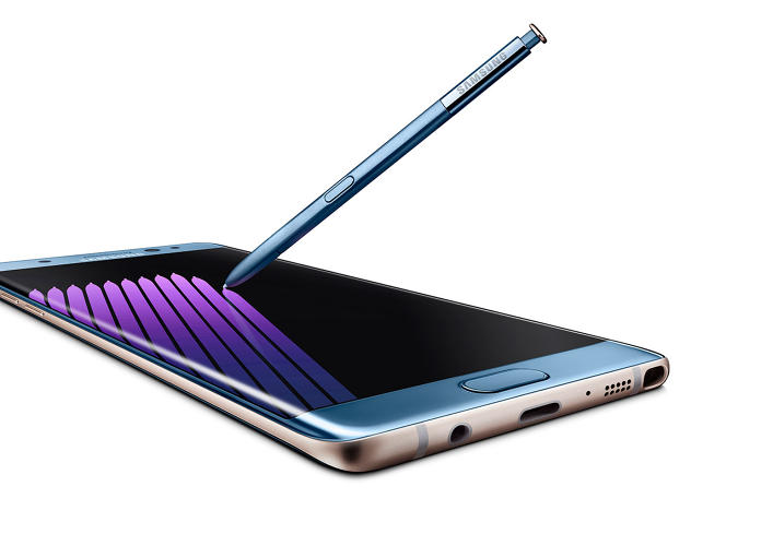
The new Note 7 is the fruit of that labor. The phone’s design seems to borrow the best elements of earlier Samsung phones while leaving many earlier design shortcomings behind. Much of the gloss has been muted, the hard edges softened.
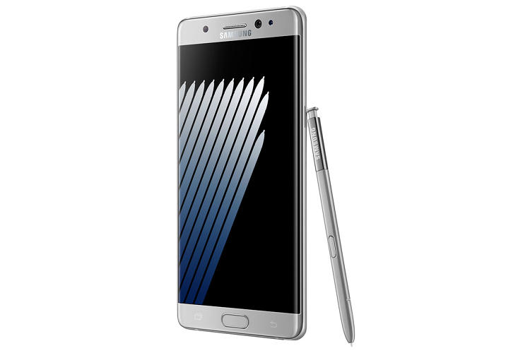
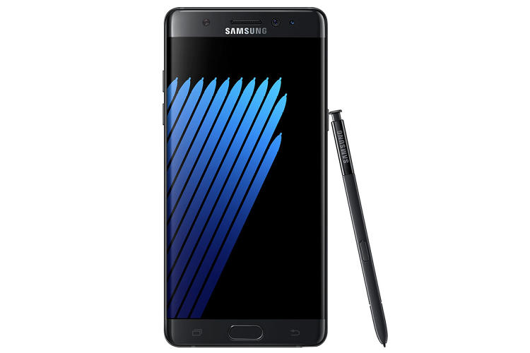
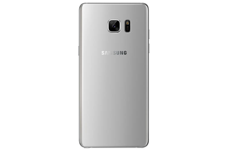
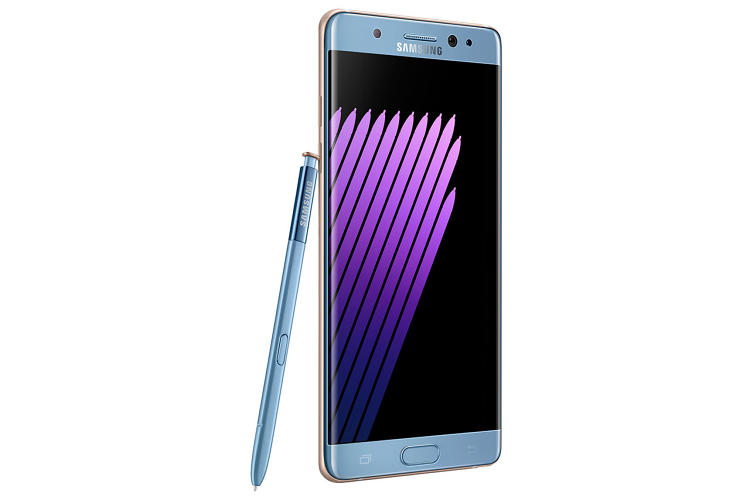
The new $850 Note adopts the curved-glass display element used in the earlier Samsung Galaxy S7 edge and edge+. The glass that constitutes the whole front and back of phone is rounded off at the sides, with just a narrow metal band constituting the side edges of the device. This gives the whole design a soft, rounded motif. Gone are the imposing metal lines around the display (and home button) of the Note 5. The Note 5 used the curved glass on its back, but the glass on its front was completely flat.
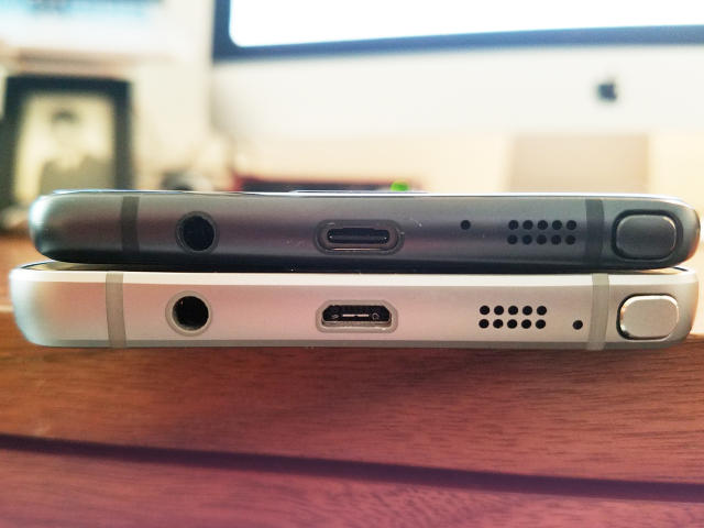
Even though the Note 7 and the Note 5 are roughly the same size, the Note 7—because of its economy of design—gives the impression of being a smaller phone.
Samsung apparently believes those curved-glass edges on its newer phones don’t rob the user of any display space. I was skeptical at first, but I think there’s some truth to it. When watching video on the Note 7’s 5.7-inch QHD Super AMOLED display (and it does look beautiful, with some of the best color saturation I’ve seen on a smartphone), the image doesn’t appear clipped or truncated where the glass curves back. Your eyes still see that part of the image; your brain comprehends it.
Like the S7 line and the earlier Note 5, the top and bottom corners (on back and front) of the Note 7 are rounded, too. But the Note 7 design uses a smaller corner radius, so the rounding-off is tighter and less attention-drawing, while still softening the hard angle.
My only worry about the artfully designed glass panels on both front and back of the Note 7 is that they might be terribly expensive to replace.
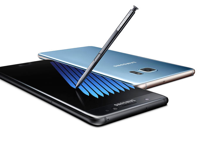
The Black Onyx version Samsung sent me for review, because of the dark color scheme, understates some of its design elements. Buttons, ports, and antenna lines blend into the phone, since they’re all various shades of gray or black. The phone also comes in Blue Coral and Silver Titanium colors.
Design-wise, the Note 7 still lacks the meticulous symmetry of the iPhone. On the iPhone 6s, for example, the speaker grill, Lightning port, and headphone jack are centered perfectly on the bottom of the device. On the bottom of the Note 7, both the USB-C port and the headphone jack are off center between the bottom edges. Also, the home button on the iPhone 6s recesses, while the home button on the Note 7 protrudes. And we’re talking only about the physical designs of the phones; how the iPhone 6s compares with the Note 7 UX-wise depends a lot on how you feel about iOS vs. Android. Android can be a very clean environment, but on the Note 7, at least, it’s sadly cluttered with bloatware.
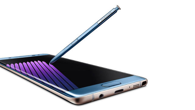
Still, it’s hard not to get the impression that while Samsung marketing dishes its corporate-funny ads making fun of Apple, the people over in the design department in Seoul have been eager students of the Industrial Design group in Cupertino. The compact, rounded look of the Note 7 is reminiscent of the design look Apple adopted with its first “large” phones, the iPhone 6 and iPhone 6 Plus. It’s a look that has greatly benefited the Samsung device.
Fast Company , Read Full Story
(24)


