The Role of Empathy in Design

Just a few decades ago, the idea that you could make a phone call to someone on the other side of the world using a flat electronic device that sat in your pocket was pure science fiction. We’d have to travel miles to find the goods we needed instead of having them land at our doorstep, and if we wanted to conduct a business meeting we’d have to do so in person. How things have changed.
We have overcome many of these obstacles through the ingenuity of intelligent design, but every small step we take has one underlying common objective – to make things easier for the user. In today’s world, things are probably more user-centric than ever before. That means a designer’s most crucial skill is their ability to anticipate user needs. Simply put, they’re problem solvers.
When it comes to user experience (UX for short), user satisfaction is increased when their interaction with a system or product is enhanced in some way. This might involve making it easier to use, making it more useful, or solving a problem the user didn’t even know they had. This requires a range of skills that will be honed and nurtured throughout an entire career, but what it requires more than anything is empathy.
So, what is empathy and why is it important?
Empathy can best be described as the ability to see things from another person’s perspective. To walk in their shoes and imagine what life must be like for them. That’s why if you’ve had a very similar experience to someone – for example, you’ve both lost a loved one – you could say that you empathize with them.
This is where empathy differs from sympathy. You can sympathize with someone’s pain, but unless you know what it’s like and you’ve walked in their steps, you can’t truly empathize. Empathy requires a connection and an understanding, and this represents the crux of the issue when it comes to design. It’s very easy to provide a band-aid solution that might help make things slightly easier, but to really solve someone’s problems designers need to think emotionally as well as intellectually.
How do design and empathy relate?
Whenever we start on a design project, it’s very easy to focus purely on features, functionality and format. Naturally, we want to make the very best product we can. But this distracts from what really matters – the user. As a result, we often end up with products that fail to satisfy despite being very feature-rich and capable.
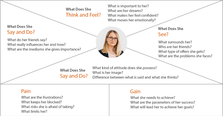
Wise businesses know that and have adopted various strategies to try and get to know their end user better. In effect, they’re looking to empathize. Gone are the days when user research was seen as a high-cost luxury which didn’t yield any fruit – today, that research is pivotal. A good UX designer should have very clear intentions based on their ability to empathize with end users. They’ll understand their frustrations, problems and pain points.

4 ways designers can use empathy to improve their work
User experience varies from one person to another. For that reason, design is very subjective. However, with enough research, you may conclude that certain user groups share common needs and expectations. Similarly, you might also find that users belonging to the same target audience have wildly different perceptions of the same product experience. For that reason, taking an empathetic approach to UX design can be quite tough, but here are some tips that should help.
1. Develop good observation and listening skills
Not every user is going to be au fait with design and may not be able to express their point very clearly. Some may not even be able to describe it. It’s therefore down to the UX team to observe and listen as best they can, and bridge the gap with their knowledge. Pay attention to expression, language, behaviour and tone to try and establish what the user is struggling with. You may be surprised at how much simply listening and observing can reveal.
2. Be mindful, and don’t hesitate to ask questions in surveys and interviews
While communicating with users, don’t be afraid to ask them to elaborate on their points. Start off with something they do like and find some common ground to get the conversation moving, then let them do the talking and prompt them for more input on points you feel are particularly important. Remember, conversations run both ways and they should feel natural – don’t just mindlessly run through a list of questions that don’t relate to one another. You want users to open up and be honest about what they like and don’t like without feeling forced or prompted.
3. Remove biases and accept what you see and hear
This point is crucial. It’s perfectly fine for designers to be proud of their work, but the best designers are always open to criticism and always willing to listen to various points of view. With that in mind, welcome every opinion with an open mind. Don’t project your views onto users during your conversations with them – you’re there to learn about them and what they feel.
4. Be sincere and humble.
Quite simply, be nice and keep an open mind. Nobody wants to be quizzed or interrogated. Structured and productive conversations don’t need to be stiff and corporate. Keep things natural and keep the conversation flowing by being genuinely sincere, attentive and respectful of their views. This will break the barrier and bring the critical aspects of their opinion into the fore.
Business & Finance Articles on Business 2 Community
(29)


