As with many virtuosos, David Brenner, founder of the San Francisco–based living wall experts Habitat Horticulture, makes his creative process seem intuitive and effortless. “Like designing anything, it starts with parameters that help define the aesthetic,” he says. But unlike the parameters of product design (dimensions, materials, and fabrication capabilities) or architecture (site conditions, budget, and permits), his parameters are often more ephemeral. Given the vacillating sunlight and climactic conditions on any given day, what will grow?
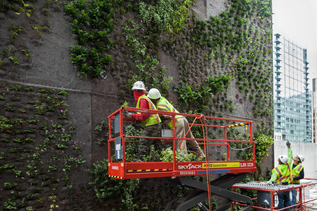
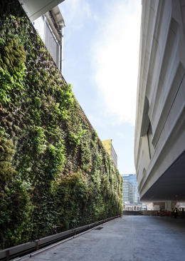
Brenner’s most recent project is a 4,400-square-foot living wall for the San Francisco Museum of Art, which is part of the art institution’s three-year renovation by the Norwegian architecture firm Snøhetta. To put that area into perspective, the average size of a house in the United States is 2,400 square feet. You could fit nearly six New York City-sized studio apartments onto the wall’s vertical footprint. It took 16,000 plants to cover the expanse, and to ensure they stay happy and healthy, Brenner had to design a complex irrigation system.

Before receiving such a high-profile commission, Brenner made a name for himself as the go-to designer for living walls. He has created designs for Ideo, Autodesk, Facebook, Salesforce, Tesla, and a slew of other offices, private residences, and public spaces.
“There’s a general shift toward reconnecting with nature and becoming more environmentally and health conscious,” he says of Silicon Valley’s insatiable thirst for living walls. “Architects and companies are looking more at the overall well-being of employees—and offering a view of greenery is a huge part of that. Plants have been shown to reduce stress and provide restorative effects. Innovation is the name of the game in the technology industry, so it’s no surprise they are inspired by the ability to bring greenery into office spaces without compromising valuable floor space.”
Brenner became interested in plants early on. When his grandparents took their annual summer vacation, they entrusted him to keep everything alive in their absence. “Growing up I didn’t know what I wanted to do but I loved plants,” he says. “I understood really early on the therapeutic value of plants just by watering them.”

He went on to study horticulture at Cal Poly, San Luis Obispo with a focus on environmental psychology. At the time—the mid-2000s—vertical gardens weren’t the Pinterest and Instagram stars that they are today. “No one knew what they were,” Brenner recalls. During an apprenticeship at Kew Gardens, in London, everything clicked. He was fascinated by all of the plants growing vertically and noticed that no one was really doing this in the United States.
From there, he focused on developing a system to grow plants vertically, which poses a lot of technical challenges, from building a robust enough system to hold the weight of the plants and soil to devising an irrigation network. “One of the botany professors gave me a greenhouse in the middle of Cal Poly that was like my laboratory,” he says. “I could play with different growing mediums and refine the system.”
After college, Brenner worked for a few nurseries and contractors, and completed some artistic commissions.
“I started small and grew organically from there,” he says—pun probably intended.
He got his big break after working with the California Academy of Sciences, a large science museum in San Francisco. After an indoor living wall they installed died out, they called Brenner to resuscitate it. “That opened a lot of doors,” he says.

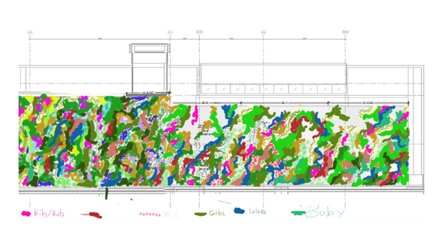
Every commission Brenner receives is different. For SFMOMA, Snøhetta didn’t want the wall to read like a rigid geometric wall. “They wanted it to feel really natural—like the essence of an understory plant community that you’d find if you hiked on Mount Tamalpais or in the Oakland Hills with native species and monochromatic shades of green,” he says. When he starts designing a wall, sometimes he begins by making an abstract sketch on an iPad, and then matches the different colors to plants. Other times when the lighting conditions are more sensitive, as was the case with SFMOMA since the wall is located in a sliver of space between a parking structure and a building, he begins by mapping out the shade patterns using a computer program.
After figuring out the lighting conditions, he then taps into his encyclopedic knowledge of plants and builds the landscape from there. Since many people would approach SFMOMA’s wall from the side, he wanted to have leafy botanicals that would add texture and movement to the composition. Think lots of ferns and amorphous swaths of greenery that your eyes get lost in. He also thought about what plants would grow during different seasons so the wall would change slightly throughout the year and still look lush in the winter.
San Francisco is perpetually water-starved, and even though Habitat Horticulture specified native plants that thrive in the local climate, they had to get creative with watering and worked with the Oakland engineering firm Hyphae to come up with an efficient watering system for the 10 different irrigation zones on SFMOMA’s 150-foot-long, 25-foot-tall wall. Sensors embedded in the wall track moisture levels. Once they get too low, they signal the automated system to water specific areas. The system uses storm water collected from the building as well as condensate from the HVAC system.
“There’s a whole room in the museum’s basement to support the living wall—I call it the life support system,” Brenner says. The system analyzes the pH levels in the water and knows when to add fertilizer on its own.
After building the wall’s infrastructure, Habitat Horticulture then projected the planting blueprint over the wall and traced the outline to create a paint-by-numbers template, which looks a lot like a Pollock splatter piece. Then, they installed each of the 16,000 plants by hand. After the greenery had a chance to grow in, the team continued to tweak the design up until the museum’s opening on May 14.
In its architectural design for SFMOMA, Snøhetta incorporated social areas so visitors could take breaks from the galleries. The living wall, which is visible outside and from the third-floor galleries, is one of the strategies to quell art fatigue, or becoming overwhelmed from looking at so much stuff.
“It’s really an experience walking out of this contemporary museum,” Brenner says. “After seeing all this artwork, you’re kind of drawn to something that’s calming and moving. You can see the rustle of leaves in the wind. Seeing something natural and beautiful resets your mind to go back inside to look at more art.”

Trulia, San Francisco
![]()
Tesla, Fremont, California
![]()
Foundry Square III, San Francisco
![]()
45 Lansing-Jasper Apartment Tallest Wall, San Francisco
![]()
Autodesk, San Francisco
![]()
City Sports Club, Mountain View, California
![]()
DPR Construction, NetZero1, San Francisco
![]()
Metreon, San Francisco
![]()
Metreon, San Francisco
![]()
![]()
© Henrik Kam, courtesy SFMOMA
![]()
© Henrik Kam, courtesy SFMOMA
![]()
© Henrik Kam, courtesy SFMOMA
![]()
© Henrik Kam, courtesy SFMOMA
![]()
Fast Company , Read Full Story
(99)