The top Walmart and Amazon product page experiences of 2017
Columnist Andrew Waber looks at some of the highest-scoring product pages on Walmart.com and Amazon to offer tips on how you can improve the consumer experience in 2018.
 There isn’t “one thing” separating a great product page from a terrible one. Instead, brands in 2018 should think holistically about how they are crafting a positive consumer experience on their product pages — even on third-party retailer sites.
At a very high level, brands can boil this concept down to execution across eight product page components: product title, product description, bullets, images, image resolution, rich media content, product rating and number of reviews.
Related to my work at Salsify, our analytics team has set up a number of data-gathering operations to power a grader for Amazon and Walmart.com product pages across all these elements. The grades themselves are based on best practices identified by the retailers themselves.
The product pages below were captured by our grader tool during Q4 2017 and were among the highest-scoring in their respective categories. Each presents its own directional lesson to brands thinking about ways to test and improve their product pages on these major retail sites.
Clothing
New Balance Men’s Arishi Fresh Foam Running Shoes
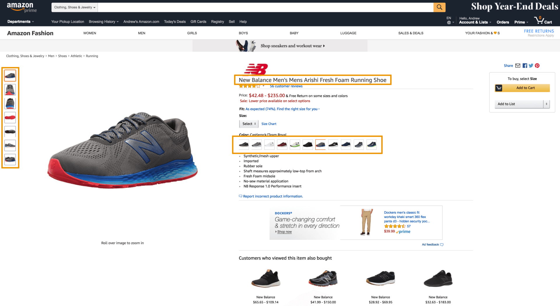
New Balance’s Amazon page for its men’s Arishi shoe had high marks across just about every metric critical to a great product page. Qualitatively, there are a number of tactics New Balance uses to great effect.
The wide array of hi-res images all change depending on which of the many color options the user selects. The product title intentionally adds a misspelling of “Men’s” to capture searches without the apostrophe.
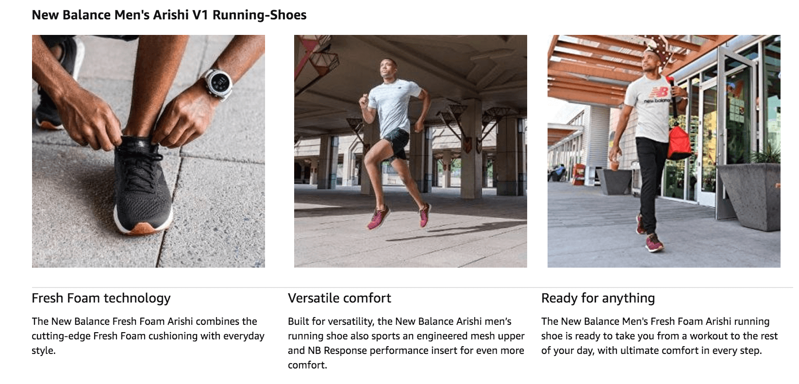
Finally, the rich content farther down the page succinctly and visually lays out the benefits of this entry-level running shoe.
Home goods
Safavieh Lavena Power-Loomed Shag Area Rug or Runner
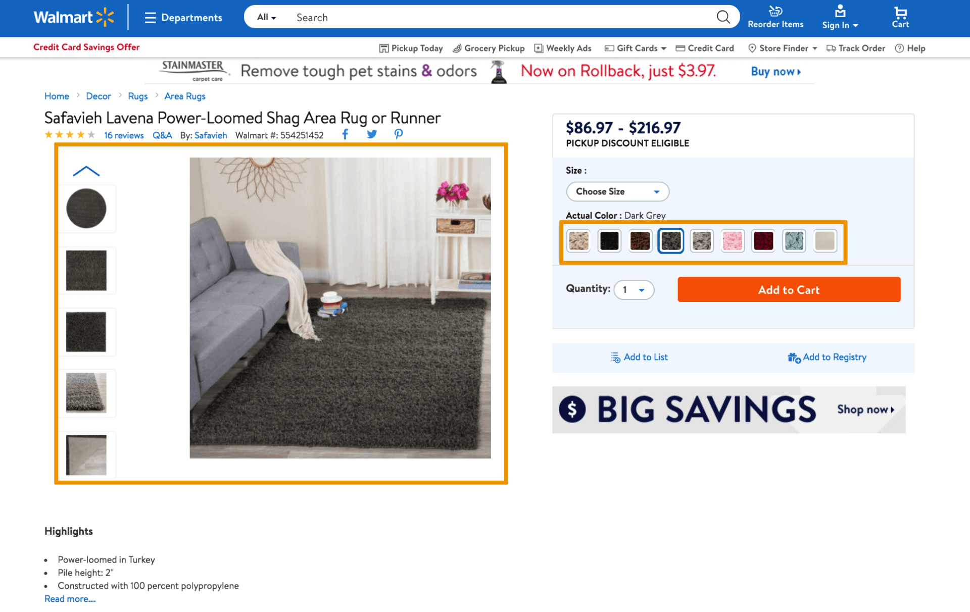
Buying a large piece of home décor like a rug is understandably a more considered purchase than most. On Walmart.com, Safavieh’s page for its Lavena series of rugs gives the requisite amount of detail consumers need to add this to their cart in the absence of actually touching and feeling the product itself.
Product shots change based on the color selected and give detailed close-ups of multiple rug styles from multiple angles, better visualizing the feel and look of the rug for the buyer.
Despite the Lavena series being an inexpensive option, customers get a detailed experience on the product page itself that still showcases the product quality — with reviews echoing this fact.
Consumer packaged goods
Seventh Generation Liquid Laundry Detergent, Free & Clear
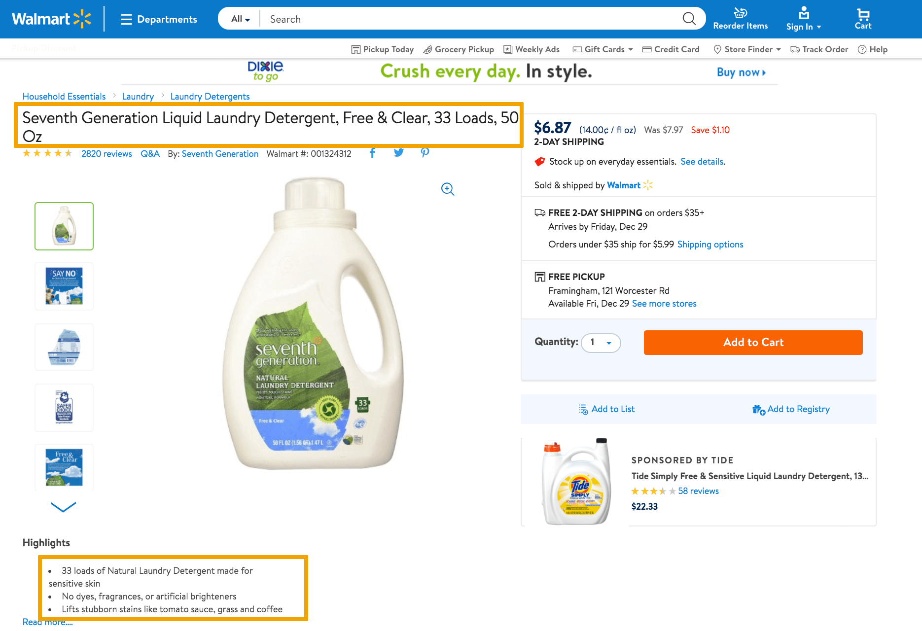
With brand loyalty for household goods like laundry detergent at historic lows, Seventh Generation is attracting customers with understandable, benefit-laden product pages that get them found and address consumer questions.
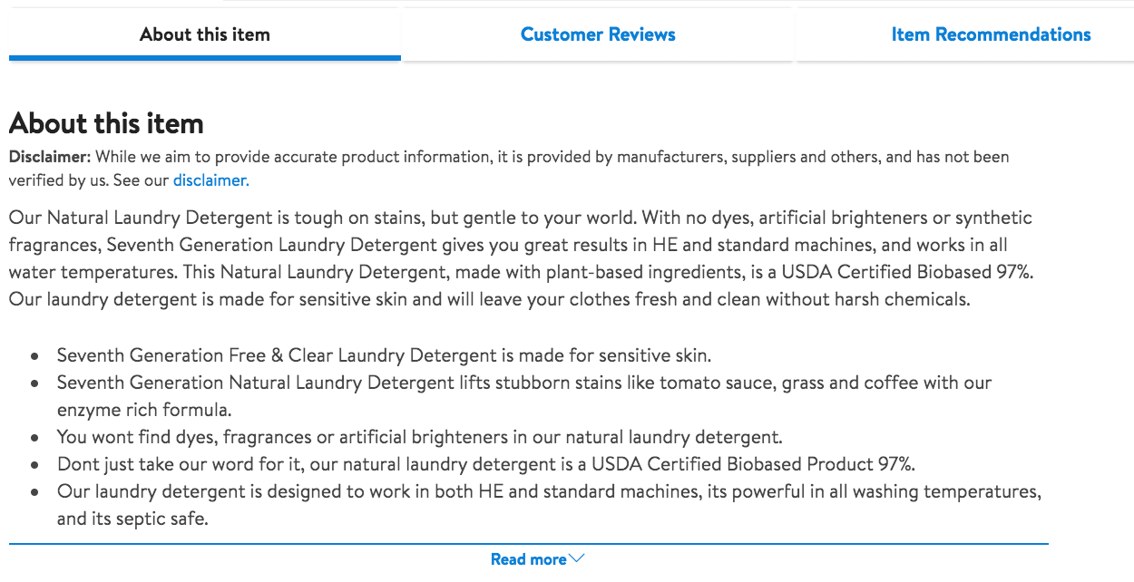
The title includes “33 loads” — speaking the consumer’s language in addition to the traditional ounce measurement. Both the images and robust amount of written copy clearly spell out the value proposition: It contains no dyes and no artificial brighteners, and it is good for sensitive skin.
Toys and baby
Disney Minnie Music and Lights Walker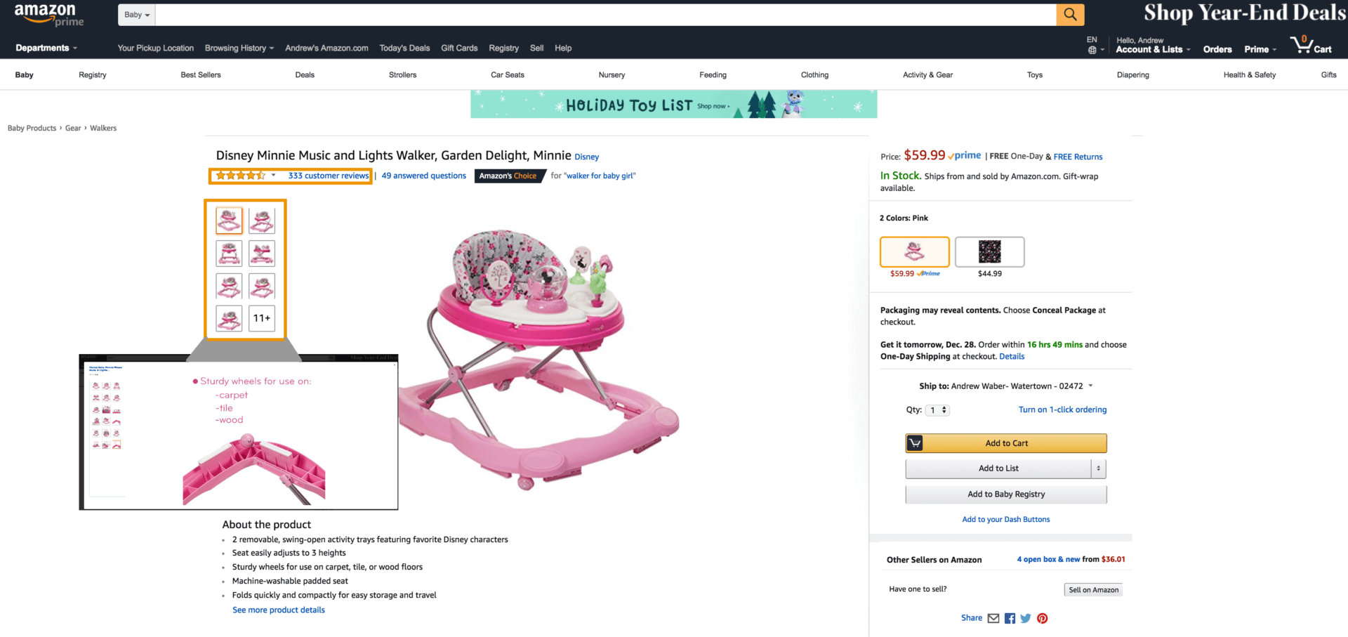
With 18 images, Disney/Safety 1st gives parents as much visual detail as possible on its Minnie Mouse walker. (Disclosure: Safety 1st, which manufactures the Disney walker, is a brand of Dorel Juvenile, a Salsify client.) One-third of the images specifically call out benefits that matter to parents — a machine-washable seat, the ability to fold up the walker for storage or travel, and wheels that work across multiple surfaces.
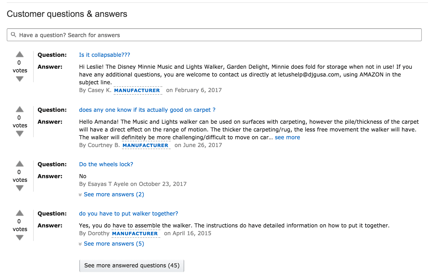
The manufacturer has also made it a point to answer dozens of consumer questions on its Amazon product page, helping assuage concerns of prospective buyers — which is particularly important for products used by children — and encouraging subsequent reviews.
Wrapping up
A new year has arrived, and with it comes a chance to hone your product content and improve the consumer experience on third-party retailer sites. Take a page from the examples above to help you think about ways to test and refine your product pages in 2018.
Opinions expressed in this article are those of the guest author and not necessarily Marketing Land. Staff authors are listed here.
Marketing Land – Internet Marketing News, Strategies & Tips
(31)


