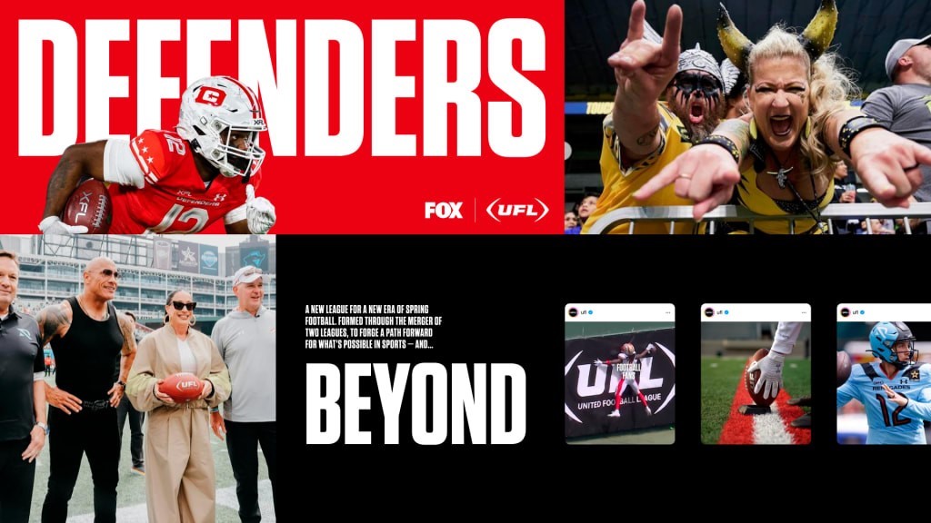
The UFL wants you to know it’s not the NFL, and it has a new logo to prove it
April 03, 2024
The UFL wants you to know it’s not the NFL, and it has a new logo to prove it
The United Football League’s gleaming, monochromatic logo is a far cry from the NFL’s stars and stripes.
One thing is clear about the logo for the new United Football League (also known as the UFL). It’s not the NFL.
“It’s not trying to be derivative in any way, shape, or form,” says Melissa Parsey, senior vice president and global managing director at R/GA, which created the league’s visual identity. “We’re not the NFL. We’re not borrowing equities in terms of red, white, and blue—there’s no shield in play.”
Instead, the UFL’s logo features a wordmark that’s slanted slightly forward to evoke momentum, inside brackets designed to look like a football.
The spring league UFL is the result of a merger between the United States Football League (USFL) and the most recent iteration of the XFL, which Dwayne “The Rock” Johnson, his business partner and ex-wife Dany Garcia, and investors including RedBird Capital Partners, purchased in 2020. Both continue as conferences within the UFL.
The logos for the two halves of the new league couldn’t have taken more different approaches. The USFL, founded in 1982, used a patriotic old school logo replete with stars and an unwieldy 65 red-and-white stripes; the XFL logo features futuristic type, as you might expect of a brand that has the letter X in its name.
Though there’s some overlap between their fans, the USFL has historically connected with communities without a pro team, while the XFL focused on “next-gen fans.” To help unify them, the UFL’s typefaces of choice, Neue Hass Grotesk and Tungsten, show up across the league. The league will implement a custom typeface later this year.

“You have these two entities,” Parsey says. “You think about that collective ambition, the collective experience of that group, the collective reach of that group, and then the opportunity to take this slot in spring football that has long evaded many, and think about how could we actually make this into something greater than the sum of its parts.”
Naming the new league, which R/GA was also a part of, was tricky due to trademark issues.
“Every permutation of every single sports metaphor you can possibly imagine has a TM behind it, so there are some things just from a very practical consideration we needed to be mindful of,” Parsey says.
For the new logo, the designers wanted to make sure it could easily thread onto items, like a polo shirt. The decision to go monochromatic ensured it could live alongside the branding of the league’s teams and let them speak for themselves. Simplicity was the name of the game.
There is a tendency to “add a thing, add a color, add a flourish” in sports branding, she says. “We said actually, no, the branding itself should be a stage.”
(3)


