The untold story of how Apple built a retail empire on trial and error
One morning in the fall of 1999, the phone rang at the San Francisco office of design firm Eight Inc. On the other end was Andrea Nordemann, longtime assistant to Steve Jobs. Tim Kobe, CEO of the firm, took the call. He and his partners had worked with Apple on the product launch of its colored iMacs a year earlier and, more recently, Kobe had sent Jobs his ideas for creating a signature retail outlet.
“Hey,” Nordemann began, “Steve is interested in that retail stuff. He would like to see your retail credentials.”
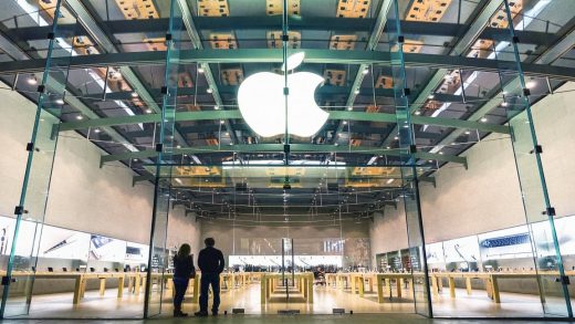
By “retail stuff,” Nordemann was referring to what would eventually become the Apple Store, a groundbreaking facility that is now a clear and unmistakable articulation of Apple’s brand. At that time, however, the process of how it would be created was anything but clear—at least from the perspective of Kobe, its lead designer. To hear Kobe’s narrative is to learn, with some surprise, that the Apple Store came about through a process riddled with failure and unpredictable turns.
“Okay, that would be great,” Kobe told Nordemann. “We can show him our credentials.”
“Well,” she said, “he’s in the car, and he’ll be there in 15 minutes.” The unexpected turns of the process were already under way.
Kobe recalls the importance of his firm’s relationship with Jobs even before that call.
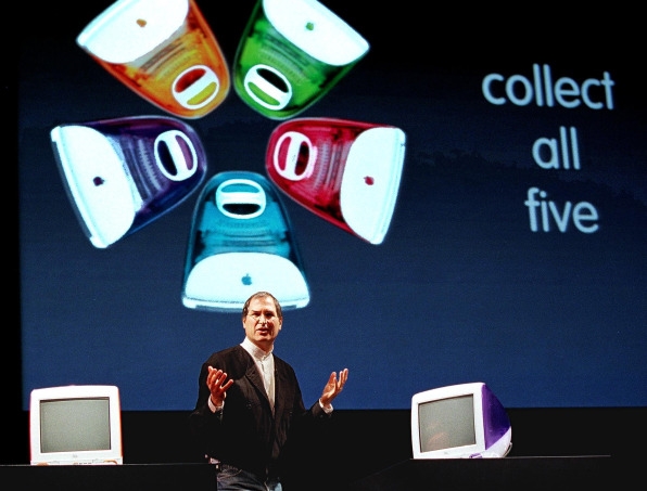
“The creation of the Apple Store really began with our relationship in 1998, getting to a point where Steve trusted us, our opinion. When Steve saw the colored iMacs, he realized he had something that was no longer an appliance, but a consumer product that was a colorful and beautiful thing. We just put them all on a big light table at the MacWorld trade show, illuminated them, and let the stunning qualities of the product come through.”
Apple changed the game with the colored iMac. “It was unheard of in that industry prior to that. Beige, beige, and gray. Nothing else.” Kobe and his team leveraged the moment of Apple’s revolutionary turn to color, and their work pleased Jobs to no end. “He recognized we weren’t about making shapes for the trade shows. It was, instead, about making the product the hero. He thought we really got it.”
During that period in the late 1990s, however, Kobe actually had his eye on a much bigger idea: a retail facility for Apple.
“We were doing three or four events a year. The first [color iMac] launch was at MacWorld in San Francisco–and then New York, Paris, and Tokyo. But even before we were doing those shows, I wrote a white paper for Steve explaining why Apple should create its own retail program. We had just finished working with Nike and North Face, both manufacturers whose products were being sold by third-party retailers. Nike, for example, was being sold at Foot Locker, but in that context the brand couldn’t stand out. Nike couldn’t sufficiently communicate what they were about, their values. And so they started the NikeTown program to sell their entire product line, but they had to do it strategically, without sacrificing the sales volume of their dealers, like Foot Locker. It made perfect sense to me that Apple needed to do something similar with flagship stores.”
Kobe’s instincts were spot on, because it turned out that Jobs was keenly interested in finding a way to increase control of Apple’s message and brand. The moment was ripe for a flagship idea. The reality of Apple products sitting on shelves next to various Microsoft and PC offerings, together with salespeople who lacked deep knowledge of Apple products, was for Jobs a serious concern. Eight Inc. had also worked with Apple on designing a “shop-in-shop” idea that they had tested in multiple locations in Japan. According to Kobe’s partner, Wilhelm Oehl, the shop-in-shop experiment was the prelude to the Apple Store, a live prototype that opened up possibilities. The Japan pilot continued in the United States (primarily through CompUSA in both San Francisco and New York), producing increased sales but not fully solving the problems of third-party retail and the central objectives of a brand that wanted greater control of its message and identity.
Enter Tim Kobe and his white paper, “Flagship Retail Feasibility Report,” originally drafted in 1996. He defined the opportunity in the executive summary, and planted the seed for an ambitious retail project.
“The image of Apple Computer in a consistent, controlled distribution of the Apple message is critical to successful renewal strategy. Apple product information and image at the retail level has been confusing at best. The industry, as well as the general media, have seemed to define the company more than the company itself. Confusion during the transition at Apple is natural but there is distinct lack of ‘information tools’ available for Apple. With the industry growing more competitive, trade show formats are not enough. Serious consideration must be given to additional formats if Apple is to successfully implement its strategic renewal.”
Fifteen minutes after Nordemann’s call, Jobs arrived at Eight Inc. and asked to meet in the conference room. But the firm, at the time, didn’t have one.
“We had a table, and that was it. My partner Wilhelm Oehl and I sat down with him and began. In those days, you still presented your work on transparencies. We had four-by-five transparencies of photographs of things we had done. We showed him the work we did for Nike. We showed him the work with North Face. And some other stuff too. He takes it all in, looks at us, and says, “What would you say if I told you I didn’t like any of this work, and that none of it looks like Apple?” Wilhelm’s jaw fell on the table.
Kobe steeled himself, looked Jobs in the eye, and spoke candidly, “‘we designed this work for Nike and this work for North Face.’
‘Fine,’ Steve says, ‘but why should I hire you if none of this looks like Apple?’
And I said, ‘The reason you should hire us is because none of this looks like Apple—and we will do for Apple what is right for Apple.’ He paused for a long time, knowing I had done the old reversal on him. I knew Steve had employed that tactic to give us a hard push. He wanted to see if we would stand up or fall.
Anyway, he got up and walked over to the door, shook our hands, and said, ‘I don’t know if you guys have enough retail yet.’ And then he walked out. Wilhelm and I looked at each other—does that mean we are hired or not? Two days later, he called and said ‘Come on down, let’s start working.’ We started on the whiteboard.”
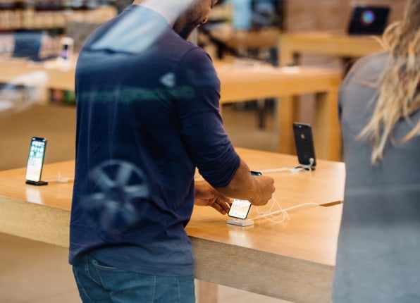
They started on the whiteboard? How could that be? The deeply imaginative Steve Jobs would certainly have had a vision for this revolutionary retail outlet. He must have known what he wanted. After all, most of us recognize him, deservedly, as the genius and architect of Apple and its innovative products. Surely that beautiful store, existing today in thousands of locations and always crowded, was a product of the vision of its celebrated leader. The wide-open spaces, the community display tables, the Genius Bar, the invitation to engage with products by virtue of their presentation alone, the choice materials and fixtures strategically deployed, the glass and the wood, the precise use of color, the intuitive layout of the whole—all of it, one would think, must have sprung, like Zeus birthing Athena, from the head of Jobs. But is that how it came about? We know the Apple Store transformed the retail landscape at the turn of the 21st century in the United States and abroad. What was the actual process that led to this remarkable outcome?
As Kobe explains during our interview, there was, in fact, absolutely no driving vision for the design of the store. Not even close. He believes that Steve Jobs was a man who made decisions through an iterative process and, in the end, through a reliance on intuition. “Steve was very quick at running through a logic tree and saying, ‘If this, then this—and here’s a bust in your logic, go back and work on it.’ But if you made it through the logic tree, then he would flip over the other side, which is very intuitive, and let you know if it didn’t feel right.”
“It sounds like he was, in certain ways, a guy who needed to engage creatively to know what he wanted,” I suggest. “Stories abound that Steve Jobs had to dive into things, construct them, feel them, until he knew what the result should be.”
“Absolutely,” Kobe confirms. “We started with bubble diagrams for the store, just saying ‘let’s try this or look at that.’ We then went from sketches and drawings to small physical models. We were making a physical model each week of different things. And then we went to full-size models in a mock-up room. We produced some component of the store every week in foam core mock-ups. Steve would walk around the models and look at them, fully realized in space. It all evolved until we found what felt like Apple. Along the way, we found a lot that didn’t work, that was too self-conscious, too technical, etc. When it didn’t work, we would just tear the models down, or move them around, rebuild them, adjust things.
“Steve didn’t even have an idea actually about how big a store he wanted,” he continues. “At one point, he said he wanted it to be big, and we said, ‘okay, but you just scaled everything down to four products, you know, the PowerMac, iMac, iBook, and PowerBook. If you want a big store we have to put stuff in it.’ That’s how basic it was. In the end, we were guided by the need to express what Apple’s core values were about. That’s where all the different design elements of the retail space eventually developed.”
There was certainly a business idea behind the store, but it was an idea that had already been in play with a number of companies and brands at the time (North Face, Nike, Sony, Disney, Levi’s, and several others). What ultimately made the design of the Apple stores distinctive (and distinguished) was the way in which the design team, as Kobe explains above, led with key values; the driving principles of Apple mobilized them. Those principles together served as the entry point into a project filled with uncertainty, igniting a making process that carried forward into the design. “When you think about what made Apple special,” Kobe reflects, “it was about [making] technology accessible to people other than engineers. That’s what the mouse did—it wasn’t keystrokes and backstrokes and writing code. It was about making technology human—that was Apple’s core differentiation, their core value proposition. Steve fought hard for the Macintosh (and was beat up about it) because he knew that was the right thing for technology if you ever wanted it to find mass adoption.”
Today, with hindsight, we can see the multiple ways in which Eight Inc. manifested these Apple values in their design. As Kobe tells it:
“You had to have a store that was easy to use. It meant making everything comfortable and inviting. In contrast to, say, traditional apparel retail, which is very dense, the Apple Store is very open, intuitive—like the products themselves—and we were trying to present those qualities through a variety of touchpoints. That meant detailed attention to the physical things, the environment, and the people attending to the consumer. Steve wanted people working at the store who knew just enough about technology but were not so absorbed that the human element was missing. He wanted a balance of the engaging, warm individual who also had technological knowhow.”
The collaborating team grew to involve key participants including Millard (Mickey) Drexler, then CEO of Gap, who Jobs recruited to Apple’s board of directors in 1999. Drexler was a celebrated retail expert at the time and contributed significantly to the conversation. Kobe explains: “He was of the school of a very dense retail product, heavy ‘stack it high, watch it fly,’ the old retail. Steve discovered that he didn’t like that. He wanted it to be the opposite of that experience.”
But the open, airy feel of the final design might not have evolved in the same way without Drexler’s provocations. According to Walter Isaacson’s biography, Steve Jobs, and similarly noted in a case study produced by the business school Insead, Drexler was the one who suggested that the design team develop “a full-scale prototype in a warehouse near the firm’s headquarters in Cupertino . . . down to the smallest details.” This idea was apparently kept secret from the public, and Kobe tells me at length about how the space was used to explore ideas and test concepts. In this context, according to Kobe, Jobs’s appreciation of the iterative process of making became glaringly evident.
Jobs himself has also been quoted as celebrating this full-scale arena of test and discovery: “One of the best pieces of advice Mickey gave us was to rent a warehouse and build a prototype store.”
Kobe recognized the importance of collaboration in improvising the design. A group would converge weekly at these Tuesday meetings. “We probably had 15 people in that meeting every week, engaged in the evolution and the making process. A lot changed along the way.”
I ask Kobe to cite specifics. For example, how did they find their way to the design feature of those tables to display product? “We were experimenting with different fixtures. We were doing one a week, and it got to the point where the design started to be too self-conscious.” And so they went back to basics. “We needed something that supported the idea that the product was the hero. And if the product was the hero, then the design display needed to take a second position to that. We also realized that we couldn’t change the store every time the product changed. Steve was clearly going to be developing new products. So we created this natural landscape—large wood tables. They were like these big Parsons tables.”
He continues, “and we would meet every week, build models, build full-size prototypes, and we ultimately got to where we were arguing over eighth-inch increments of the thickness of the table. But the whole process, the making, was a search for what felt right and what matched Apple’s values. The tables needed to be generous, spacious.”
“Did you know,” I ask, “the effect it would have in creating a sense of community energy around the table, something that I think is a brilliant stroke of that retail environment?”
“It all goes back to the making process,” he says. “You have to experience it, feel it, to know. That’s what we did. Happy accidents, I suppose.”
Another discovery on the design journey had to do with the lighting in the store and how it influenced the look of the products. Working with a lighting designer based in Florida, the team discovered a thorny problem that they needed to solve—a problem identified through the reality of elements in relationship in physical space.
“Apple does amazing product photography,” Kobe says. “When you look at that product photography you see beautiful highlights—everything comes from the soft box lighting effect and it’s what makes the product look good. What we discovered was when we placed a poster over the tables, the product didn’t look as good as the photograph above it. We were unintentionally sending a bad message; we were, in effect, telling people they shouldn’t trust Apple—that we say one thing and do another. The product has to be just as spectacular when you see it live.”
The challenge, in Kobe’s words, was for him and his collaborators to find a way to “look at the product on the wall and the product on the table—and see it as equally beautiful. There is integrity to it all.” Again, they experimented with all kinds of ideas. “We spent a long time at it and eventually started working with a product called Nomad. It was a vinyl heat-formed material. We kept doing mock-ups and more mock-ups, trying to get to where we had just the right amount of soft-box light as well as some color highlights and other accidents. We got there and the product looked as beautiful as the image.”
Designing the store had everything to do with understanding the experience of the consumer. That driving sense of empathy, however, was not a quality Jobs could simply manifest from a preconceived vision. Together with the team, he had to experiment, explore possibilities, accept some ideas, reject others, iterate, sketch, build models, and test material. In short, the store wasn’t so much a product of his vision as it was something made, constructed, and fashioned in the course of a creative journey. Kobe insists that the making process itself was the way to know that central experience of the customer and the design that would honor it. “Steve put himself in the position of the user. If ideas we presented didn’t have the qualities that attracted him, we wouldn’t do it. But he wouldn’t have known without the process itself.”
Kobe offers a final example of the process in a brief anecdote about the design of the Chicago store and its use of stone.
“It was Indiana limestone. We had just done a project for Gucci, so I knew exactly what stone was required for Michigan Avenue. We got hold of some Indiana limestone very quickly and then wrestled with how we might treat it. Should it be smooth? Should it be textured? It needed to work in cold weather and snow and ice. I remember we went for two or three months looking at stone samples at different size and scale. Steve was looking at all of this one day and suddenly says, ‘you know, we are so stupid. We are doing this all wrong. It rains in Chicago. We are looking at the stone out here in dry, sunny, happy California.’ He asked us to go get water and suddenly everybody scrambled to go get buckets of water. And we start throwing the water on the mock-up. We must’ve spent five hours looking at wet rock and looking at different ways of treating the stone. That informed the rest of the process, and we made sure that the store would look beautiful wet or dry.”
Kobe’s account of the design of the Apple Store gives evidence of a tremendously successful project that evolved through a creative course of iteration, experimentation, and improvisation. In what is nothing short of a tribute to the powers of progressive ideation, his tale upends any myths about the visionary genius that brought the facility to life. Indeed, Kobe and his collaborators, together with Jobs, leveraged the fundamentals of an applied making that brought them to knowing the design—sketching, prototyping, modeling, problem-solving, testing, research, and generating questions that beget questions, happy accidents, and multiple dialogues among designers and fellow collaborators.
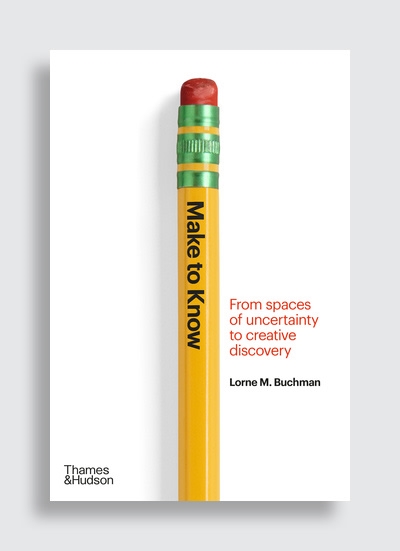
The story of how the Apple Store was created contains many elements of an experience I call “make to know”: a concept that receives surprisingly little acknowledgement in the wider literature on creativity. It is a process of moving from uncertainty to invention through the very act of making. My ultimate purpose here is to lay bare, through the stories of a diverse and talented group of artists and designers, the revelatory nature of the creative journey itself.
Lorne M. Buchman is president of ArtCenter College of Design in Pasadena, California, and an international leader in art and design education. He is also a theater director, dramatic literature professor, the author of a book on filmic adaptations of Shakespeare’s plays and host of Change Lab: Conversations on Transformation and Creativity, a podcast in which he conducts interviews with leading artists, designers, and cultural innovators.
This article was adapted with permission from Make to Know: From Spaces of Uncertainty to Creative Discovery, by Lorne M. Buchman © 2021 Thames & Hudson Ltd Text © 2021 Lorne M. Buchman Reprinted by permission of Thames & Hudson Inc.
(81)

