The Women Behind The New Bustle On Reinventing “Women’s Media”
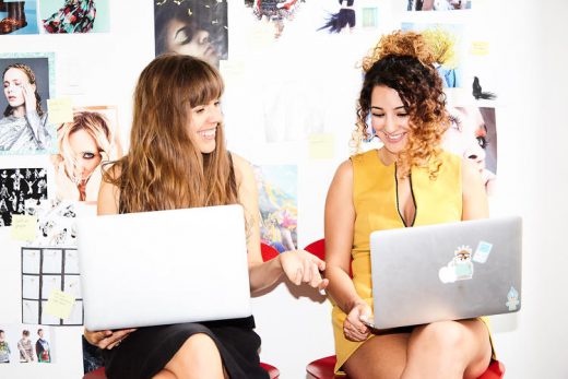
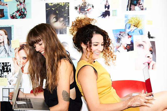
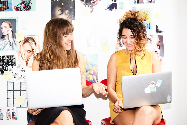
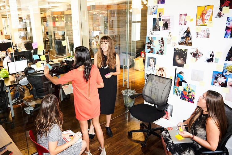
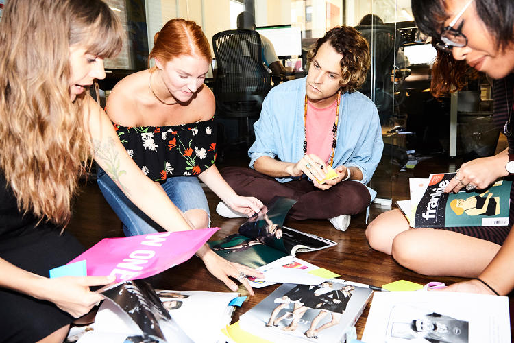
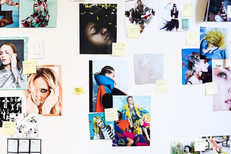
At Bustle‘s Chelsea office in Manhattan, the two women at the heart of the website’s overhaul—creative director Isla Murray and senior engineer Zahra Jabini—are sitting together in the design room. Around them, the walls are covered in inspiration boards filled with images from recent photo shoots for the online publication. Women wearing colorfully patterned dresses seem to float in a sea of bright pinks, teals, oranges, and yellows. Such scenes of warmth, optimism, and fun have been channeled into Bustle‘s brand-new look, which is being revealed today.
The site was first developed three and a half years ago and had a functional aesthetic much like Medium or Tumblr that allowed you to scroll through blocks of clickable images that would take you to an article. The background was white and minimalistic. “There wasn’t that much personality,” Murray says. “As we’ve grown, developing our editorial voice and our social voice, and really come into our own, we’ve been screaming for a way to visually express that.”
Bustle was founded in 2013 by Bryan Goldberg, who had previously cofounded the Bleacher Report. The lucrative site churned out hundreds of articles a day written by sports fans, rather than professional journalists. Goldberg and his cofounders sold it in 2012 to Turner Broadcasting for more than $200 million.
The next year, Goldberg’s plan was to build a media site along the same lines, but about women’s issues, targeting millennial women. The site got off to a rocky start with many people accusing Goldberg of being offensive and tone-deaf in his early efforts to describe the kind of site that would appeal to women. “Yes, we believe that a partner-track attorney can be passionate about world affairs and celebrity gossip,” Goldberg wrote in Pando Daily. “On the same day. During the same coffee break. And there is nothing wrong with that. Welcome to the year 2013.”
Three years later, the site has become a magnet for 18- to 35-year-old women. Every month, the site draws a whopping 50 million unique visitors globally, 36 million of whom are in the U.S. It is on track to profitability. In March, Goldberg raised a series D round of $11.5 million, bringing the total amount of capital raised to $38.5 million, a portion of which has been used for this redesign. “We’re trying to reach a mass audience,” says Lindsey Green, Bustle‘s VP of corporate communications.
To do this, Bustle now has over 70 full-time editors and 250 contract contributors who pen more than 200 articles a day about topics they are interested in, from their favorite celebrities or TV shows, to makeup and fashion tips, and relationship advice. There is also a sprinkling of hard news in the mix. “We want to create content that we know our readers will like,” Green explains.
Instead of bringing in external designers, engineers, and consultants, which is what often happens at media companies, Goldberg hired its own team and built everything in-house, to have as much control over the process as possible and to perfectly tailor the new site to Bustle‘s audience. It was also no coincidence that he picked women in their twenties—Murray and Jabini—to head up this overhaul. “Bustle is a publication focused on millennial women, so it makes sense that millennial women would take a lead role in bringing this new engineering vision to fruition,” Jabini says.

All Together Now
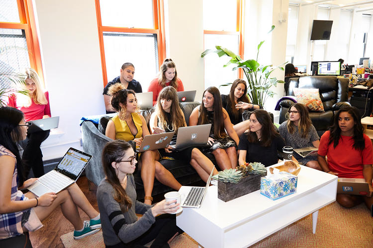
Earlier this year, the design team moved from their Brooklyn offices to the editorial headquarters in Manhattan, which she says was an important breakthrough moment. Overnight, engineers and designers were able to better understand what writers were thinking and how they were engaging with readers every day. “There’s a whole different kind of collaboration that comes when you’re face-to-face with someone every day and you’re not a train ride away,” she says.
And while early on, the site did not have a discernible point of view, it has now carved out a distinct place for itself in the media landscape. While glossy magazines like Vogue seem exclusive and elitist, and feminist sites like Jezebel have a snarky tone, Bustle wants to sound like your best friend. “It’s fun, it’s inquisitive, it’s inclusive, and authentic,” says Green. (It’s not entirely unique, though, as sites like Refinery29 have a similar tone and audience. Full disclosure: I wrote for Refinery29 before joining the staff of Fast Company.)
Murray’s goal has been to translate all of this into how the site looks. “The most important goal of the redesign is for the site to appear approachable and friendly,” Murray says. “We don’t want it to feel too cool or unattainable. We want to be something that you can relate to.”
The Second Look
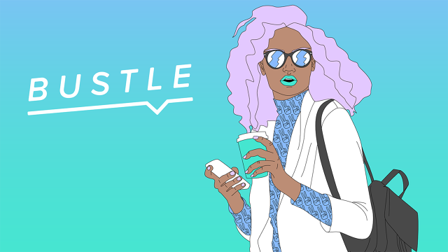
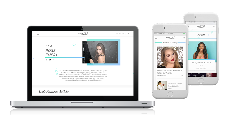
A good place to start is Bustle‘s new logo, an evolution of its former logo, that was in a simple all-caps sans serif font. This version is designed with softer edges to feel warmer and friendlier. It is at an angle to represent movement and energy. The word is underlined, as if to say that it is getting right to the point. As Murray and Jabini explain, these are the kinds of decisions they made throughout the redesign process. “We’re trying to express the voice that Bustle has grown into,” Murray says.
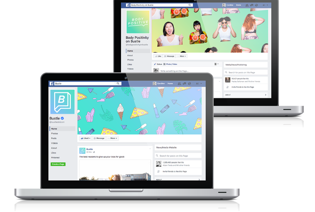
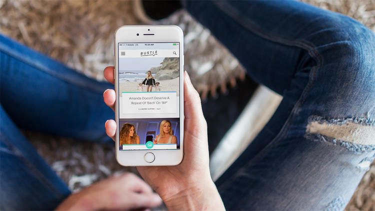
On first glance, the website itself also looks lighter and airier. They achieved this by having a subtle but vibrant pattern in the background, rather than the stark white from the previous site. White, minimalistic backgrounds are the norm on many media websites, from the New York Times to (ahem) Fast Company, so this element makes Bustle distinctive. Bits of color and design show up in unexpected places, mostly a blue-green panel that is on a gradient, so the experience is unpredictable. “It’s supposed to feel like a friendly wink,” Murray says.

A Never-Ending Stream Of Content
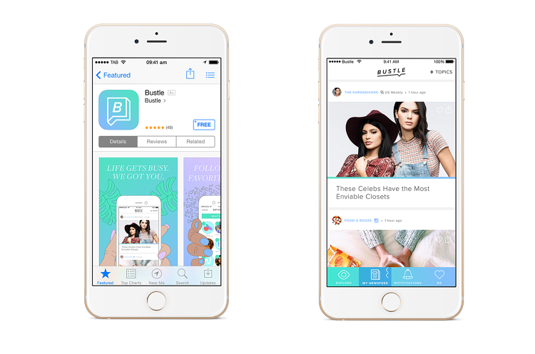
The new site was designed to be mobile-first, and it does look a lot like a feed. Given that their readers tend to be tech-forward women in their twenties, the redesign team wanted to create an experience they would find intuitive based on how they use other platforms. “This is how we’re seeing our users engage with content, whether it’s on Facebook, Instagram, or just another website,” Murray says. “We’re taking these models as inspiration here.”
But rather than having a predictable stream of stories, Bustle will constantly play around with what the user will see. Editors will be able to curate what readers see first, such as breaking news or a new exclusive story they want to promote. It will most likely start with the top stories of the day, but as you scroll down, you might find an interactive flow chart you can engage with. Or there might be a game tucked into the feed that you can pause to play. There is also room to include tweets or Instagram posts on the feed, GIFs, and photographs with captions.
At the end of a story, you will be thrown back into another feed. Editors will have picked out related stories that you might be interested in reading next. “The philosophy is to give you everything you need about a subject in one go,” Murray says. “Not just articles, but also Instagram posts or whatever.”
Memes Everywhere
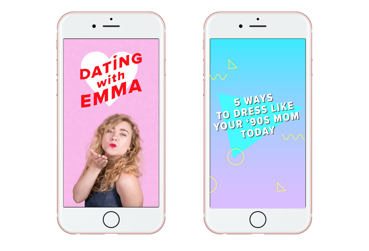
Bustle already has a group of illustrators in-house who create humorous drawings that will show up in Instagram feeds, much like the comics that the New Yorker publishes. Recently, there was a picture of a woman floating on top of an enormous coffee cup to channel everybody’s mood on Monday. Another showed the feeling of taking off your bra at the end of the day (think: so awesome it’s akin to riding on a unicorn). These are meant to make the reader feel like they are in on an inside joke. “Everything is supposed to reflect what it is like to be a woman in today’s world,” Green says.
These images will also start to appear on the main Bustle website in the feed. But the redesign team has also been creating other products in the same style. For instance, they have created a sticker pack that will be launched in iOS 10, so that people can drop cheeky images into text messages and emails. Users will be able to give one another silly trophies and awards for things like waking up in the morning or putting on their pants.
Under The Hood
One of the most valuable parts of this new platform is that it is very flexible, which means that if the editors want to play around with what is shown on the homepage, they can do so without having to go back to square one. Jabini explains that the site was designed with movable blocks that can be reorganized at will. So you might want to move where a story appears on the website, insert a game here, or a new image there.
They can also design new products at any time and plug them in quickly. This is very different from a system that is based on a WordPress template, for example, which is far more rigid. This modular design concept is a growing trend. “We rebuilt the site from the ground up because we wanted to make it easier for designers to come up with their wildest ideas and for us to be able to quickly make it for them,” Jabini says. “They’re just like Legos that can be moved around.”
This also means that the new website can be changed over time as users interact with it. Bustle might discover that some new features—such as the games or flowcharts—didn’t take off in the way they anticipated, so they can tweak parts of it without having to reinvent the whole platform. “We’re always evolving as human beings,” Jabini says. “One of our values here at Bustle is that we’re not perfect, and that’s why our readers love us. We’re saying we’re just like them, and we’re open to continually experimenting until we get things right.”
Correction: An earlier version of this story mistakenly stated that Bustle is already profitable. It is actually on track to profitability. We apologize for the error.
Bustle‘s Isla Murray and Zahra Jabini. Click through to see the Bustle rebranding and behind the scenes at the Bustle office.


Fast Company , Read Full Story
(80)

