These 6 ingenious time-savers will change how you use Chrome
Here’s a funny disconnect to consider, Chrome users: No matter which websites you visit the most, the page you’re probably pulling up more than any other is Chrome’s completely forgettable New Tab Page. That uninspired screen shows up every time you pop open a fresh tab—and yet, for most of us, it offers shockingly little value.
Don’t get me wrong: Chrome’s New Tab page is fine. But fine is about the nicest word you can use to describe it. The entire page is basically just a big Google logo, a redundant (and fake) search box, and a collection of links to websites you’ve recently visited.
With a couple minutes of work, though, you can transform that underwhelming space into a personalized launching pad that’ll make your days meaningfully easier. I sought out some of the most interesting and helpful New Tab page replacement tools—simple pieces of software that add significant function into that oft-opened area and make it indispensable. See which suits you best, and get ready to see your browser’s default starting screen in a whole new light.
1. The on-demand private scratch pad
I’ve got more note-taking tools than I know what to do with, but you know which one I rely on the most? It’s a dead-simple Chrome extension called Papier. It doesn’t involve collaboration, cloud syncing, or any other especially fancy features.
Instead, it’s a lightning-fast scratch pad I can pull up at a second’s notice simply by hitting Ctrl-N from anywhere in my browser. Within a second, it’s there—just a plain, blank page, waiting to hold whatever thoughts are spilling out of my head.
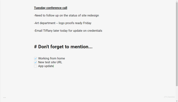
I use Papier for things like jotting down quick bits of info from a call, pasting over paragraphs I want to reference later, and storing outlines I’m only going to need for a short while (like talking points for my weekly podcast). Anything typed into the software’s surface gets saved locally only and comes back up in every new tab you open, even after a restart.
Papier has some basic text formatting commands—Ctrl-B for bolding, Ctrl-Shift-C for creating a checkbox, and so on—and it also has a small menu where you can adjust the font style and size and choose from a handful of theme options. The software’s best feature, if you ask me, is its lack of over-the-top features. For all the clever and complex possibilities present for Chrome’s New Tab page, including the ones we’re about to discuss, I’ve yet to find anything that convinces me to leave Papier’s single-task simplicity behind.
2. The upgraded search mecca
Maybe you like the search-centric nature of Google’s default Chrome New Tab page but wish it had a little more power and flexibility. Well, search no more: The aptly named Universal Search Tab is just the tool for you.
Universal Search Tab gives you a familiar-feeling interface with a Google logo, a search box, and a series of icon-based shortcuts beneath it. Look closely, though, and you’ll realize there’s a lot more going on than meets the eye.
Most notably, when you hover your mouse over the Universal Search Tab’s Google logo, those familiar letters transform into a menu of searchable services—everything from Amazon and Wikipedia to YouTube, eBay, and DuckDuckGo.
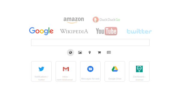
You can expand or slim down the list to include only services you’re likely to use. Oh, and as for those icons beneath the search box? The bottom row shows recently visited sites, just like in the standard Chrome New Tab page. But the row above that shows options specific to your current search engine—so with Google, for instance, you can click the image icon to send your search directly to Google Images or click the location pin icon to search Google Maps right from that very same spot.
3. The streamlined document searching system
Speaking of search, if you find yourself toggling between numerous apps and services for information—and who doesn’t?—you might benefit from turning your Chrome New Tab page into a cross-platform command center for tracking down documents.
The FYI extension does just that: It lets you link up your browser’s landing screen to services such as Slack, Google Drive, Gmail, Evernote, Dropbox, and Trello. Then it creates a streaming feed of recently modified documents from all of those places. You can open any listed document with a single click—or, if you’re looking for something specific, you can search across all your connected services without ever leaving the page.
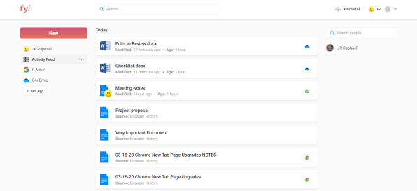
FYI can work on an individual-user basis or with company-provided accounts for more collaborative purposes. You can even connect it to multiple accounts from the same service, if you really want to get wild.
4. The tidy tab organizer
I don’t know about you, but I tend to have somewhere between seven and 700 tabs open at any given moment—and keeping track of all that stuff is never exactly easy. That’s where Toby comes into play: The extension turns your New Tab page into a drag-and-drop board for collecting and organizing tabs, so you can close whatever you aren’t actively using and then find it when you actually need it.
So for instance, you might create one collection for productivity apps, another for articles you want to read, and another for pages related to a particular project you’re working on. You can even save an entire Chrome session into its own Toby collection, if you want. All your sites will then be waiting for you and ready to access whenever you open a new tab.
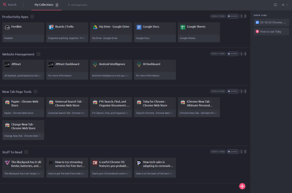
Toby automatically syncs all your collections to any browser where you’re signed in. If you’re feeling overwhelmed by tabs—and especially if your browser’s performance is starting to suffer—it might just be the New Tab page upgrade for you.
5. The widget-filled wonderland
Way back in the ancient early 2000s, Google had a beloved service called iGoogle. Ring a bell? It had nothing to do with iOS; in fact, it came about more than two years before the word iPhone had ever been uttered. Rather, iGoogle was a personalized start page for the internet—a customizable canvas you could fill with all sorts of interactive modules and information.
Google pulled the plug on iGoogle in 2013, but the service lives on in spirit by way of the coyly named iChrome New Tab extension. The extension turns your browser’s New Tab page into a smartphone-like home screen, with your choice of background, widgets, and overall function.
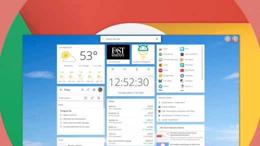
You can fill your iChrome screen with everything from an Android-like clock widget to a live stock ticker, a weather window, and fully functioning views of your Google Calendar agenda, your Google Keep notes, and your recent Google Drive documents. There are even widgets for general news updates and custom RSS feeds, if you have specific websites you want to keep up with and always see on your landing screen.
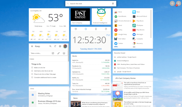
The iChrome extension lets you control the layout and theme of your page and has some neat optional extras, too, like “live” backgrounds that animate behind your widgets. Some of the extra features require a $5-a-month or $30-a-year Pro subscription, but the free service is perfectly fine—as long as you don’t mind the occasional ad showing up on your screen.
6. The choose-your-own-adventure chameleon
Last but not least, a New Tab page option for anyone craving complete control: the simple-as-can-be Change New Tab extension does one thing and one thing only—it gives you a blank field in which you can specify any web address you want and have it fill the role of your personal New Tab page.
You could paste in the address of a news, weather, or social media site you visit often and want to make even more accessible. You could set your company’s website to be your default landing environment. Or you could use a site like developer Jason Savard’s Checker Plus Homepage, which works alongside his associated extensions for Gmail, Google Calendar, and Google Drive to show live, interactive boxes of your inbox, agenda, and cloud storage—effectively turning your New Tab page into a streamlined spot for personal productivity.
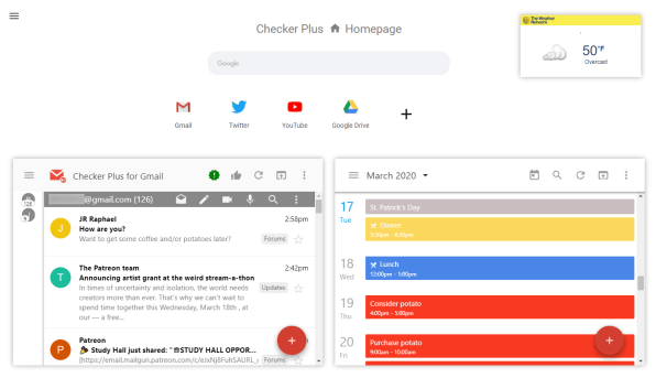
The options are virtually endless—and no matter which way you go, you’ll almost certainly be giving yourself something more useful than what you had before.
For even more next-level Google knowledge, check out my Android Intelligence newsletter.
(9)

