These are the internet’s favorite government logos, and NASA’s isn’t one of them
Everyone knows NASA has some of the most beloved branding in the federal government, but what about the hundreds of other, lesser-known government agencies?
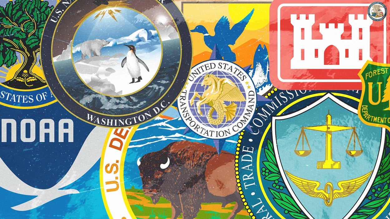
In a recent conversation on Reddit’s r/fednews board for federal employees and contractors, users shared their favorite logos and seals. Their list includes some that don’t usually get much love, showing how varied branding can be across the U.S. government.
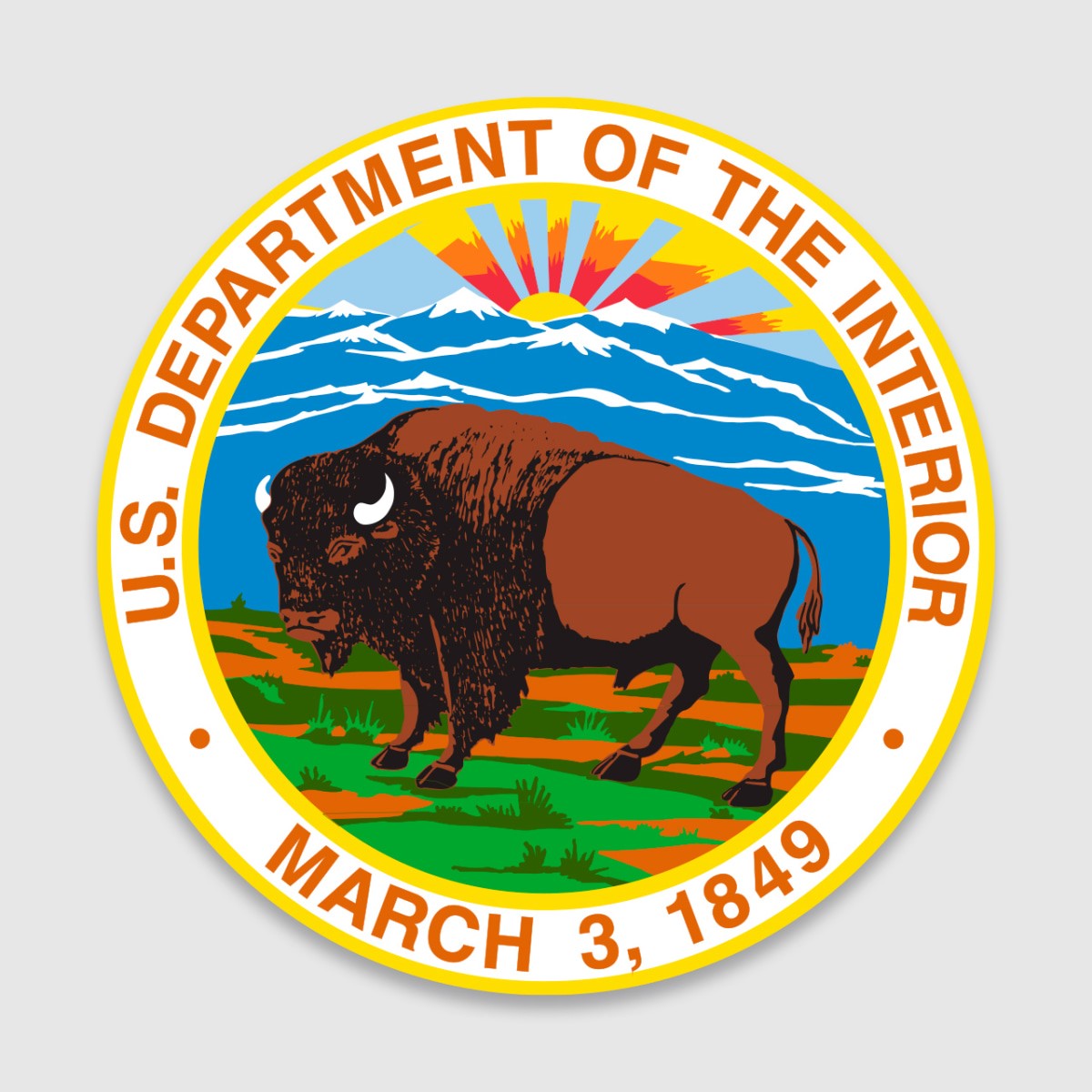
The most upvoted mark in the thread is the Department of the Interior’s seal, which depicts a bison in front of a prairie landscape with mountains and a rising sun in the distance. The DOI manages 507 million acres of federal lands, including national parks and monuments, and it first used a bison in its seal in 1917.
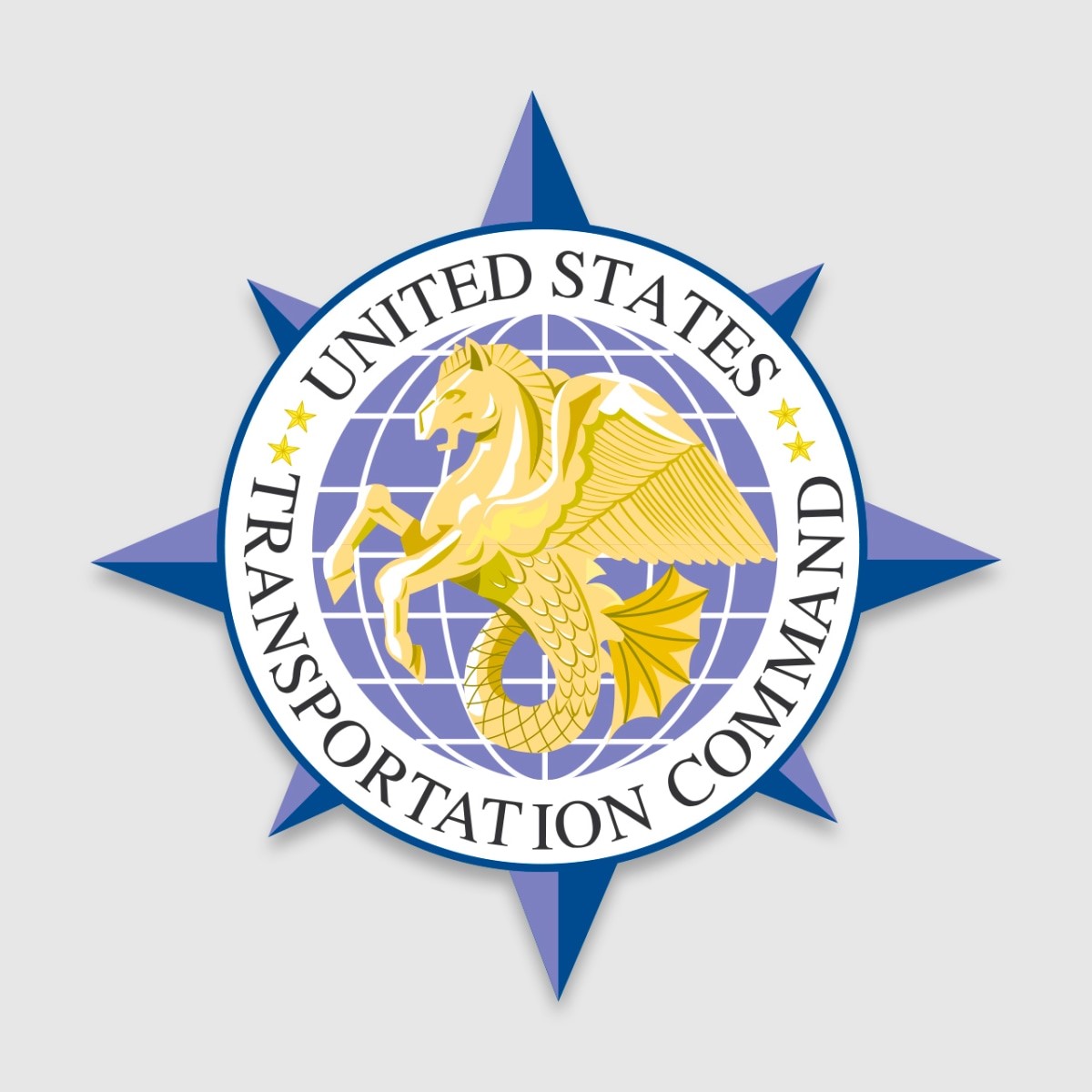
The seal for the U.S. Transportation Command, showing a hippocampus—a mythical, winged seahorse—is the second-most popular. Using a creature that’s part horse, part bird, part fish is a nod to the command’s mission, which provides transportation services for the Department of Defense across land, air, and sea.
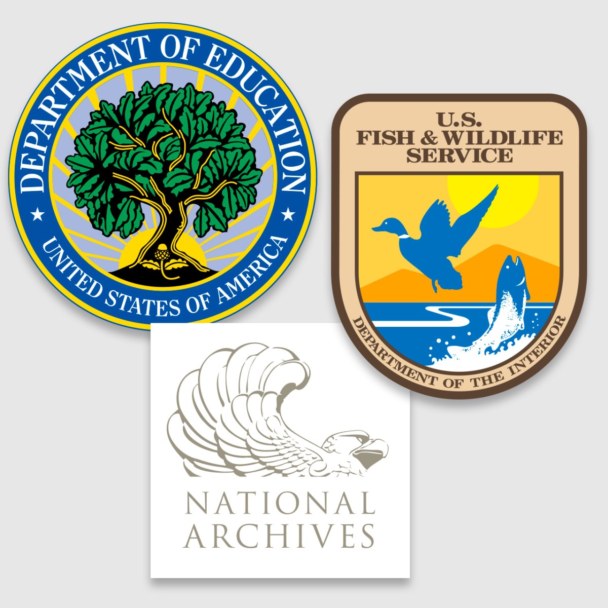
Other favorite logos in the thread are the Department of Education’s seal of an oak tree and rising sun, the emblem for Fish & Wildlife Service, and the eagle logo for the National Archives and Records Administration. Though that one is based on the stone eagles that adorn the National Archives building in Washington, D.C., one Reddit user compared it to Sam the Eagle, and the resemblance is uncanny.

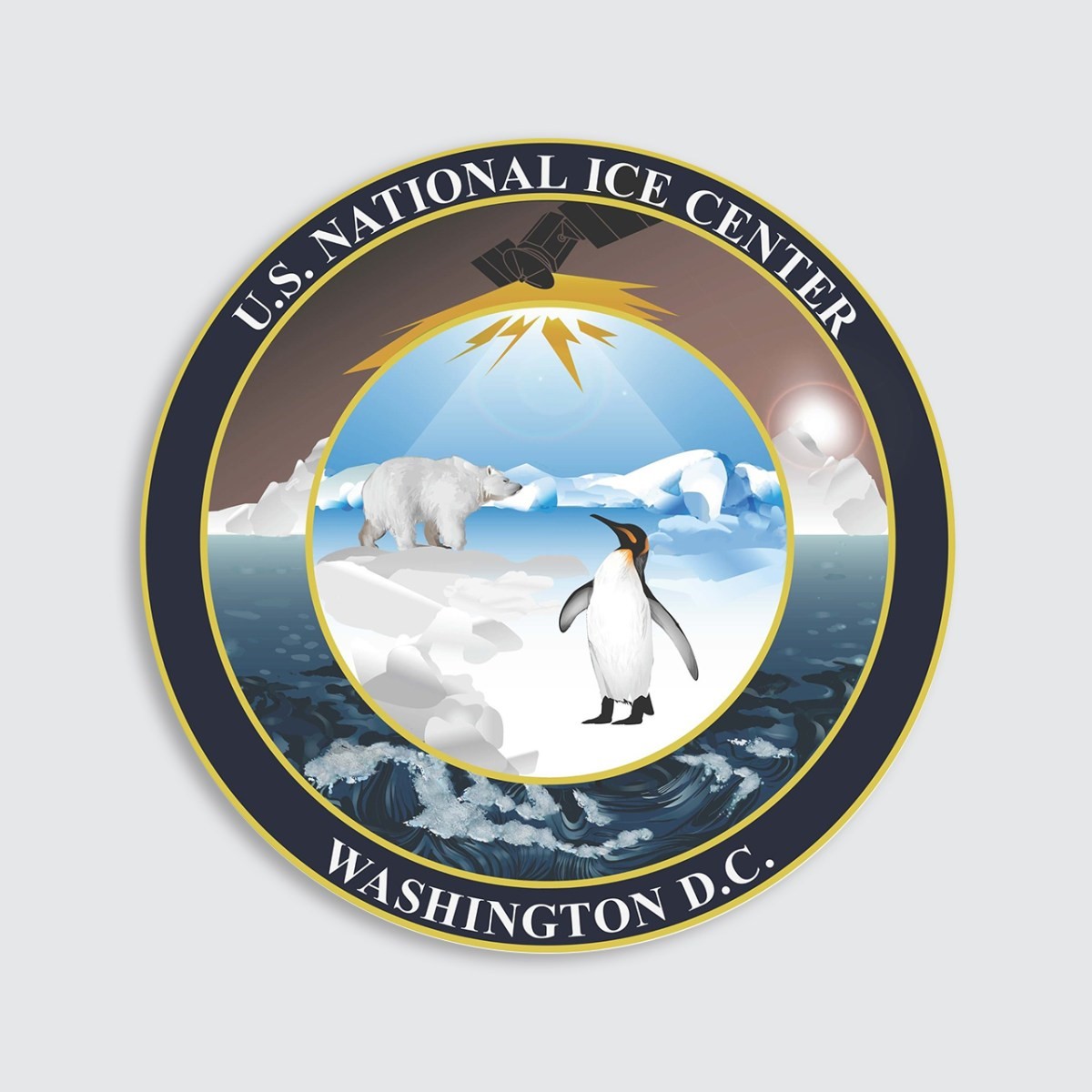
While traditional seals are widely used in government, contemporary logos are popular, like for the Bureau of Reclamation, which uses a professional-sports-style illustration to depict a dam. Meanwhile, the National Ice Center, a multi-agency organization that monitors global sea ice, rolled out new branding in 2019 featuring a contemporary illustration of a polar bear and penguin on a seal.
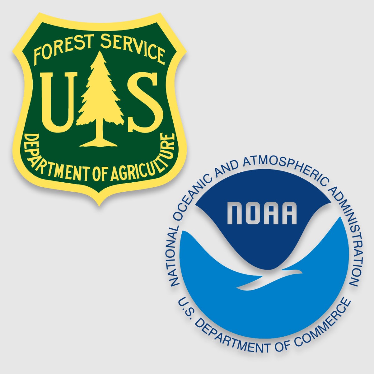
Other observations included that the Forest Service logo is classic and suitable as a patch on the agency’s employees’ khaki uniforms. And the user who suggested the logo for the National Oceanic and Atmospheric Administration called it “simple but also very relaxing.” One user remarked that the Army Corps of Engineers’ mark looks like an app icon.
In a separate conversation on r/fednews, users also discussed their least favorite federal agency logos, led by the wordmark for the Library of Congress. Designed by Pentagram and released in 2018, the mark gave the LOC a customizable, dynamic brand, but the concept didn’t catch on with federal workers who were more used to formal, governmental-looking seals and branding.
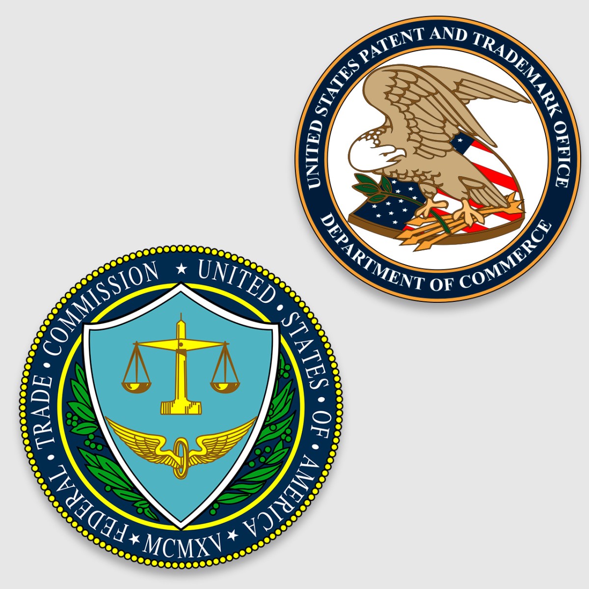
The seal for the U.S. Patent and Trademark Office was dinged for the bent-looking neck position of its eagle, and the user who suggested the Federal Trade Commission seal as their least favorite mark wrote, “Once you see the clown face, it can’t be unseen.”
(95)

