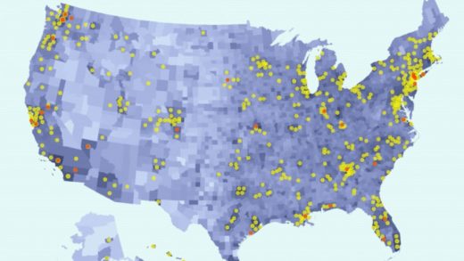
This animated map shows Trump’s slow response as COVID-19 spread through the U.S.
The most stirring scene in the film Titanic is probably when the captain gives a two-hour screaming presentation on why it’s not his fault the ship is sinking, it’s actually everyone else’s fault.
Okay, that may not have happened in the movie, but it sort of feels like it’s happening right now.
Donald Trump—America’s captain—is spending enormous time and resources to appear blameless in our current devastation, naming one scapegoat after another. It’s the media’s fault. It’s China’s fault. It’s the Democrats’ fault. It’s everybody’s fault but his own. After all, he imposed a ban on Chinese flights entering the United States in late January, even though that move has not been as impactful as he’d like people to believe.
In Trump’s eyes, and those of his supporters, he is infallible, and thus none of this even could have been his fault. It’s simply not possible.
The president’s transparent obsession with finding others to blame shows where his priorities lie. Not with amping up testing, nor with making sure that hospitals can handle the rising influx of patients. No. He is consumed instead with preventing the coronavirus from tarnishing his reelection chances in November.
Even with the lowest possible expectations, it’s still disappointing to see him apply the same narcissistic approach to a monumental, once-a-century catastrophe that he has in so many previous situations with lower stakes. As he asserts total authority, jokes about a nemesis senator catching coronavirus, and brags on multiple occasions about his TV ratings, he remains fixated most of all on his own image, and avoiding any blame.
Trump didn’t create the coronavirus, nobody blames him for that, but many people do indeed blame him for the lackluster response once it hit U.S. shores in late January. The spread escalated immediately, and brought with it much confusion. Anybody paying attention to the news at the time, though, saw Donald Trump say and do (or not do) many things that are at odds with his narrative of that period ever since.
Trump can and will spin history, but the facts remain. The truth is incorruptible. A trail of damning documents and videos proves unequivocally that Trump’s failure to meet this crisis with an appropriate response vastly exacerbated the situation.
Although assigning blame is not the most important job America has at this moment, Trump’s constant efforts at yoking blame onto others in the lead up to November make it a priority. With that in mind, redditor jrsherrod has created a detailed map graph charting Trump’s words and deeds from January through to April. The redditor, who claims to have “ran a national newswire service publishing federal news just like the Coronavirus Taskforce briefings, but it was during the recent Ebola crisis,” uses data from the U.S. census bureau and the New York Times, along with campaign rally data from Wikipedia, and golfing data from trumpgolfcount.com, to paint a portrait of presidential failure.
Have a look at the map graph below:
The yellow circles indicate confirmed cases of COVID-19, the red circles indicate deaths from the disease, and the counties with darker shading have denser populations.
It’s the captions that go with the data visualization, though, that have the most impact. With the day-by-day progression of the map graph, we see that on Wednesday, March 4, for instance, Trump suggested that people feeling sick should still go to work, then denied saying that on Thursday, and then went golfing both days that weekend. That was six weeks ago.
Liberal super PAC Priorities USA made an ad with a similar concept, but it was nowhere near as detailed or current as this one. Of course, Trump’s reelection campaign threatened legal action over it, even though all the ad did was use his own damning words.
Fast Company , Read Full Story
(12)


