This Awesome Concept Car Splits Into Two Motorcycles
My ultimate fantasy vehicle was rendered by a guy who’s designed concepts for NASA.
Here at Fast Company, I have a video series called Creative Director for a Day. The premise is simple. I walk into a business and tell people far more talented than myself what to do for a day. In the latest episode, I pitched Cadillac on a car that drove like any car you know, but with the push of a button, split into two badass motorcycles.
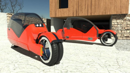
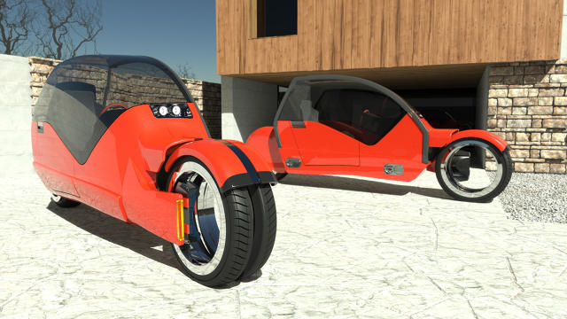
Without spoiling the video above, I’ll say that Cadillac wasn’t huge on the idea! So I tapped the Austin-based firm argodesign—the same guys who created these concepts for the future of wearables and this drone ambulance—to flesh out the concept further. They call it the Lane Splitter, and it’s a rear-wheel-drive, all-electric vehicle designed to my spec: “a car that split into two closed-top motorcycles, or tiny Syd Mead-style vehicles.” What can I say? I like the idea of having a social experience of a car, but a sporty personal urban transport vehicle for the rest of my life.
Chipp Walters, who designed several projects for NASA in the ’80s and ’90s, took lead on the project, and created what you see here. It’s what you might get if you crossed the little known 1980s cartoon M.A.S.K, the Akira motorcycle, the Batman Tumbler, and the Blade Runner Spinner—a seemingly plausible vision for a car that could split into two. And plausibility, Walters tells me, is the key to any good concept.

“If it were too goofy and too sketchy, it would come across as, ‘That would never work!” Walters tells me. “If you can get it realistic enough that people can suspend disbelief for even a fraction of a second, they are left with the notion in their brain that, ‘That could work!’ That’s the measure of success.”
But to make it look plausible, Walters and company had to solve—at least in theory—a lot of problems with my concept. The obvious big question was, how would two vehicles join as one. The first solution was to make the motorcycles very flat on each side. But the team wasn’t keen on the boxy look. It lacked the dynamic lines of a something designed to travel. It didn’t look fast just standing still. And so they decided that the geometry should embrace asymmetry—the motorcycles could be flat on the inside and curved on the outside. Locking mechanisms would attach the vehicles near the bottom of the frame. And an auto parking system, like what some cars have today, could guide the the motorcycles while docking together. Plausible!

The larger issue is in handling. Motorcycles, after all, are leaning vehicles. You tilt them left and right, onto their edge, to turn, and you balance them with your legs as you ride. Meanwhile, cars are planted on four wheels that stay flat at all times. In response, Walters imagined a hubless steering mechanism for the car mode with a range of motion of about 35 degrees. It can turn, and fat tires keep a lot of surface contact with the ground. But each wheel can also tilt to its side, like a motorcycle wheel. “This will help it in sharper turns,” Walter says, before laughing, “at least that’s the thinking. I’m not sure that’s physically correct!”
Then in motorcycle mode, the front wheels each split into two wheels. The idea is to widen the motorcycle’s posture out a bit, providing extra stability for the pod. Walters imagines that without the rider’s legs leaning left and right, the motorcycle would need counterbalances, like a Segway, to stay vertical. He also imagined training wheels might pop out for some circumstances. It might sound like an emasculating idea for a motorcycle, but these wheels could allow the vehicle to “parallel” park at a 90-degree angle (a term like “perpendicular” park describe the idea better).
Walters still seems uncertain about the car’s front end, which gave him the most trouble aesthetically. And he admits that it would be an engineering feat to bring the concept to life. “I’d like to take another pass at it, frankly. It’s a pretty challenging design problem. From both an aesthetic standpoint, and make it feel real standpoint,” he says. “[However] I think people are looking at it with one raised eyebrow. To a certain extent, I think we got farther along than I thought we would.”
Check out the first installment of Creative Director for a Day, where I made a crazy piñata of food at Taco Bell, here.
Fast Company , Read Full Story
(235)

