This brilliant note-taker is the best Google app you aren’t using
When you talk to people about note-taking apps, the theme you hear more often than any other is compromise. Plain and simple, most folks don’t love their note-taking software. They tolerate it.
Maybe the service they use gets the job done but is slightly too complicated—or costly. Maybe it has everything they need but also has too much other stuff in the mix, making it annoyingly bloated and unpleasant to use. Or they’re thoroughly invested in it but wish it’d be available on more platforms or integrate better with their other tech tools.
These are all things I hear people say about popular note-taking apps such as Evernote, OneNote, and Apple Notes. Lots of people use those services. Few, however, truly seem to adore them.
Google Keep is different. Keep isn’t the best at everything—but what it does, it does exceptionally well. And consequently, lots of people seem to love using it.
If you have relatively basic note-taking needs—and especially if you’re already invested in the Google ecosystem—Keep might just be the best Google app you aren’t (yet) using, for four very specific reasons.
1. It’s really, really simple
Keep has come a long way since its lackluster 2013 debut. If you haven’t looked at the app in a while, you’d be forgiven for thinking it doesn’t do much.
At its beginning, Keep was as simple as could be: just a scrolling list of basic notes, without any bells or whistles or even a real system for organization. The app felt like more of a skeleton than a fully fleshed out product, and it was hard to envision it amounting to anything more than another short-lived Google experiment. (The fact that Keep awkwardly debuted just days after Google Reader’s demise didn’t help.)
Almost seven years since that ho-hum arrival, Keep has really come into its own. The simplicity that was once a liability has evolved into an asset—one that goes a long way in setting the app apart from its often overly-complex competitors.
At its core, Keep is essentially still a scrolling list of notes, but beneath that interface lies a commendable balance of function and usability. You can now organize your notes by Gmail-style labels, for instance, which are satisfyingly easy to apply: Just type the hashtag symbol anywhere within a note’s body, and you can add a new or existing label right then and there.
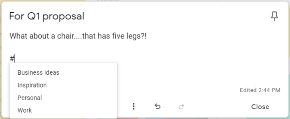
If you’ve used Gmail at all, in fact, the labels will feel immediately familiar: You can add as many as you like to any note, and all of your available labels are always available within the app’s sidebar (on the desktop) or main menu (on mobile) for easy browsing.
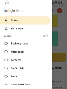
Just like in Gmail, you can archive an item when it no longer needs a prominent position in your primary inbox-like view. And as for that view, you can easily change the order in which notes appear by dragging and dropping them into any position and using an Inbox-reminiscent pin command to keep particularly pressing notes at the top.
Compare that to the interface of an app like Evernote—which has a dizzying array of overlapping options, sections, and organizational systems—and it’s easy to see why Keep’s simplicity is so appealing.
2. It’s got Google-quality search
Keep’s simple-seeming exterior hides some genuinely useful Googley powers—most notably a stellar search function.
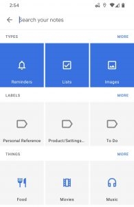
You can search Keep for any text contained within your notes, of course, but that’s just the start. You can also search for text contained within images attached to notes, for words from your spoken voice memos, or even for content from your handwritten missives (as Keep is able to turn messy scribbles into regular text with a couple of taps).
Keep can search for notes by theme—finding those that relate to food, travel, or music, for instance—and can even filter results by the color you apply to a note’s background. And, just like with Google search in any other scenario, you can combine any of those possibilities together to narrow down your hunt and find what you need.
3. It makes collaboration painless
Whether it’s a coworker or a significant other with whom you want to collaborate, working together in Keep is as painless as clicking an icon within a note and inviting someone else in. And since pretty much everyone has a Google account—something that isn’t the case with any other note app’s platform—there’s practically no friction or hassle involved; people you invite will simply receive an email and then find your shared note within their own Keep list for viewing or editing.
And speaking of the Google connection, our final Keep advantage might be the most important one of all.
4. It works well with other Google apps
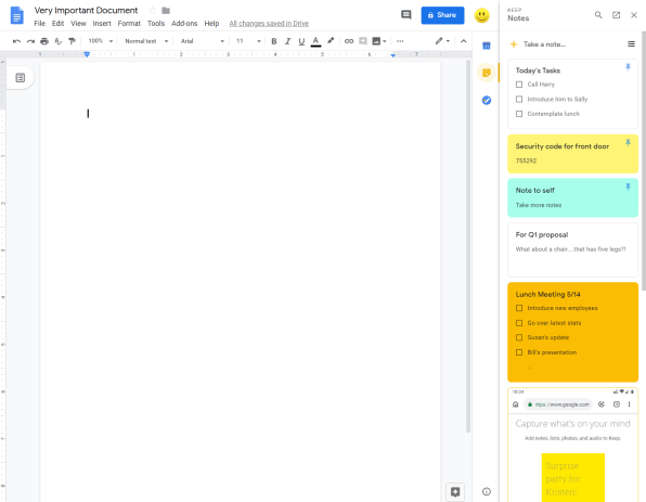
As a Google app, Keep fits in seamlessly with the rest of the Google ecosystem. That manifests itself in a handful of, shall we say, noteworthy areas:
Now, let’s make one thing clear: Google Keep isn’t going to be right for everyone. The service lacks some of the more advanced features its note-taking competitors offer—features like text formatting, tables, and templates, not to mention integrations with services whose names don’t begin with Google.
For even more next-level Google knowledge, check out my Android Intelligence newsletter.
(80)


