This burgeoning community helps people build stunning data visualizations
Creating sophisticated data visualizations may not be for everyone, but a startup called Observable is trying to make the process a bit less impenetrable.
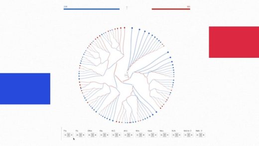
Observable provides a free website for creating complex graphs, charts, and other visual representations of data, such as face mask adoption in the United States or an Electoral College decision tree for the U.S. Presidential Election. While it requires some coding knowledge to use, it also lets anyone take an existing visualization and modify it for their own purposes, either by changing the visuals or plugging in their own data. That means people can start learning the ropes just by playing around with what’s already been made, and even the coding part scares you off, you can still visit Observable’s website to absorb its impressive graphics.

[Photo: courtesy of Observable]
Observable first launched in early 2018, but just raised $10.5 million in a Series A round led by Sequoia Capital and Acrew Capital. Mike Bostock, Observable’s cofounder and CTO who previously worked on visual stories for The New York Times, says the hope is to build the site into a GitHub-style community, where users endlessly tweak and build upon one another’s creations. The startup says 4.7 million people have engaged with the platform so far, either by visiting the site or creating visualizations themselves.
“We wanted to bring together this creative potential with something that’s going to be more accessible, really by helping people learn from each other,” Bostock says.
Tweakable visuals
For an ideal example of how Observable works, just look back to the fall of 2019, when impeachment inquiries against President Trump were getting underway.
At the time, a tweet by Lara Trump had gone viral, showing a mostly red electoral map supporting the President. That’s when Karim Douïeb, a Brussels-based designer, decided to respond with a corrective. He logged into Observable, and within about two hours had created a much more honest map, with red and blue population bubbles hovering over each U.S. county.
That map, which helped illustrate the point that land doesn’t vote, soon went viral. (My colleague Mark Wilson covered Douïeb’s map and the greater the election map debate a couple weeks ago, when it started getting renewed attention during the U.S. Presidential election.)
Douïeb wasn’t shy about crediting Observable for the map, and when people started asking for source code, he simply directed them to his project page where they could freely tinker with his work. Before long, people were making their own adaptations, including similar maps for elections in Switzerland, Germany, Spain, and Canada.
“That’s the beauty of it,” Douïeb says. “You don’t have to set up anything on the computer. You just go to the page, and the code is there. You can modify it straight away.”
The power of sharing
Observable isn’t exactly starting from scratch. Long before cofounding the company, Bostock had been a key creator of a Javascript application framework called D3, which generates data visualizations using web standards. D3 has become wildly popular among developers—it’s been downloaded more than 131 million times in the past five years—and Bostock credits much of that growth with the way people would share examples of their code.
“I grew up on GitHub, and I saw the explosive growth of open-source, and how people were sharing code, writing blog posts and tutorials,” he says. “I had built earlier sites for people to share examples with D3, and I was amazed by how successful those examples were.”
Observable is an attempt to build a platform around that kind of sharing. D3 still provides the underlying code, but each visualization appears in a “Notebook” where users can document their work. Users can then modify the code to see how it changes the results on the page, or they can “fork” the code into an entirely separate project.

[Photo: courtesy of Observable]
Melody Meckfessel, Observable’s CEO and co-founder, and a former vice president of engineering at Google, says that approach lets people create visualizations faster, since they can easily build on what others have already created.
“When someone comes and they fork [a project], or they were inspired by it, they don’t have to start with this blank slate,” she says.
Compared to other visualization tools, Observable is essentially trying to find a happy medium between simplicity and complexity. It’s more flexible than no-code visualization tools like Flourish but less intimidating than Jupyter, which uses a similar “Notebook” concept but without a GitHub-style community. And compared to Tableau, whose visualization tools cost $70 per month per user, Observable is considerably cheaper. Public, individual use is free, while teams can pay $9 per month for private collaboration.
“They’ve lowered the bar [to entry], but they’ve also continued to allow people to pioneer new visualizations, and new approaches in the same architecture,” says Jim Goetz, a partner at Sequoia Capital who was part of the recent funding round. (Observable, which has 24 employees, and says it will use the funding to grow its team and support its community.)
Not just for coders
Even if you never dabble in Observable’s visualization tools, you might someday come across the results.
Beyond Douïeb’s work on election maps, people have used the site to illustrate the ebbs and flows of coronavirus deaths, air quality over time in California, the flipping of electoral votes in the election, a world map showing where all the humans live, and some truly trippy interactive visualizations. (Bostock himself has created a map of daily COVID-19 cases across the United States.) The site’s professional clients include Stitch Fix, MIT, and the LA Times.
Observable’s founders have embraced the idea of the site itself becoming a destination for curious consumers. It maintains a list of staff picks and trending projects, and has an “explore” page where visitors can dive into popular topics.
“That’s one of the beautiful things about data visualization . . . that it speaks to nontechnical people,” Bostock says. “You don’t have to necessarily understand how the sausage was made in order to appreciate it.”
Still, Observable does want to make its actual tools more accessible over time. While the coding element isn’t likely to go away, the startup does plan to add higher levels of abstraction that would let people get started without knowing as much code. All of this could help turn some of those curious visitors into creators themselves.
“We also want to make a very graceful transition between the reader and writer,” he says, “so that people can start diving in and learn how these things are made and create their own work.”
(41)


