This clever app turns your spreadsheets into slick interactive web tools
A hot trend in tech these days is coming up with the next great “spreadsheet killer”—the dazzling app that’ll make us all abandon Excel and Google Sheets in favor of some newer, sleeker, and more versatile alternative. From Notion and Coda to Airtable and its rivals, there’s no shortage of alluring services trying to remake the tired old spreadsheet and trade it in for something more modern.
Grid is not one of those services. Yes, it’s Yet Another New Spreadsheet App—but unlike most such creations, its aim isn’t to replace your tried-and-true spreadsheet setup. Instead, it wants to work alongside that environment and add an extra layer on top of it to make it even more empowering.
“We are very much building for someone that is already a spreadsheet user, has already built spreadsheets, and wants to do something more with them,” says Hjalmar Gislason, the founder and CEO of the Reykjavik, Iceland-based startup.
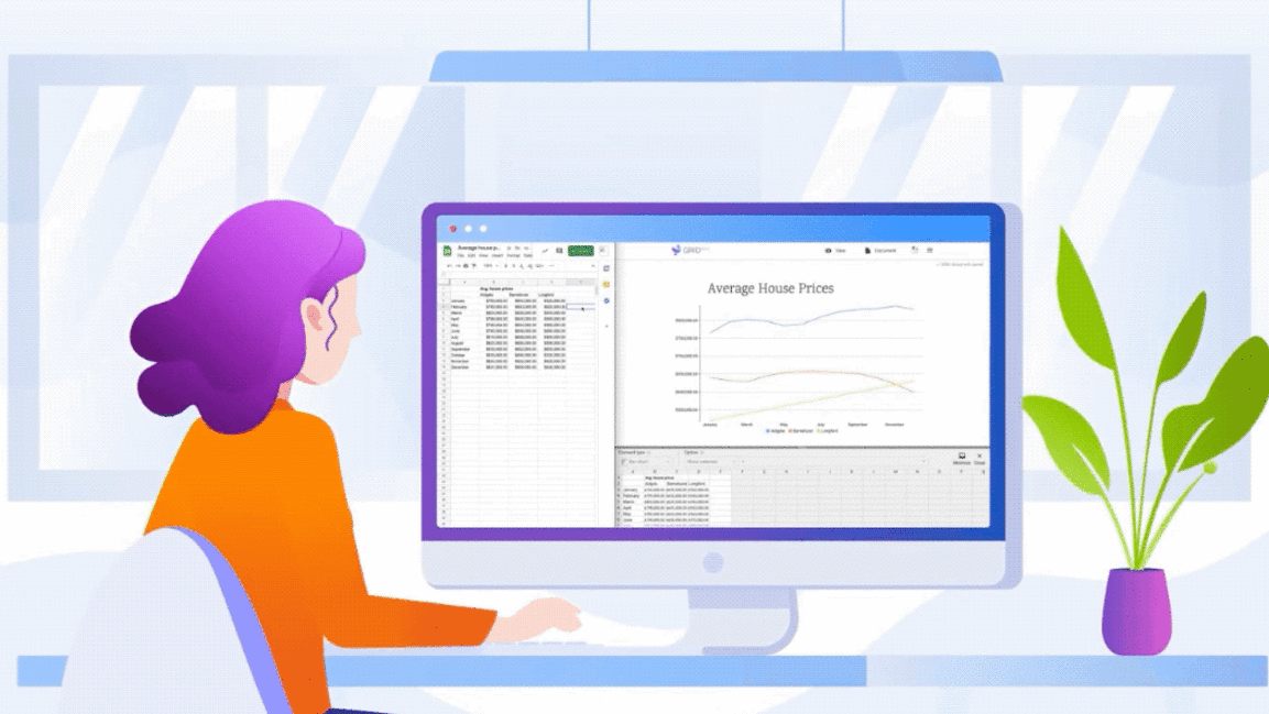
The service—which launched last week—lets you inject a dash of web-based interactivity and a pinch of presentation polish into your existing spreadsheets. And instead of requiring you to import your data and then work within an entirely new structure, Grid syncs with your Excel or Google Sheets setup, allowing you to keep working within the app you already know while simultaneously getting a whole new set of tools to complement it.
For anyone who’s ever shared a spreadsheet or used one as part of a presentation, it might be just the finishing touch that’s long been missing.
Evolution, not substitution
Before we dive deeper into Grid’s philosophy, let’s address the basics: Anyone can use the full set of Grid spreadsheet-enhancing tools for free. The service is open and available right now, and it takes all of two seconds to sign up. The only real catch is that if you stick with Grid’s default, free plan, you’ll end up with a small watermark at the bottom of any presentations you embed within another website. A $348-per-year (or $35-a-month) Professional plan eliminates that watermark and adds custom branding options along with advanced statistics into the equation.
As for the driving philosophy behind Grid, it’s really quite simple: Practically everyone uses spreadsheets. And practically everyone’s invested a lot of time and energy in learning how to make the most of them.
We are meeting people where they’re already comfortable.”
Hjalmar Gislason, CEO, Grid
But capable as they may be, spreadsheets are woefully lacking in one increasingly important area: the ways in which they can be shared and presented. And that’s where Gislason sees an opportunity to do something special—and something that doesn’t force everyone to start over entirely.
“We are meeting people where they’re already comfortable,” Gislason says. “They already know how to use spreadsheets. We are giving them a way to do more with that instead of having to rebuild something from scratch.”
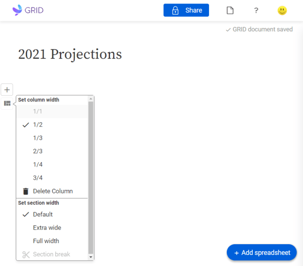
At its core, Grid is essentially just a web editor: You sign in to the service’s website, fire up a new document, and then find yourself facing a blank screen in which you can create columns and enter any kind of text or images. The true power, though, comes when you find the “Add spreadsheet” button at the bottom of the screen.

Click that button, and Grid will prompt you to upload a new spreadsheet from your computer—or, preferably, to allow the service to access your Microsoft OneDrive, Google Drive, or Dropbox account so it can sync up with your spreadsheet there and maintain an active connection.
However you go about it, once you have a spreadsheet in place, you just click a small plus icon within the Grid editor to create all sorts of fancy charts and displays from your data—kind of like what you can do within Excel or Sheets but with the added benefit of a simplified experience, some expanded forms of control, and some really interesting forms of interactivity.
You might, for instance, put together a presentation that combines graphics and bits of info with line charts that illustrate shifting income levels over time. With a couple of quick clicks, you could then add in an interactive slider that’d let anyone manipulate the data and look ahead at how trends might shape up in a variety of scenarios.
In more concrete terms, that could manifest itself as a revenue forecast—in which anyone could adjust a series of on-screen sliders to see how a company’s financial picture would fluctuate as different variables evolve.
It could also take the form of a mortgage calculator, where multiple sliders work together to let folks figure out down payments, annual mortgage payments, and property equity over time, all by selecting the values that apply to their situation.
“It’s almost tangible, almost kind of tactile,” Gislason says. “You get a visceral feel for the model because you can just interact with it so easily.”
The presentations seem so polished and advanced, in fact, that they almost come across as their own custom apps. As of now, Grid presentations can be viewed via a private web link, a public web link, or a password-protected link in addition to being accessed as embedded elements within other websites. It’s a far cry from the more typical experience of opening someone else’s spreadsheet in Excel or seeing a pasted replica of some data inside a static document. And that, according to Gislason, is precisely the point.
“We often hear people say they can build something in less than an hour here that would easily be a few weeks’ worth of [work] if they had to do it differently,” Gislason says.
Critically, too, the presentation remains perpetually connected with your original spreadsheet—and so long as you opt to allow Grid access to the cloud service where that file is stored, any changes you make to the original data (in either Excel or Sheets) will instantly and automatically be reflected in your Grid document and all of its elements.
The spreadsheet evolution spectrum
Grid may be only days old right now, but its strategy of working with existing spreadsheets instead of trying to replace them has already won an eye-catching endorsement.
That’s the approval of Dan Bricklin—who, along with Bob Frankston, is one of the fathers of the spreadsheet. The two are considered computing royalty for their work creating a program called VisiCalc back in the late ’70s. The app first introduced the world to the idea of the electronic spreadsheet, establishing an idea that continues to serve as a foundation for every spreadsheet-related product we see today.
VisiCalc was so significant, in fact, that Steve Jobs once credited it as being the biggest factor that “propelled” the Apple II computer to “the success it achieved”—a rare bit of public praise from a man who wasn’t exactly known for doling out accolades.
Bricklin holds the title of “scientific advisor” for Grid. He was initially attracted to the service because of the way it managed to blend his original ideas with new concepts but without requiring a new environment and method of working.
“So much of the spreadsheet is built into it, and your spreadsheet thinking is useful for understanding how this works,” Bricklin says. “You don’t have to learn a new way of thinking about calculating and representation and stuff like that.”
It turns out the spreadsheet is really good for what it is.”
VisiCalc cocreator Dan Bricklin
Bricklin—who continues to be an active force in the broader programming community, with a popular iPad app and an assortment of other ongoing projects—has offered up plenty of advice and insight throughout Grid’s development journey. He sees the service as being a natural evolution of the concept he and Frankston created more than 40 years ago and a sensible way to push spreadsheets forward toward more modern-day demands.
“It’s tuned to the way we do things on the web,” Bricklin says. “But I can feel that heart underneath, the engine . . . being the same one that we had underneath VisiCalc, [just] with a different way to interact with it.”
As for the idea of the spreadsheet interfaces we know eventually being killed off in favor of some flashier alternative, both Bricklin and Gislason laugh off the possibility. They’re confident that building on top of that foundation instead of trying to replace it is the way to go—and that that path will ultimately pack the greatest punch for productivity-focused people, most of whom have spent years mastering those grid-based environments.
“It turns out the spreadsheet is really good for what it is,” Bricklin chuckles. “A general-purpose tool of its type is very hard to kill off.”
For even more next-level productivity knowledge, check out my Android Intelligence newsletter.
Fast Company , Read Full Story
(43)


