This colorful new font doesn’t use a single letter
This colorful new font doesn’t use a single letter
Poly Mono is like Wingdings, if Wingdings was colorful, geometric, and obsessed with Karel Martens.
When is a font no longer a font?
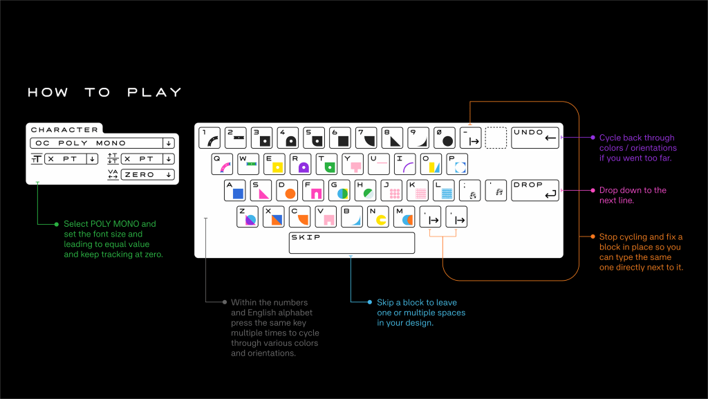
Poly Mono, a new font made of shapes instead of letters, blurs that line. Like Wingdings, the dingbat font made of primitive emoji-like characters, Poly Mono isn’t actually designed for spelling anything out. Instead, the font’s characters are geometric squares, circles, lines, and other shapes that can be arranged into designs. The characters are monospaced, or all the same height and width, so they tile perfectly.
“If there are no letters, is it technically a font?” asks Andrew Bellamy, Poly Mono’s designer and creative director at Otherwhere Collective. “I don’t have a definitive answer, and that’s part of the point.”
The font’s 38 characters are still assigned to keyboard keys “and we interact with it in the same way,” Bellamy says. “You press a key and something comes up on screen, but with the new twist that you can keep pressing the same key to change the assigned shape.” Hitting a key twice changes a character’s color and position, the period, comma, and hyphen all freeze characters in place.
The font’s “letterforms” were inspired by the prints of Karel Martens, a Dutch graphic designer, as well as 8-bit video games (the keys for colons, semicolons, and quote marks bring up an 8-bit mustached man in overalls named Marten who bears a passing resemblance to a famous video game plumber; hitting those keys multiple times makes him run in place).
And while most fonts use ligatures, or special glyphs that combine two or more characters into one (like the side-by-side F and T in “after,”), Poly Mono explores what Bellamy calls “mega-ligatures” that connect as many as eight characters.
Bellamy says he anticipates people will use the free font for fun, but with his background in branding and visual identity design, he also thinks it highlights a potential for brands.
“Brands tend to want to own a single color or combination of two that are unique in their market,” like McDonald’s and Ikea, he says. But “this is getting to be increasingly difficult with the sheer volume of brands out there now,” not to mention the limited number of colors on the color wheel.
Poly Mono, though, shows “how a consistent combination of many colors can also be used to create a recognizable and compelling identity.”
ABOUT THE AUTHOR
(12)


