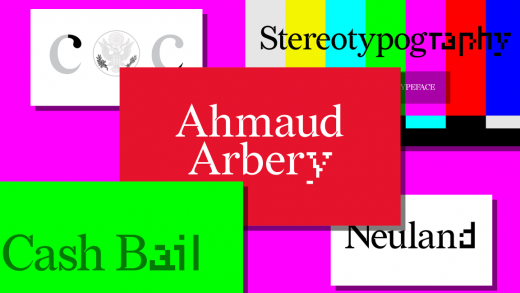
This font brilliantly subverts civil rights injustices
The system of paying bail is broken. If you have the cash on hand, you can buy your freedom until your trial. If you don’t, you spend your pretrial days in jail. So the have-nots are punished for their socioeconomic place in the world—a policy that disproportionately hurts African Americans. It’s an injustice that designer Forest Young wants to address with a thoughtful new typeface called Redaction.
Redaction was born in an exhibit by the same name that ran at MoMA PS1 last year, by artist Titus Kaphar and attorney Reginald Dwayne Betts. Kaphar placed etched portraits of incarcerated people next to Betts’s edited court transcripts, each redacted to tell a new story about prisoners amid the legal jargon. Redaction the exhibit subverted the court’s obfuscation to become a tool of civil empowerment—if only for a few dozen prints in a museum.
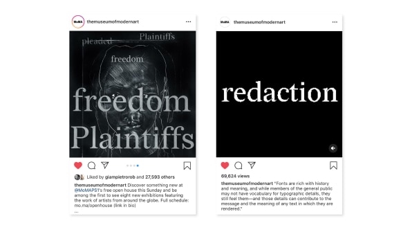
But when Young, who is global principal at the design firm Wolff Olins, was chatting with Kaphar, a former Yale classmate, about his new work, Young asked a question: Did Kaphar intentionally choose Zapfino as the typeface for his exhibition? His answer led to Redaction the typeface, a font that’s available to download for free.
“I was challenging him, saying Zapfino is playing such a pivotal role . . . and your work is about the semantics of who is being obscured,” says Young. Zapfino was created by Hermann Zapf in 1944. Zapf is considered a renowned typographer whose typefaces, such as Palatino and Optima, were standardized in the 1990s across Windows and Mac. He was also a Nazi soldier and cartographer during WWII—and Zapfino was considered the quintessential German lettering by the Nazi party. Kaphar didn’t realize this, and discovered an unintentional semiotic layer to his work. So he agreed that Young should create something new for the exhibition.
Young teamed up with typographer Jeremy Mickel, and the two began researching the history of U.S. court documents and their editing. As it turned out, the typefaces on these documents is highly standardized. Century Schoolbook is used by every document that the Supreme Court reads. Times New Roman is the standard of the U.S. Court of Appeals.
“We were curious: What is the space between these two? How do we use the semiotics of these two with the air of legal quality, but something subversive we want to bring to it as well?” says Mickel. “We did initial sketches . . . and it’s like . . . okay, you made something that’s exactly in between New Roman and New Century, but does it advance the conversation?”
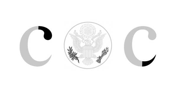
The duo began searching for other metaphors to incorporate. The presidential seal was an inspiration. The eagle holds an olive branch in one talon and arrows in the other. The branch became a soft curve in the typeface, seen at the top of a letter like C, while the arrow became a disquieting thorn at the bottom.
“So we have this supersharp version, and I distinctly remember Titus [Kaphar] saying, ‘It looks great . . . but let’s fuck it up a little bit,’” Mickel says. That’s when they embraced the idea of degradation: As court documents get copied over and over, they might be redacted and lose generational fidelity. Words became a copy of a copy of a copy. So the more a document has been processed, the less legible it becomes.
Young and Mickel infused their typeface with ink traps inspired by analog ink printing. Small slices inside corners of a typeface are left open, to allow excess ink to soak in. But in the case of Redaction, these ink traps became a difficult-to-reproduce watermark.
“If someone uses this typeface with intention, they understand if it’s photocopied or shared, these ink traps serve as a trigger to show this has been modified,” Young says. If you recompressed or processed these ink traps, they might be lost, or distorted, to an algorithm—an idea inspired in part by the work of artist Peter Saville.
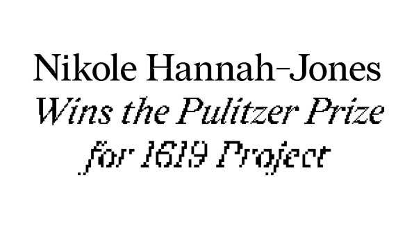
After building that typeface, the duo decided to make Redaction a full font, with italics, bold, and also bitmapped versions, which are full of compression artifacts and, at the same time, still legible.
“It raises notions of what does degradation mean? Is it an aesthetic process, superficial? Is it bringing awareness to the visual evidence of modification and something that’s been obscured?” Young says. “I think in some ways the typeface is wrestling with these ideas.”
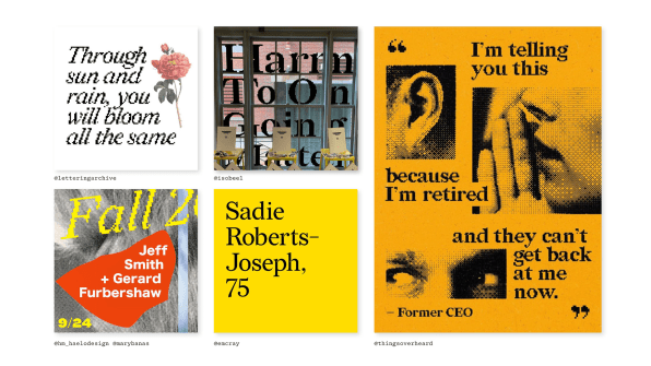
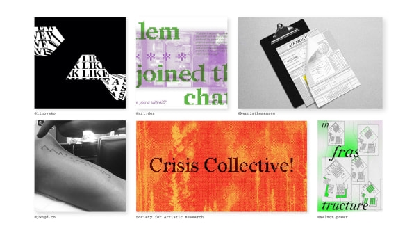
Since debuting at the MoMA PS1 in the Redaction show last year, Young and Mickel have made Redaction (the font) available for free download and use, with a full Latin character set for multi-language implementation. And while it’s ambitious, Young and Mickel hope that Redaction can become a shorthand typeface for civil rights.
“As the typeface gained awareness beyond the show, we had someone on Twitter say, ‘I need Spanish accents because I need to raise awareness for arrests at the border,’” Young says. “It’s evolving.”
Fast Company , Read Full Story
(12)

