This interactive map shows how wrong we picture the world
The maps we use to navigate planet Earth, to tell us what’s what, lie to us all the time. Take New York City’s transit map, for example. Manhattan is wildly out of scale. The warping of reality is best illustrated by comparing the world famous Central Park to Prospect Park: the former (843 acres) appears to be at least six times the size of Brooklyn’s finest park (526 acres), when it’s not even twice the size.
Zoom out now. Chances are pretty decent that, relying on similarly flawed maps, everything you understood about the world is wrong. Did you know that California is bigger than the U.K. (all of it)? Or that the contiguous United States could blanket Australia?
If you did, good for you. If you did not, well there’s hope for you yet, young scholar.
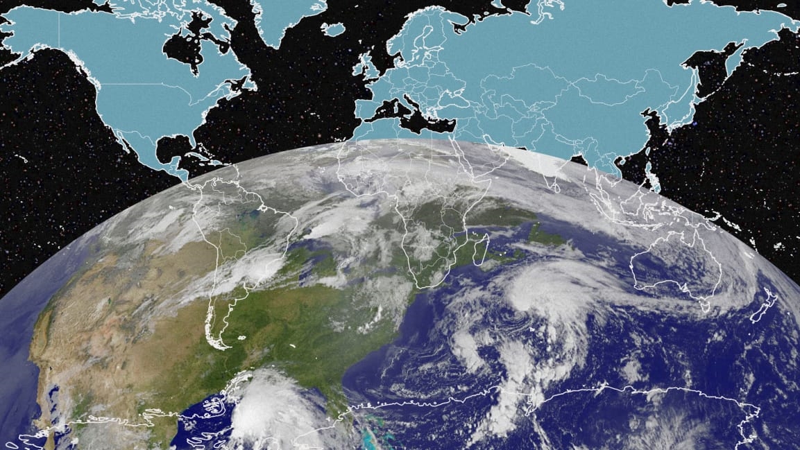
Interactive mapmaker Neil Kaye has animated a world map that is true to scale. In this version, Greenland is shown a full 16 times smaller than its likeness in the classic Mercator projection, which distorts land size so that countries farther away from the equator appear larger.
Animating the Mercator projection to the true size of each country in relation to all the others.
Focusing on a single country helps to see effect best.#dataviz #maps #GIS #projectionmapping #mapping pic.twitter.com/clpCiluS1z
— Neil Kaye (@neilrkaye) October 12, 2018
Notice that some other textbook titans–including Canada, Russia, and China–all shrink, while the continent of Africa, and its 54 countries (home to varied climates, cultures, cuisines, and more), flexes its properly mapped might. Perspective–and reality–matters in how we think about the world. Hopefully, we can all unlearn what we’ve been taught by maps our whole lives.
Fast Company , Read Full Story
(49)


