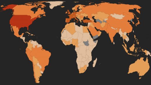
This live coronavirus news dashboard puts maps, recoveries, and global sentiment all in one place
Who says innovation can’t flourish through the work of depressed at-home employees? Witness the Coronavirus News Monitor, a new dashboard from analytics platform RavenPack, which should be your new browser homepage.
Like most COVID-19 live dashboards, it shows the latest reported cases, recoveries, and fatalities in numbers and maps, by region, with data drawn from Johns Hopkins University.
Unlike most, it also includes a global newsfeed, as well as at-a-glance indicators of global media sentiment and chatter. Stock-ticker-like indexes also show current levels of panic, hype, and contagion, gleaned from tens of millions of news articles, alongside 15 categories receiving the most coronavirus-related coverage, including countries, politicians, companies, retailers, and treatments. This all tells you where to pay attention. For example, if a treatment succeeds or fails, or a governor does something noteworthy, or cases in Iran spike, you’ll see it. (Read: PR professionals everywhere should love this.)
In aggregate, you can scan and get an immediate sense of global case tallies, what people are talking about, what’s changing, and overall attitudes (panic buying! losing patience! sewing face masks! failing mental health! etc.) This is a boon if your goal is to remain smartly informed without spending hours clicking through downer news.
Pro tips: You should filter by country. And on the indexes, click the little arrows to see pop-out graphs of year-to-date information.
Why aren’t all news dashboards this good?
(12)


