This real-time coronavirus U.S. map shows detailed data on local death rates, cases, and demographics
From the earliest days of the coronavirus outbreak, Johns Hopkins University has been one of the go-to sources for global case counts, data visualizations, tracking tools, and other statistics. What’s especially useful about its COVID-19 dashboard and associated maps is that they keep getting better as new contextual data is added.
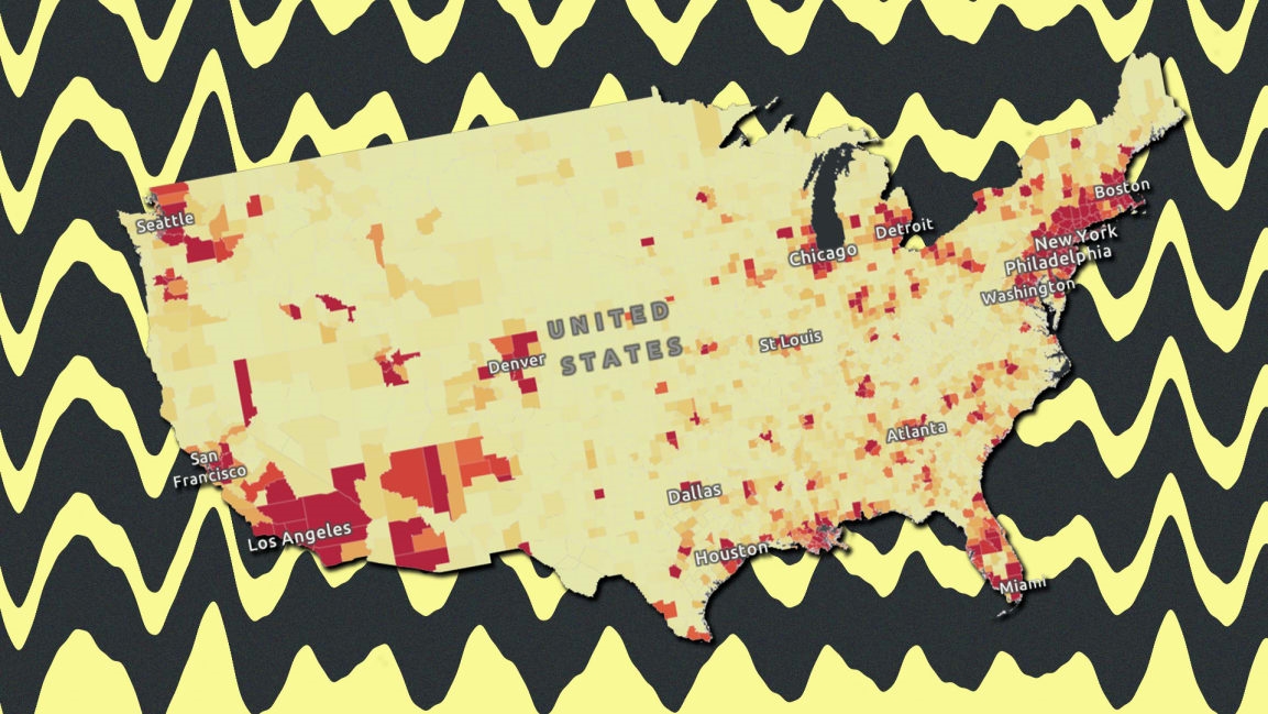
The latest iteration of JHU’s map of the United States has just been updated with a wealth of county-level public health data to help local governments and medial professionals better understand how the coronavirus pandemic is impacting their area. The map, powered by software from spatial analytics firm Esri, now includes the following data, all searchable by county:
All of this information appears in addition to the coronavirus case counts, death counts, fatality rates, and confirmed cases by population.
To find this additional demographic and health data for a specific county, you can use the zoom tool on the map or just search for a specific city or zip code. A window will appear next to the county, and within that window, you can find an information panel. Double click the information panel to see a close-up look at the county’s “Status Report,” which includes a breakdown of the data and infographics. It looks like this:

(15)