This stark visualization proves it: You should be making a lot more money
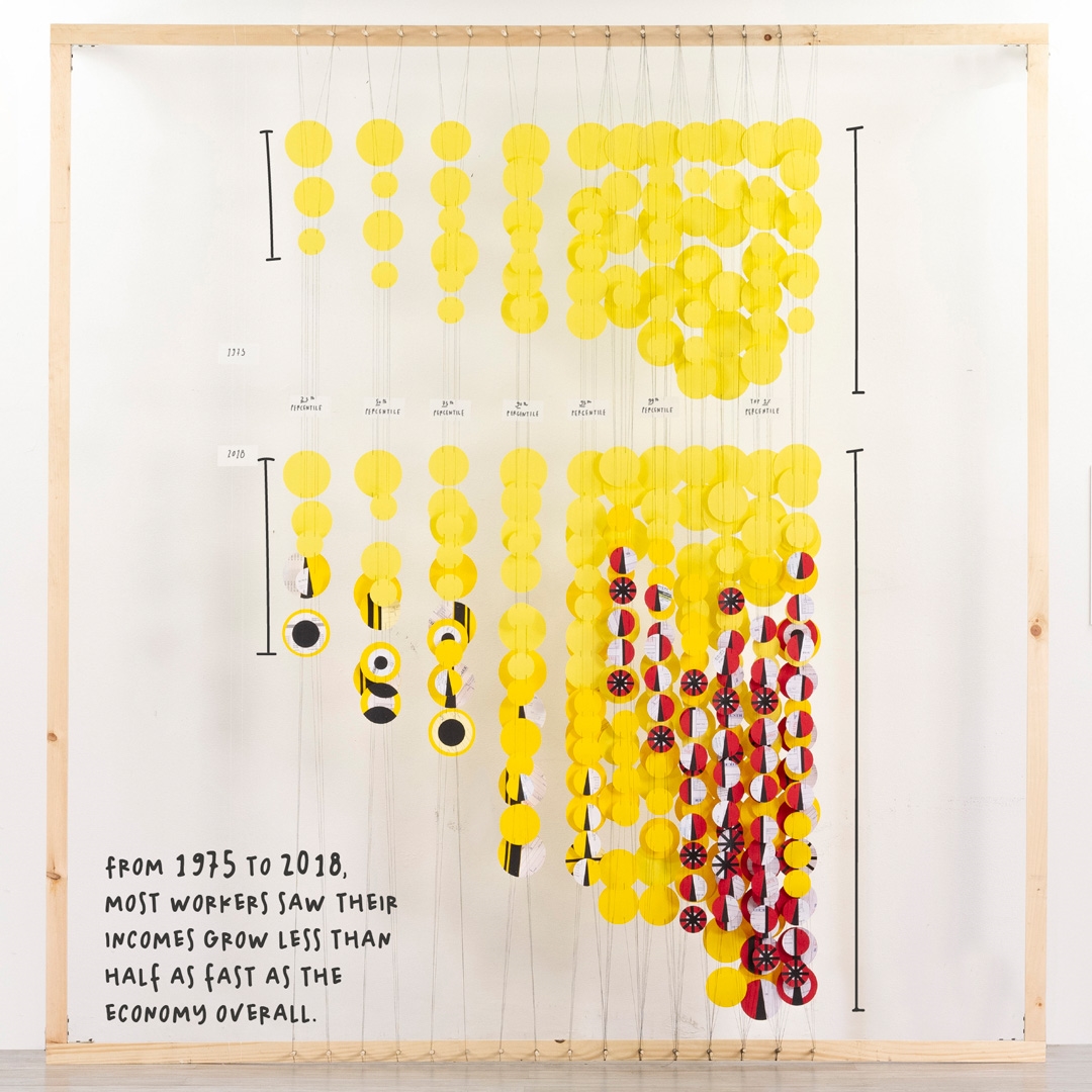
It looks like some abstract museum installation. Yellow dots dangle in the air between a plywood frame, as if we’re getting a glimpse into Yayoi Kusama’s closet. But what you’re really seeing is a depiction of hard data: nearly half a century of income inequality that has served the top 1% of Americans, and pretty much nobody else.
Created by the design firm Pentagram for Rand Corp., the visualization is based upon the think tank’s 2020 research, which analyzed the last 43 years of U.S. economic growth. We’ve all heard the stories, and seen charts, depicting how low- and middle-class Americans have earned stagnant wages for decades when adjusted for inflation. But this newer research introduces the concept of a counterfactual. It didn’t just analyze how our economy changed; it demonstrates how wealth distribution should have been different, if 1975’s class equity had remained intact. If we maintained ’70s era wealth distribution, a person making $33,000 today would be making $61,000 instead. That’s almost double.

“The more we read the data, the more we saw charts in the reports, the more we felt [these findings] really might be overlooked,” says Giorgia Lupi, the Pentagram partner who led the project alongside designer Ting Fang. “The idea was to make the topic and actual data in the chart very tangible and understandable.”

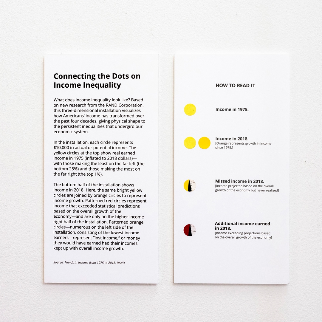
To make the chart feel tangible, the team built the sculpture you see here, using paper, string, and wood. Each coin-like yellow circle depicts $10,000 in earnings. On top, you see a snapshot of what people made in 1978 at various income levels. On the bottom, you see a snapshot of what those same groups made in 2018.

What you’ll notice quickly is that there aren’t more yellow dots for most Americans in 2018 than there were in 1975, because controlling for inflation, most of our incomes have grown a mere 13% to 17%. But what are those black-and-yellow circles about? And what about the red-and-black ones? Those are the counterfactuals that tell more of the story.

The black-and-yellow circles are the extra cash we should be earning, if we applied 1978 income distribution to today. (These circles are made of actual pay stubs.) And the red-and-black circles depict where all that extra income actually went. (These circles are made of receipts). “Ninety-nine percent of income was distributed to the people who made the most money,” Lupi says. That’s why you see so many red circles on the wealthiest portions of the sculpture. And that’s why your bank account may be feeling a bit emptier than your parents’.

While Rand’s report doesn’t dig into the reasons for all this income inequality, previous studies tie much of it to ballooning executive compensation. CEOs now routinely earn thousands of times what their employees do, as the wealthiest Americans have consolidated profits for themselves rather than distribute those earnings more evenly to others (a practice only emboldened by the current tax code).
The sculpture is not on display anywhere at the moment; Pentagram built it to be photographed and annotated online. “Right as we started to talk to Rand and prototype it, Rand asked, ‘where is the actual sculpture? It would be interesting to have it in our office.’ So it might start living eventually as a physical installation,” says Lupi. “With a topic like this one, [creating something] tangible, even if it only means to photograph it for social media, might get people’s attention more. In our work, the first thing [we ask] is, will people stop? They won’t usually stop for a chart, but they may stop more if they say . . . ‘This is data, it’s beautiful. Let me swipe more to see what it’s about.’”
(29)


